Created in 2020, a brand of unique and original toys for children and adults has become the owner of a fun style to match the toys themselves. They are not just fun to play – they are easy and simple to “grumble” and tear their tummies with laughter. The brand has set itself the task of uniting as many people as possible based on laughter and fun. Toys are waiting for everyone who still has a reserve of energy and a lot of laughter, who is ready to have fun until they drop. They help people to reveal their inner mischiefs and enjoy a fun and carefree pastime.
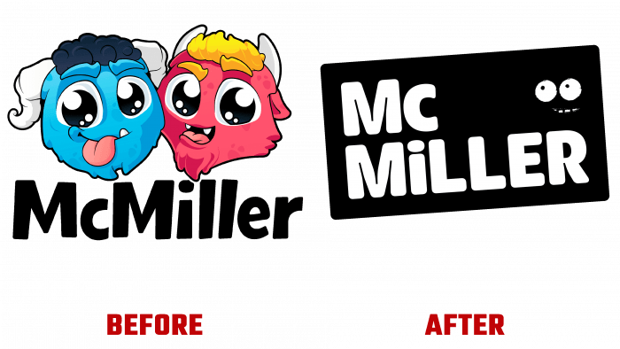
Rebranding agency Studio Chong (London, UK) has done a great job on the new logo. Through a professional and creative approach, they could create a bolder, more colorful, fun logo. They were able to visualize a graphic identity. With all its humor, it is like an avalanche transmitted to everyone who at least once sees this funny and unexpected logo for everyone. Just as in the previous version, the new one contains two very attractive, colorful monsters, but they are much more abstract, unlike the previous ones. This is a strange couple with very different personalities and anatomy. They are essentially two cute, monstrous cotton candy that is more like ambassadors or guides in games. It is worth noting the inscription, made very boldly, original and funny. The lowercase letter “i” in the word “MiLLER” imitates the lowercase letter “c” in “Mc,” which is also another stupidity but small and not critical. The selected font, Doughy Typeverything, is not serif. The inserted floating eyes and a smile look very impressive. They turned out to be very useful. First of all, they give the logo an even more fun look.
The most spectacular are the monsters. It is simply impossible to pass by them and not smile. They are the main brand symbols. Thanks to them, the necessary level of pranks and fun, playfulness, and constant celebration was provided. But the further elaboration of the packaging is required. It is too general, universal, does not differ in uniqueness and internal meaning, which does not agree well with the essence of each of the games.


