The Mellow Mushroom logo is whimsical and fantastical, fully reflecting the concept of a “planet of colorful mushrooms” where visitors to the restaurant chain find themselves. The emblem instantly evokes associations with an unusual, vibrant, and creative atmosphere, where every detail is carefully thought out. It invites guests to enjoy pizza with unique, meticulously crafted sauces while immersing themselves in a relaxed, almost magical environment. This visual symbol represents the freedom of expression and the laid-back vibe that guests can experience at every franchise location.
Mellow Mushroom: Brand overview
The story of Mellow Mushroom began in 1974 when three University of Georgia students—Mark Weinstein, Mark Cecil, and Mike Nichols—decided to open a pizza restaurant in Atlanta, Georgia. Their idea was born out of a love for pizza and a desire to create a unique spot that reflected the free-spirited, artistic atmosphere of the 1970s.
The first location opened on Spring Street in Atlanta. The name “Mellow Mushroom” was chosen to evoke the era’s psychedelic culture and represent the restaurant’s laid-back atmosphere. The quirky interior, filled with vibrant colors and eclectic decor, immediately drew in locals and students.
Initially, the menu focused on pizza made with freshly prepared dough and a unique recipe. The founders experimented with different ingredients and toppings to create a flavor that set their pizza apart. The restaurant also offered a wide selection of beers, salads, and sandwiches, making it stand out from other pizzerias at the time.
Over the years, the business grew in popularity with locals and visitors. The combination of a distinctive atmosphere, delicious pizza, and friendly service attracted more customers, and the success of the original location led the founders to consider expanding.
In the late 1970s and early 1980s, new restaurants opened in other cities across Georgia. Each new location maintained the original concept and vibe but had its unique design elements, which became a hallmark of the brand.
Throughout the 1980s, the company continued to innovate, refining its recipes and expanding its menu. This period saw the introduction of the “build your own pizza” option, allowing customers to customize their pizzas with various toppings.
The 1990s marked a turning point as the company began focusing on franchising. This decision enabled the brand to grow beyond Georgia. Franchisees were carefully selected to maintain the distinct character and quality that had made the brand successful.
By the late 1990s, the company had established hundreds of locations throughout the Southeastern U.S. Each new restaurant maintained its unique style while often incorporating local history and culture into its decor. This approach helped the brand feel like a local favorite wherever it opened.
In the 2000s, the business experienced significant growth, expanding into new regions and attracting a broader customer base. The company focused on building its brand with a creative marketing strategy that matched its playful and imaginative business approach.
During the 2010s, the chain continued to expand, opening restaurants in more states across the U.S. The company also adapted to changing consumer preferences by increasing its selection of craft beers and adding healthier menu options, helping it retain loyal customers while attracting new ones.
In 2015, the company introduced a new design concept for its restaurants. While staying true to its quirky, artistic roots, the new design was more modern and appealed to a younger audience.
The brand celebrated its 40th anniversary in 2018 with special events and promotions across its locations, highlighting its longevity and success in the highly competitive restaurant industry.
Like much of the restaurant industry, the company had to adapt to the challenges posed by the global pandemic from 2020 to 2022. It improved online ordering and delivery services and implemented new restaurant safety measures. Despite these challenges, the brand continued to grow and open new locations.
By 2023, the company had over 200 locations across multiple states, making it one of the country’s most recognizable and beloved pizza chains. The company has remained true to the values and principles established nearly 50 years ago, offering its unique approach to restaurant design, food quality, and customer service.
Throughout its history, the brand has demonstrated its ability to evolve with changing industry trends while maintaining its distinctive identity. From a small pizzeria in Atlanta to a nationwide restaurant chain, the journey is one of creativity, quality, and a commitment to creating a unique dining experience.
Meaning and History
What is Mellow Mushroom?
This eccentric pizzeria has carved out a special place in the casual dining market by offering a unique experience. Originating from Atlanta, Georgia, it has spread nationwide, attracting food enthusiasts with its combination of stone-baked pizza, craft beer, and an unusual, surreal atmosphere. Each location is designed as a unique artistic space with creative installations and furniture that reflect the local spirit while maintaining the brand’s bold style. The menu includes calzones, sandwiches, and salads, but the main star is their famous pizza, made with carefully selected ingredients and a crust crafted with spring water. The establishment has become a favorite spot for pizza and beer lovers thanks to its relaxed atmosphere, variety of drinks, and focus on high-quality products.
1974 – today
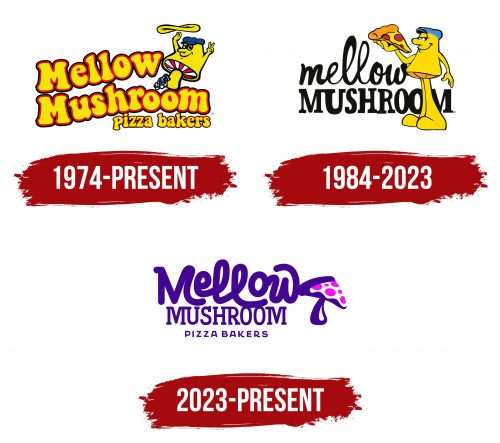
With its playful and friendly design, the pizzeria’s emblem brings a genuine smile. The cartoon-style letters appear sculpted from the dough, evoking the pizza-making process. The red outline symbolizes baking over hot coals, emphasizing the delicious warmth of freshly made food. The pizzeria’s name instantly brings thoughts of hot and delicious meals.
On the right is the brand’s mascot—Mel O. Mushroom, created by artist Buddy Finethy. This character, wearing a cap, plays the role of a pizzaiolo, enlivening the emblem with his cheerful image. The raised fingers of his other hand make a casual gesture that, in youth culture, means “cool” or “everything is great.” His clothing style and relaxed demeanor highlight the atmosphere of freedom and ease in the pizzeria.
The café’s founders, students, aimed to combine fresh food with a laid-back social atmosphere. This is reflected in the mascot and the overall design of the logo.
Beneath the main brand name is a caption, “Pizza baker,” which completes the logo’s overall look. It is done in the same playful style as “Mellow Mushroom,” enhancing the emblem’s cohesiveness and friendliness.
1984 – 2023
The opening of new locations prompted a slight update to the logo. The name is now written in black letters but in two different fonts. The word “Mellow” looks like it’s made from sauce or stretchy cheese, highlighting the uniqueness of the chain’s recipes and hinting at hot, freshly prepared dishes. At the same time, the word “Mushroom” resembles baked dough with a delicious crispy crust.
The black color gave the logo a more solid and mature appearance, reflecting the network’s growth and development. However, the brand’s cheerful and lively character remains thanks to the combination of different font styles, which add a playful touch to the lettering.
The mascot, Mel O. Mushroom, appears again in the foreground, now about to bite a tempting pizza slice. Unlike the previous version of the logo, which depicted the process of working with raw dough, here we see a finished dish, making it more attractive and appetite-stimulating. This change subconsciously enhances the feeling of speed and convenience in getting an order.
The mascot glances slightly at the viewers as if watching their reaction, trying to evoke envy with his pizza slice. This look seems to invite competition and encourages buying an equally delicious slice.
2023 – today
The Mellow Mushroom logo stands out for its originality and evokes associations with an unusual, slightly fantastical world. The use of purple and the design elements are reminiscent of the psychedelic aesthetic popular in the 1970s when this pizzeria chain was founded. The purple color emphasizes the atmosphere of relaxation and creativity that characterizes the establishments.
The logo’s name is written in three levels of fonts, each conveying its mood. “Mellow” is done in freely flowing letters with smooth curves, like liquid or melted sauce. This style highlights the casual and laid-back nature of the chain. The second element, “Mushroom,” is in a more formal and angular serif font, balancing carefreeness and professionalism. Finally, “Pizza Bakers” adds the finishing touch—it’s a description of the business written in simple yet confident letters.
A special symbol of the visual sign is the mushroom, a bright toadstool with pink spots, which adds a psychedelic accent. This element references the brand’s name and evokes associations with something magical and unusual. The Mellow Mushroom franchise has always stood out for its unique approach to pizza-making and the unusual atmosphere in its locations. The logo reflects its eccentricity and connection to the relaxed and experimental 1970s when it all began.
This visual style resonates with people looking for delicious pizza and an unforgettable atmosphere.
