A family business, Mendocino Farms first opened its doors to its first visitors in 2005 with the mission of offering much more than just food to everyone. Sandwiches, salads, snacks – everything that the brand offers is distinguished by creativity, sophistication, and unsurpassed taste. All of them are ready to take every gourmet on a real culinary adventure, which is accompanied only by fresh products and a fearless combination of unexpected taste solutions. Created by the brand A new hospitable place for friendly meetings always bestows a sense of happiness, which is directly related to order. It has become the main one for everyone who is ready to come to Eat Happy, which has become for many a real feast for the stomach and soul. Throughout the years of its existence, the brand has expanded its range and implemented new ideas both in the culinary field and in organizing events, joyful and attractive meetings. The changes that have taken place and the changes that modern conditions have caused have necessitated the implementation of internal changes. The strategy, style, identity required special attention to ensure that they were fully consistent with the changes that have taken place.
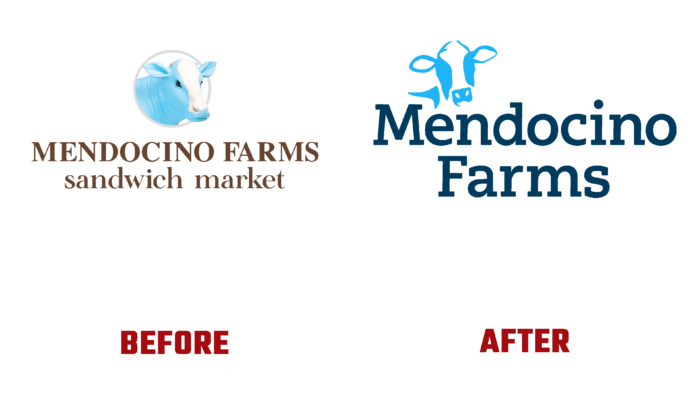
And you were the first to touch the logo and brand name, which have become concise and simpler in their execution. Keeping the image of the cow’s head as a symbol of the naturalness of all products used by the brand in their preparation, some changes were made to its visual design. Now the head has been simplified to its stylized image, which has reduced the load on the logo with illustrated elements. Having retained the main color of the brand – delicate light blue, almost sky blue for the execution of the symbol; the brand has also maintained its commitment to its long history. Characterized by the absence of any impurities, almost heavenly purity, this color symbolizes both the purity of the products and the breadth of offers and delicious prescription solutions.
Yorkten Slab Normal Medium by insigne, used for the main text block, features sharp yet soft graphics, making it readable at any size. The midnight gray color used for its execution helps it to stand out against the background of the light color of the brand emblem, drawing attention to the entire graphic composition.


