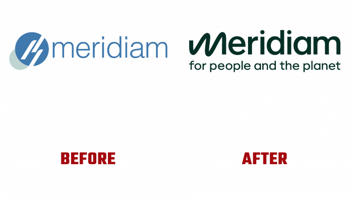
Global investor, the French independent company – Meridiam, which has been operating since 2005, has unveiled its new visual identity. With a focus on development, financing, and long-term management of public infrastructure, the company invests throughout Europe, North America, and Africa. Currently, the simplified joint-stock company has more than 100 funded projects in the transport, construction, and utility sectors. Constantly developing, the company strives to expand its areas of interest, especially in the modern areas of “green” energy and active management and reduction of human electricity consumption. In this direction, the brand has become the majority shareholder of Voltalis, acquired a leading position in Europe. The changes that have taken place required the introduction of fundamental changes in visual identity, which should summarize them and present them understandably and attractively.
The British company OPX (London, UK), which positions itself as a company that opens up an exceptional future for others, was entrusted with the reworking of the appearance, corporate identity, and logo and the formation of a new strategy.
In proof of its own identity, OPX, in its creative work with Meridiam, has been able to articulate and reflect the brand’s new mission: business for a better quality of life, supporting communities and protecting the planet for future generations; work – in the name of the man and the Earth. The latter formulation became the basis for all communication of visual self-presentation. All the information content created was designed for both internal and external audiences.
Starting to form a new identity with the development of a logo, the company paid the most serious attention to its brevity, attractiveness, and readability in any application. Having preserved its textual informational content, the designers made a spectacular move – the letter “M,” which is the capital in the brand name, was created graphically incorrect, bringing notes of humanity to the general atmosphere of the entire composition, demonstrating the symbolic connection of man with the planet. However, there are some visual flaws in the execution of the letter, which are striking and beg for correction. The lack of smoothness in some “wavy transitions” and smoothness in the interior counter-spaces makes them sharp. The rest of the sans serif letters make the logo visually accessible and appealing.
The choice of the color palette was based on the priority of applying neutral shades. The dark green across the board reinforced the emphasis on the earthy and natural focus of the brand’s core purpose.


