


![]() Messages Logo PNG
Messages Logo PNG
The created Messages logo reflects the essence of this application, as the speech bubble is a popular symbol of communication on the Internet. At the same time, the designers’ choice of gentle green makes the emblem easily noticeable and recognizable among other icons.
Messages began in 2002, before it carried its current name. Apple released iChat for Mac OS X 10.2 as a desktop messenger using AOL’s AIM and XMPP protocols. It supported text chats, audio and video calls, and screen sharing. For the next decade, iChat remained Apple’s main communication tool on Mac, reaching iChat 6 before being replaced.
On mobile devices, the story started on June 29, 2007, with the first iPhone and its built-in Text app. It worked as a basic SMS client, without MMS support for photos or videos. Apple linked the missing feature to hardware limits, while rivals on Android and Windows Mobile already offered multimedia messaging.
On June 17, 2009, iPhone OS 3.0 added MMS and renamed “Text” to “Messages”. The app could now handle SMS and MMS, send contact cards, and share voice notes. The biggest shift came on October 12, 2011, with iOS 5 and iMessage, an encrypted internet messenger using Wi-Fi or mobile data. Messages also arrived on iPad and iPod touch, with green bubbles indicating SMS and blue bubbles indicating iMessage.
On February 16, 2012, Apple announced Messages for Mac, and OS X Mountain Lion replaced iChat on July 25. Later updates added voice notes, short videos, location sharing, Apple Watch replies, Digital Touch, stickers, effects, tapbacks, Animoji, Memoji, pinned chats, mentions, and threaded replies. WhatsApp from Meta and Google Messages with RCS remained key rivals. In 2022, iOS 16 added editing and unsending for iMessage. In 2024, Messages gained RCS for improved chats with Android users.
Meaning and History
![]()
Initially, Messages were created for iOS devices. The first version of the app was released in 2009 and was introduced on iPhone OS 3.0. During its development, the online chat’s logo has changed several times but has always remained brightly green and included a white or gray speech bubble.
What is Messages?
Messages is an online chat application created by the American technology company Apple Inc., exclusively for its devices. The program allows users of Mac personal computers, iPad tablets, iPhone smartphones, and other devices with the Apple operating system to communicate. It supports sending text, graphics, and voice messages.
2007 – 2009
![]()
Since the iPhone’s creation, a native messaging application called Text has been integrated into the smartphone’s system. Its icon was a green square with rounded corners. Inside was a white “bubble” with the green word “SMS.” A bold sans-serif font was used, with all letter corners smoothed. To give the logo volume, designers made the top lighter and the bottom darker.
2009 – 2013
![]()
When iPhone OS 3.0 was released, the old Text application was replaced by the new Messages. The word “SMS” disappeared from the online chat icon because the new smartphone version now supports MMS. To fill the speech bubble on the icon, developers applied a gray gradient. The green base in the form of a square with rounded corners remained but became striped: it was covered with green diagonal lines arranged in parallel. Designers used different shades, making the lower half brighter and more saturated. The emblem’s contours were slightly blurred.
2013 – today
![]()
The first minimalist Messages logo appeared in 2013 for the iOS 7 built-in application. After the redesign, the speech bubble was completely recolored in white. The “striped” square base disappeared, giving way to a smooth green gradient. A year later, in iOS 7.1, the icon color was darkened, and in the iOS 11 online chat emblem, the oval bubble became round.
macOS
![]()
The Messages version for macOS was not created immediately; it was released in 2012, alongside OS X Mountain Lion. The new program replaced the iChat application, which, until 2012, supported text message exchange on Mac computers. It inherited its predecessor’s logo only partially: the blue speech bubble remained the only element. In 2020, its color changed to green to match the overall brand concept.
2002 – 2012
![]()
The predecessor of the Messages application was iChat, formerly known as iChat AV. As the messaging client supported audio and video calls, its main icon was a white camcorder. It was located inside a blue speech bubble, which personified the communication process. Due to the gradient, darkened areas, and bright highlights, it seemed voluminous. Gray shadows along the edges further enhanced the three-dimensional effect.
2012 – 2014
![]()
In 2012, Messages replaced iChat on macOS computers. To associate the two programs, developers retained the most vivid element of the logo: the blue speech bubble. However, they outlined it with a dark contour, removed the camera image, and decorated it with multiple diagonal stripes. On the right was a smaller gray bubble with three blue circles representing ellipses. In most messaging applications, this symbol appears when a conversation partner is typing.
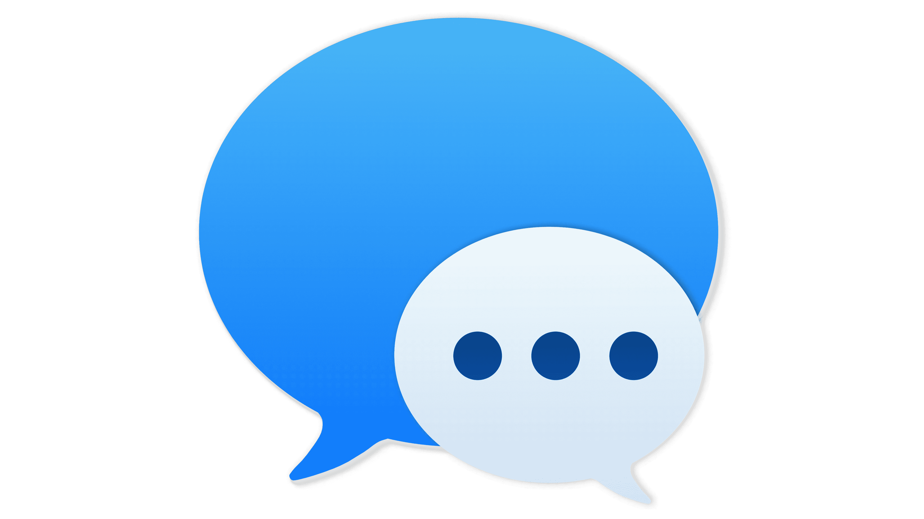
2014 – 2020
![]()
The large speech bubble lost its line pattern and outer contour, and the gradient was inverted: the dark top and light bottom switched places. The small bubble became white. At the same time, the three dots inside it were recolored uniformly dark blue.
2020 – today
![]()
In 2020, macOS Big Sur, the seventeenth release of the operating system for Mac computers, was launched. It was then that the Messages app with the green logo, similar to the iOS app icon, appeared. Now the speech bubble is large and white (with a gray gradient that gives it a convex shape), and its base resembles a green square with rounded corners.
Previously, the Messages icons for macOS and iOS were completely different. But in 2020, the developers decided to standardize them and redesign the computer program icon. Designers used a gradient to make the digital image look realistic. This style is called skeuomorphism.
Font and Colors
A fairly bright green palette compensates for the absence of inscriptions. The logo has a light top and a dark bottom, creating a three-dimensional effect. The gray dialogue bubble in the Messages emblem for macOS also appears voluminous due to the transition of shades. In contrast, this element on the iOS icon is completely white.