![]() Microsoft Edge Logo PNG
Microsoft Edge Logo PNG
For Microsoft’s browser, the most important things are high speed and convenience. The Microsoft Edge logo not only conveys these qualities but also hints at the product’s name. The emblem symbolizes the program it belongs to and its connection to web surfing.
Microsoft Edge grew out of the long decline of Internet Explorer, which had launched in 1995 and once held more than 90 percent of the browser market. Its position weakened after Mozilla Firefox appeared in 2004 and Google Chrome arrived in 2008. Chrome offered speed, a cleaner interface, and stronger support for web standards, while Internet Explorer became associated with slow performance, security issues, and compatibility problems.
By the early 2010s, Microsoft understood that Internet Explorer’s reputation could not be repaired through small updates. In 2014, the company began building a new browser under the code name Project Spartan. The goal was to compete with Chrome and Firefox by offering a modern interface, better support for standards, and a technical break from the old Trident engine.
On April 29, 2015, Microsoft introduced Microsoft Edge at the Build conference. The browser used EdgeHTML, a new engine developed to replace Trident. In July 2015, Edge shipped with Windows 10 as the default browser, while Internet Explorer remained installed for corporate compatibility. Early reactions were mixed: Edge was faster and cleaner than IE but lacked extension support at launch.
Extensions arrived in 2016, but the catalog stayed small compared with Chrome and Firefox. Edge failed to take much market share, despite being bundled with Windows 10. In December 2018, Microsoft announced a switch to Chromium, the open-source base of Google Chrome. The new Chromium-based Edge launched in January 2020 for Windows and macOS, with Chrome extension compatibility, tracking protection, reading tools, and automatic rollout to Windows 10 users in 2021.
Meaning and History
![]()
The Microsoft Edge emblem once resembled the Internet Explorer icon, but the two applications are different. The modern browser inherited the IE logo as a symbol of continuity since the same company created it. Designers significantly altered the iconic letter “e,” removing the ring around it. This icon accompanied the application until 2019, when it became clear that Edge was recognizable enough to shed any associations with IE.
What is Microsoft Edge?
Microsoft Edge is an application that provides access to websites. It was created by the American technology corporation Microsoft and introduced in 2015. The internet browser has versions for different operating systems, including Linux, Windows 10, iOS, and Android.
2015
![]()
Until April 29, 2015, Microsoft’s new browser was known as “Spartan.” Its beta version featured a logo with a stylized globe: a graticule of two parallels and two meridians within a ring. All lines were blue, and the base was white.
2015 – 2021
![]()
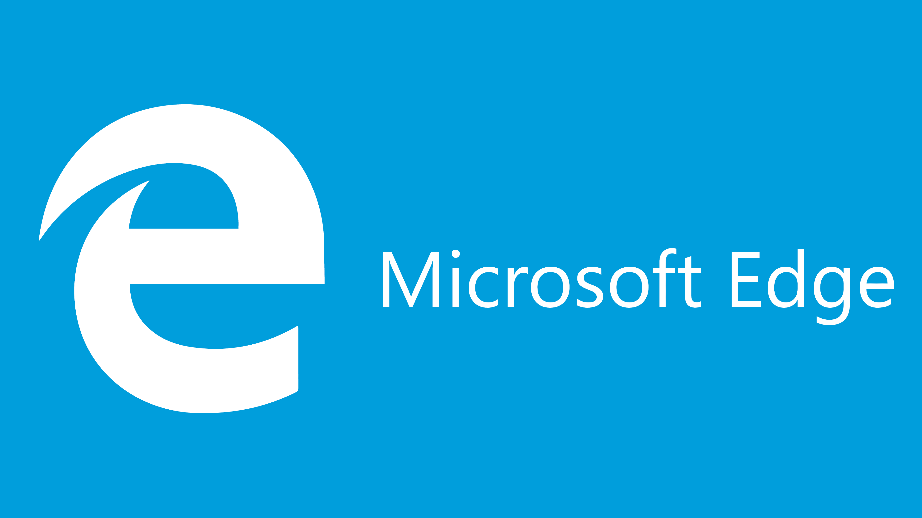
In April 2015, an emblem resembling the Internet Explorer icon was introduced. It contained a stylized blue “e” without the usual ring (as in IE), making the letter look like a planet. The left half of the “e” was divided into two parts, each with a sharp end.
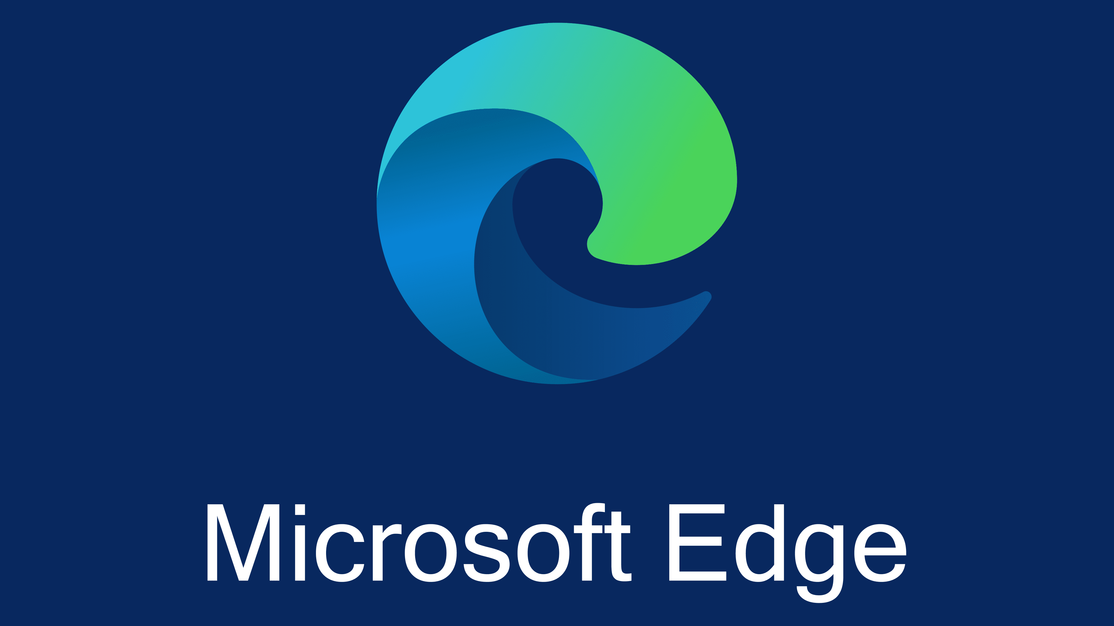
2019 – today
![]()
Microsoft changed the logo of its browser, making the “e” resemble a “c.” The new letter refers to the term “Chromium,” as Edge is now based on Google’s technology. The symbol is shaped like a multi-layered spiral with different-colored segments: dark blue, light blue, and turquoise, with a turquoise-green gradient. The three-dimensional design creates a sense of motion, making the image resemble a wave. The dynamic emblem emphasizes the goal of fast web page loading. The rounded shape reflects the developers’ goal of making the browser simple and accessible.
The icon was officially presented on November 2, 2019. However, users discovered it a bit earlier in a mini-game where they had to solve puzzles to visualize a 3D object at the end. This object turned out to be the Edge logo. It is designed in the same Fluent Design style as all Office application icons.
Font and Colors
The Microsoft Edge emblem features a stylized letter “e” with no additional inscriptions. It is painted in blue with a turquoise-and-green gradient. Blue is a tribute to the heritage of Internet Explorer. It is associated with reliability, professionalism, and tranquility. The additional bright shades give the icon depth and a three-dimensional appearance.