Hartzler Familiy Dairy is a family-owned dairy business in Wooster, Ohio. Founded in 1996 by Harold and Patricia Hartzler, the business offers a wide range of dairy products in the state, including cheeses, ice cream, and eggnog. The quality product is very popular in the region, and the half-gallon glass bottles with delicious, long-lasting milk are famous beyond. Over the past two years, the brand has paid special attention to its own identity, gradually making changes to its visualization changing the look and style of packaging with the professional help of the C&C design studio from Cleveland, OH.
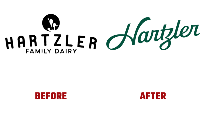
The update has become a tribute to the times and a direct necessity. The old logo was made in a different setting, having handicraft work for all its charm. The new variant is presented in a beautiful design. The brand’s commitment to family values, a tribute to the obligatory courtesy and respect typical of the Midwest, was reflected in a handwritten font.
The very execution of a verbal text gravitates towards the rules of high calligraphy, which was previously taught to all children, which was considered a reflection of a high level of culture and education. However, there are accent points in writing that attract the eye of even an inexperienced viewer. First of all, the originality of the brand visualization is ensured by fonts, of which several are used here. These are Tofino Pro from Lost Type, Sharp Grotesk from Sharp Type, Barlow from Google Fonts, and Tussilago from Typodermic. The high professionalism of the designers ensured their organic interweaving both on the website and on the packaging. Everything was bold and fun. To fully reflect the spirit and specifics of the brand, space was also left for several screen fonts.
Particular attention was paid to the packaging container, a new bottle that looked like a custom-made product. Its shape and execution were chosen in the lettering style for a harmonious application of the corner logo. All free vertical space was beautifully and aesthetically used for icons. As a result, retro bottles take on a new and very modern look. At the same time, the decision to keep glass containers is the right one not only from the point of view of the properties of this material but also aesthetically correct, since only glass provides high-quality color rendering of natural shades poured into their products. As a result, such containers themselves provide the formation of a rich and natural color palette system, forming a great design.


