Mind: Brand overview
Founded in 1946 by a coalition of leading psychiatrists and mental health advocates, Mind, originally known as the National Association for Mental Health (NAMH), had the noble goal of improving mental health services, changing perceptions, and providing community support. In the 1950s, NAMH began managing a range of mental health service providers, such as hospitals, residential homes, and specialized workshops.
In the 1970s, the organization shifted priorities and began to advocate for changes in mental health policy and legislative frameworks, strongly advocating for the rights of people with mental disorders. Recognizing the need for a broader identity, NAMH rebranded as Mind in 1983, embodying a holistic approach that resonated with those directly affected by mental health issues and the general public.
In the years that followed, Mind expanded its reach and influence. It was not just about providing services; the organization actively advocated for mental health transformation. Its work ranged from challenging public prejudice and promoting mental health in professional settings to supporting early intervention and community-centered care.
In the modern world, Mind is a leading mental health charity in England and Wales. Its multi-faceted work includes service delivery, research, active campaigning, and strong advocacy on mental health issues. Mind’s distinctive green logo, now a recognized symbol, reflects its unwavering commitment for over seven decades to uplifting and supporting people facing mental health challenges.
Meaning and History
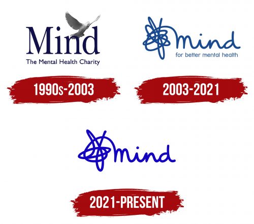
1990s – 2003
2003 – 2021
2021 – today
A British charity focused on mental health has chosen a unique logo that initially might seem unusual. However, upon understanding the organization’s mission, the emblem perfectly aligns with supporting mental well-being. The design element on the left represents a tangled entity gradually organizing into a coherent structure, symbolizing the journey from confusion to clarity in mental health.
This transformation is creatively depicted through chaotic lines that eventually form the word “mind.” This word is designed in a font that mimics handwriting and is colored in a deep cobalt hue. The text is lowercase, casual, and connected, emphasizing human and personal aspects of mental health.
The logo effectively communicates the charity’s focus on mental health by illustrating the process of untangling complex thoughts and emotions to reach a state of understanding and peace. The use of a handwritten style font and the transformation from chaos to clarity in the design underscores the personal growth and healing the organization aims to support. Through this visually engaging and meaningful logo, the charity conveys its commitment to helping individuals navigate their mental health journeys, making a powerful statement about its vital work.


