DesignStudio took an active part in the development of the new logo and changes.
Mind is a charity in England and Wales that helps residents address mental health issues. Mind provides special consultations, therapeutic talks, and assistance in crises, for example, regarding difficulties in finding a job or finding housing. There are 160 stores in England and Wales where you can buy branded products and support the organization.
The pandemic that began in 2020 hit the mental health of a large part of the population hard. The problems have become more acute, and it is necessary to look for new ways to solve them. Mind decided to update its style, give it a fighting spirit, and add personality.
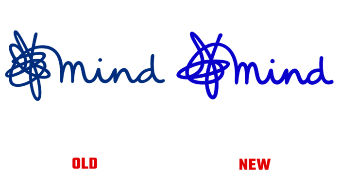
The previous logo looked good, so DesignStudio didn’t change the main concept of the image. The designers have simplified the wavy line that turns into a knot – now, there are fewer strokes. Some changes were made to the inscription of the name. First, DesignStudio has removed the slogan entirely to focus on the word Mind. The space between the letters has become smaller, and the inscription looks more compact. Small changes are needed for usability across different media and platforms. The fewer the details, the easier it is to use the drawing for different purposes.
Additionally, the design studio expanded the brand’s color palette and removed the previous three fonts. Instead, there was one developed in collaboration with the Monotype Mind Meridian. The font is accessible even for visually impaired people.

Before making significant changes, the team talked to staff, volunteers, and people with diverse backgrounds. So the team was able to create a visual identity for a relevant audience. DesignStudio employees presented the organization with a set of author’s drawings on a beautiful background. All images are related to mental health and possible problems, which harmoniously complements the brand and makes it even more recognizable. Illustrations are made with the same font, line weights, and textures.


