The brand’s history with the playful name “Trackinsight” began less than ten years ago when future investment tycoons and financial companies began to appear in Europe. This company is one of those that allow exchanges to grow, analyze the work of commercial funds, are engaged in the selection of various services in finance, and in general, is a major search platform. The brand is engaged in investments and securities, which are important for supporting the region or the country as a whole.
And the country of the foundation of this company in France. It is the birthplace of wine and cheese and a resource base for many financial professionals. This initiative group, located in the French city of Biot, organized the work in 6 countries of 6,000 exchange-traded funds with working systems around the world.
London-based creative agency How & How presented the brand’s new look. They considered it important to convey the idea of a digital world, reading the information in a graphic sense. Investing is always a responsible and long-term business. This lays a certain imprint on the attitude of the actors in the financial process; therefore, it is necessary to emphasize equality, the seriousness of intentions, and, in some way, even disciplinary order.
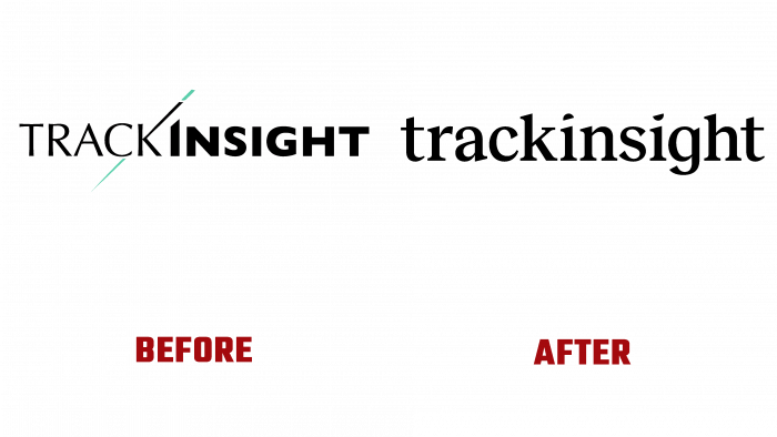
Initially, the logo was a combination of an alphabetic font and a graphic image of a pointer. The letter “k” is pierced with the tip of a stick; the emphasis is on the “i.” Because the pointer seemed to cut off the top of the letter, the first half of the name’s underlined elegance is “track,” a thin and sans-serif font, but with elongated contour points. The very word “insight,” which speaks of the subtle flair of investors and financial analysts of the company, is executed in a different bold font, even and geometric; we can say that it gives the impression of a square shape.
We decided to round off the font, remove the graphic flavor altogether, but focus on small accents – the dots above the letter i. Perhaps to convey the thought of being attentive to the little things, focusing on the details of financial transactions, and close attention to business processes in general. No capital letter. As if this is a continuation of a sentence already said.
There is nothing unusual in the new logo. However, the serif font, black letters, and roundness make it clear that the brand positions itself as a confident leader in the niche and can afford to be intrigued by its appearance. Still, at the same time, it completes projects and can be trusted. This is the very “insight.” By the way, the new Reckless Neue font from Display Type, unlike the previous Optima and Gill Sans, has retained its zest since, in the animation, the logo connects the two parts of the word, and the beveled dot above the “i” is a continuation of the first part of the brand name.
If anything, the new identity describes brand values and possible visual ways of the creative genre.


