


![]() Minnesota Timberwolves Logo PNG
Minnesota Timberwolves Logo PNG
The Minnesota basketball club, founded in 1989, chose a wolf as its mascot. The modern logo of the Minnesota Timberwolves symbolizes aggressiveness, affiliation with the state, the aspiration to be a worthy defender of the region’s sports reputation, a forward-looking approach, and respect for its past.
The Minnesota Timberwolves began in 1987, when the NBA awarded Minnesota a new franchise after nearly 30 years without a team following the Minneapolis Lakers’ move to Los Angeles in 1960. Owners Harvey Ratner and Marv Wolfenson paid $32.5 million for entry. The name Timberwolves was selected over Polars through a statewide vote.
The team debuted in 1989 with losses to the Seattle SuperSonics and the Chicago Bulls, before securing its first win against the Philadelphia 76ers. Early seasons were marked by weak results, with no more than 29 wins per year, though attendance exceeded one million in the first season. In 1990, the club moved to Target Center, and in 1994, Glen Taylor acquired the franchise.
A turning point came in 1995, when Kevin McHale drafted Kevin Garnett directly out of high school. By 1997, the team, alongside Stephon Marbury, reached the playoffs for the first time. After Marbury’s departure, Garnett led Minnesota to seven straight playoff appearances, though all ended in first-round exits.
In 2004, with Sam Cassell and Latrell Sprewell, the team won 58 games, reached the Western Conference Finals, and Garnett earned MVP honors. They lost to the Los Angeles Lakers, led by Kobe Bryant and Shaquille O’Neal.
After 2004, results declined. In 2007, Garnett was traded to the Boston Celtics. The team missed the playoffs until 2018. In 2020, Anthony Edwards was drafted first overall, joining Karl-Anthony Towns.
By 2023–24, Minnesota won 56 games and reached the Western Conference Finals again, led by a defense anchored by Rudy Gobert. In 2024–25, after Towns moved to the New York Knicks, the team repeated this result.
Meaning and History
![]()
The basketball club’s logos are associated with its mascot, Crunch the Wolf. In addition to him, they contain the full name Minnesota Timberwolves, which at different times was written in various fonts. Emblems presented after the 1990s have two forms: round, as a ball, and figurative, with images of trees. Each version is conceptually thoughtful: the designers paid attention to the artistic and the meaningful components.
Throughout the year, designers worked on a new emblem. Eventually, the logo’s creators preferred the option that evolved from previous logos. But at the same time, designers added elements symbolizing Minnesota to the updated emblem.
Specifically, the current Minnesota Timberwolves logo features the North Star, which appears on the state’s flag. The wolf in the new emblem looks into the future. “Of course, the team respects its past, but the new logo symbolizes moving forward and the aspiration to conquer new territory,” writes the official Minnesota website.
Rodney Richardson and RARE Design worked on the new logo. Richardson previously collaborated with the “Charlotte Hornets,” “New Orleans Pelicans,” “Atlanta Hawks,” and “Memphis Grizzlies.”
The discussion of the new team logo sparked a lively reaction among club fans. According to many sports enthusiasts, the new “Minnesota” emblem copied the logo of the National Hockey League (NHL) club “Arizona Coyotes,” which depicts a coyote in a similar form.
What is Minnesota Timberwolves?
The Minnesota Timberwolves are a professional basketball team based in Minneapolis. It is a member of the National Basketball Association and, as of 2021, has not yet won a championship. The team, which debuted in 1989, has played at the Target Center since 1990.
1990 – 1996
![]()
The “New Minneapolis” basketball club appeared relatively recently, in 1989. Residents voted for the name and eventually chose the aggressive “Timberwolves.” Bob Stein, president of the Minnesota Timberwolves, wished for the wolf on the logo to look not sinister but aggressive. Artist Mark Thompson took on the realization of this idea. He depicted the animal’s head against a gray background with blue and green contours. The wolf does not seem dangerous, but its eyes glow pale green, indicating hidden hostility. The club’s name is located under the circle: the first word’s font imitates handwriting, and the second is in a sans-serif font.
1997 – 2008
![]()
After the first Minnesota Timberwolves logo was used for six years, the owners decided to change it. The new logo, introduced in 1996, was designed by Peter Thornburgh. He made the drawing more emotional by depicting a grinning wolf with sharp fangs and using black to create an “emerging from the shadows” effect. To the right and left of the animal’s head are green trees, and at the bottom is the inscription “Minnesota Timberwolves.” The second word looks unusual, thanks to the stylized font with sharp serifs.
2009 – 2017
![]()
The logo changed as the level of graphic design rose. After 11 years, the creators decided to do without significant changes, merely adjusting the details. The 2009 emblem is not much different from the previous one. The artist kept the recognizable drawing but changed the colors. Now, the wolf is gray with a white spot and a black outline, the trees are pale green, and the “Timberwolves” inscription is white with a blue-black stroke.
2017 – today
![]()
April 11, 2017, marked the official release of the new logo. Its development took 12 months as part of a creative collaboration between designer Rodney Richardson from the branding agency RARE Design, NBA executives, and basketball club owners. They combined iconic elements from previous emblems: the ball, the wolf’s head, and the team’s name.
The new Minnesota Timberwolves club logo underwent significant changes, except for some symbols that the designers kept. As in previous years, the blue Wolf is at the very center, depicted against a blue ball and a green star. The wolf is shown in profile, its mouth open. The animal’s snarl symbolizes the courage and energy with which the team moves towards glory. It is worth noting that the green eyes and the star’s color were chosen deliberately. It is both a nod to Minnesota’s green color and to the color of the large buds on the trees that grow abundantly in this state.
Font and Colors
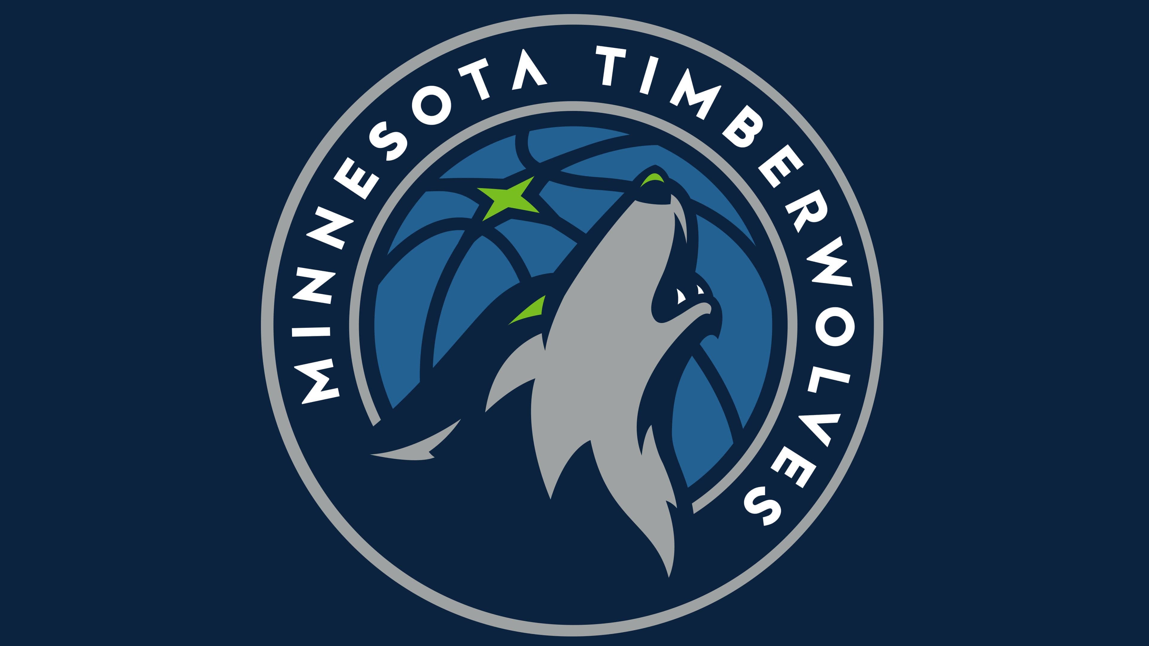
The modern Minnesota Timberwolves logo is a tribute to the club’s historical heritage. For many years in a row, a wolf has been at the center of the composition. But this time, it is not growling but solemnly howling, throwing its head back. There is a special meaning hidden here, as wolves use howling to strengthen connections with the pack, assert their rights over territory, and warn strangers not to approach.
Lines on the basketball cross, forming a green four-pointed star. This is the North Star, which, in turn, is the embodiment of northern Minnesota. Inside the dark blue ring, which serves as a frame, the club’s name is written in white letters.

The inscription “Minnesota Timberwolves” is done in a simple hacker font. Developers paid much more attention to color selection. They tried to maintain the classic green-and-blue combination while changing the usual shades. The palette includes white (#FFFFFF), blue (#005083), gray (#C6CFD4), green (#7AC143), and dark blue (#002B5C).
The inspiration for each color came from the picturesque landscapes of Minnesota. The color palette reflects the depths of lakes, the moonlight, the night forests, the northern lights, and the contrasts of a snowy city.
FAQ
Who created the “Timberwolves” logo?
Rodney Richardson, the founder of Rare Design, developed the 2017 logo. Peter Thornburgh created the 1996 version. Artist Mark Thompson drew the very first version of the emblem.
What color is “Minnesota Timberwolves”?
The team’s colors have picturesque names related to Minnesota’s natural features: Lake Blue (#005083), Moonlight Gray (#C6CFD4), Frost White (#FFFFFF), Aurora Green (#7AC143), Midnight Blue (#002B5C).
What does the “Timberwolves” logo represent?
The 2017 logo features a basketball. It’s associated with the night sky, serving as a backdrop for a howling wolf. Moreover, the intersecting lines on the ball form a four-pointed green star. The wolf’s head merges with the dark ring framing the drawing. At the top of the improvised frame, the club’s name is written. The letters are white, angular, and sans-serif.
Why did the “Minnesota Timberwolves” change its logo?
The Minnesota Timberwolves team changed its logo to keep up with the times. It wanted to add elements to its style associated with Minnesota and the United States. For example, the North Star is depicted on the flag.