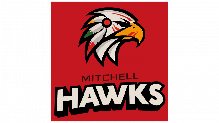
A new hockey season is approaching, for the onset of which teams of professionals and juniors, fans, and fans are preparing. Everyone strives to enter it fully prepared, not only physically. So on July 21, 2021, the Mitchell Hawks junior hockey club announced the creation of a new team emblem, with which it will compete in the PJHL championship of the upcoming season.
The team informed their fans and fans about their changes back on July 20, making a couple of tweets on their page. The familiar image of an Indian warrior resembling the emblem of the Chicago Blackhawks was replaced by the image of a bird – a hawk, corresponding to the team’s name. This decision was taken under pressure from the indigenous peoples of America, violently protesting against the use of their historical and spiritual heritage, images of faces, and national clothes for advertising purposes, especially on the logos of sports teams. Today, the rejection of offensive elements to the indigenous representatives in the symbolism is everywhere observed in all directions – business, sports, advertising in America and Canada. In Ontario, the process accelerated significantly following the consideration of the Commission on Human Rights issue. She discovered real violations and sent appropriate decisions to amend their emblems to several sports teams and associations. Among them are Washington NFL, Edmonton CFL, Cleveland of Major League Baseball.
The design of the new logo was entrusted to Tom Fanson, a leading branding designer. In agreement with team members, staff, fans, and fans, it was decided to keep the logo’s traditional color scheme, which used red, white, green, and shades of yellow. The image of the hawk very closely repeated the head of the Indian, right down to the elements of war paint, which were made in the form of red strokes on the beak, under the eyes, and above the eyebrows of the bird. At the same time, the arrangement of feathers on the head and even a stylized hair clip duplicate the combat headgear from the image on the old emblem. The team name is written below the image, in which the smaller font of the first word is in black and the second is in bold, slightly curved type in white, with each letter outlined in contrasting black, which makes the font especially noticeable against the red background of the logo.


