In the era of oversaturation of the information products market, one of the important tendencies in a business organization is the assertion of one’s identity and the search for one’s unique style.
The Mitigram brand, which deals with global trade finance as a major digital platform, has excelled in this. Scandinavian fintech claims its web service provides a whopping $ 70 billion in trade flows and facilitates trading in more than 100 markets. You can also boast that there are already more than 100 financial institutions around the world, without looking at their risks and losses, because this platform has covered them.
The brand has existed since 2016, and during this time, it has notably changed, grown, strengthened. He has his charisma, which the employees of the company always try to embody.
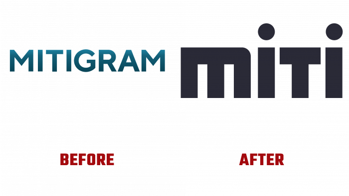
Mitigram’s new identity embodies a bold desire to remove various risk factors from the path to effective trade management for large, reputable corporations and financial institutions, thus facilitating profit and easy trading.
Milena Torciano, CEO of the company, states that Mitigram was created to turn a closed market into an open one. The important idea was to create conditions for optimizing and expanding trade, building the correct market strategy, smooth transition of operations from the plane of digital operations to something more. They were, namely, overcoming communication barriers and the emergence of a basis for cooperation.
The company is introducing a new product – an end-to-end transaction ledger called MitiManager. In essence, it is a bundle product that brings together the other two – MitiSquare and MitiGateway (trade finance asset market and mono-bank solution).
Looking at the new visual design, the first thing that catches your eye is the similarity of the letter M with the same letter of the Xiaomi brand. The only difference is that there is no separating stick in the middle of the letter, which seems to be torn off from the main construct of the letter. Next, we see that the logo is designed in white or charcoal gray, depending on which part of the brand is under consideration. The MitiManager service has a dividing point between the parts of the word, even though the main part – Miti – is framed in large bold, geometrized, and the second – Manager – is spelled out in a regular serif font.
In general, rebranding has a good prerequisite to becoming a starting point on the path to greater success and authority in the global market.


