Major League Soccer (MLS) is a prominent representative of professional soccer in the United States and Canada that has accumulated a large number of loyal fans over the years. In addition to a common crest symbolizing the league, each participating team has an individual logo. These logos serve more than just an identifying function.
Like corporate and non-profit organizations, each soccer team’s emblem is a visual narrative that reflects its history, mission, and core values. Emblems are not simply aesthetic symbols; they are designed to reflect the ethos and essence of the soccer club, often incorporating cultural or historical elements specific to the city or region they represent.
Many emblems pay homage to local history, creating a sense of connection and continuity. Some teams opt for a more modern approach, using vivid imagery and bright color schemes designed to evoke an emotional response from the audience.
The purpose of this paper is to examine existing MLS team logos, dissecting their elements to find the stories they tell and the values they represent.
The features of soccer team logos
In the world of sports, team logos carry considerable weight. More than just aesthetic symbols, they are emblems imbued with the history, tradition, and spirit of the team they represent. The artistic and design elements incorporated into these logos aim to resonate deeply with fans and followers by visually representing the team’s ethics and heritage.
In Major League Soccer (MLS), each team’s logo is carefully crafted to embody its unique personality. While some elements may be repeated, such as the inclusion of a team name or a penchant for emblems, the overall meaning and impression of the emblem are different for every team. This complex process involves branding experts and designers working together to ensure that every aspect of the logo – color, shape, emblem icons – is relevant and evokes emotion.
The driving force behind these logos is to establish a deep connection with fans. They are meant to epitomize the spirit of the team, evoke enthusiasm and devotion from fans, and attract views from all corners of the globe. Every detail is important, whether it is a shade symbolizing the culture of a region or a mascot reminding of local folklore.
Major League Soccer logos: All MLS logos in 2023
The Major League Soccer Association, commonly referred to as MLS, is a prominent professional soccer league operating under the auspices of the United States Soccer Federation. By 2023, this thriving league will have 29 teams, with 26 of them scattered across the United States and the remaining three based in Canada.
Originating in 1993, MLS is the latest in a string of elite soccer clubs, drawing inspiration from its predecessor, the North American Soccer League (NASL). The creation of MLS signified not only the continuation of the NASL legacy but also the beginning of a new era designed to captivate viewers and further cement the importance of soccer in the North American sports space.
If you pay attention to one aspect of MLS, an intriguing narrative unfolds around the emblems representing each team. These distinctive logos are not mere graphics but embody the essence, values, and aspirations of each team.
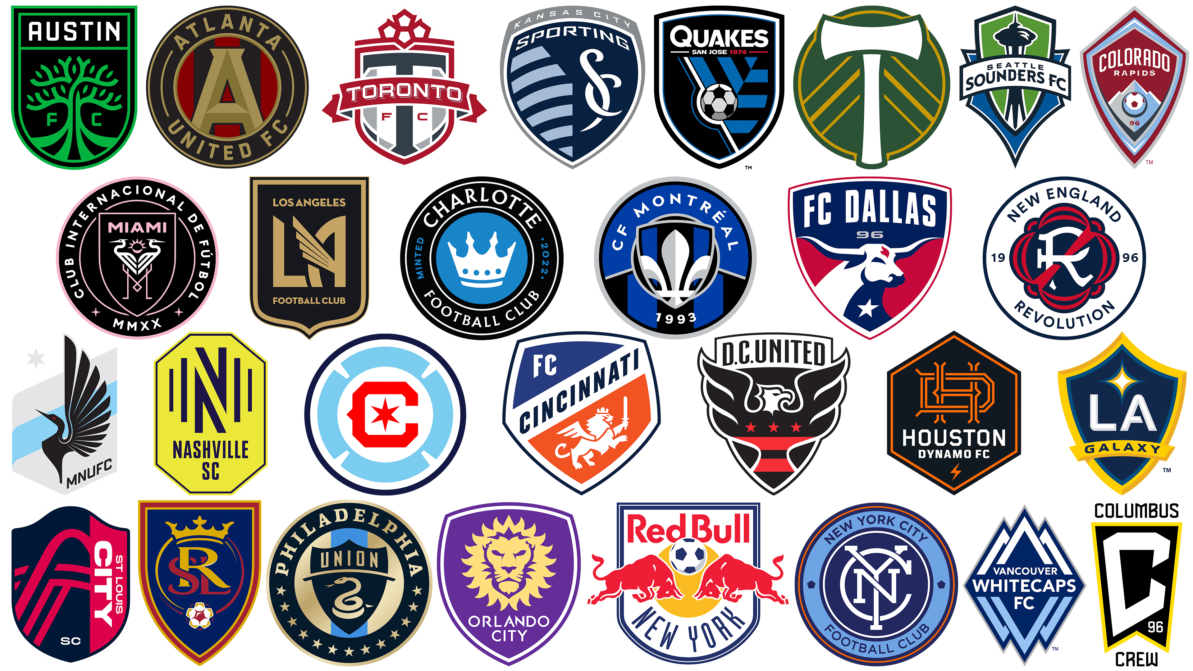
LA Galaxy
![]()
Founded in 1996 as one of the club’s first ten members, the LA Galaxy has earned a reputation as one of the most successful teams in the Football League. The team has won five MLS Cups, setting the benchmark for success in the league.
The club’s emblem features a minimalistic yet meaningful design. The shield-shaped emblem features dark blue tones and a four-pointed star at its center. The dark blue hue carries weight and significance, symbolizing the team’s deep legacy in league history.
The central four-pointed star is not just a decorative element but can be seen as a symbol of excellence, reflecting the team’s numerous championship titles and consistent results over the years. The combination of these elements in the club’s emblem reflects the essence of the Los Angeles Galaxy: a team with a rich past, a solid present, and a future that promises further achievements in Major League Soccer.
Seattle Sounders FC
![]()
Founded in 2007, the Seattle Sounders made their Major League Soccer debut in 2009, expanding the scope of MLS teams. The modern incarnation of the team grew out of the legacy of the former club that played in the American Professional Soccer League (APSL). Their journey in the league has been nothing short of spectacular. Not only did they excel on the field, but they also established unprecedented fan attendance at matches.
The emblem worn by the Seattle Sounders team is imbued with symbolism. It is a heraldic shield, a classic emblematic form that carries echoes of tradition and strength. Its two-layered structure is a deliberate choice by the designer, emphasizing the unity and camaraderie inherent in social bonds. Incorporating the iconic Seattle Space Needle into the emblem allows the team to recall its geographic roots, the city’s pioneering spirit, and high aspirations. This intricate detailing makes the badge more than just a logo but a reflection of the team’s ethos and deep connection to its hometown.
Inter Miami CF
![]()
Based in Fort Lauderdale, Florida, Inter Miami CF became a new member of the league in 2018 and made its debut on the pitch in 2020. The club’s prominence increased in 2023 when renowned soccer player Lionel Messi expressed interest in joining the team.
The emblem of Inter Miami depicts two birds arranged back to back. At first glance, they look like flamingos, but in fact, they are white herons. The combination of black, white, and pink colors gives the badge a distinctive and memorable look. This combination reflects the vibrant essence of Miami and allows the club to stand out with its players and visual identity. The pink hue, in particular, evokes the vibrant and energetic spirit of the city, further strengthening the connection between the club and its homeland.
Atlanta United FC
![]()
Atlanta United FC, established in 2014, became the 22nd member of the respective league by 2017. The emblem and shades representing the team were unveiled in 2015. The intricate design of the emblem is inspired by the city of Atlanta’s emblem, which features a large letter “A” in the center.
The round emblem is accompanied by alternating stripes of red and black. These are not just decorative elements; each stripe symbolizes the team’s core values.
The color palette chosen for Atlanta United FC has deep significance. Black represents the team’s unwavering strength, red represents the zeal and drive to win, and gold represents aspiration, symbolizing the relentless pursuit of lofty goals and ambitions. Each shade, chosen deliberately, represents the team’s individuality and its ambition to make a name for itself in professional soccer.
Portland Timbers
![]()
Among the emblems of the soccer league, the emblem of the Portland Timbers team stands out for its simplicity and, at the same time, deep symbolism. The team was founded in 2009 and on the soccer field appeared in 2011. The emblem is predominantly green, complemented by golden stripes, with a distinct white axe positioned in the center.
Inspired by an earlier design associated with the United Soccer League, the emblem embodies notions of completeness and unity. The white axe at the center of the emblem is not just a design element; it has a deeper meaning. It references the rich history of the logging industry, an iconic industry in the Pacific Northwest. The team effectively wove historical relevance into the emblem while maintaining a modern look, blending tradition with contemporary aspirations.
New York City FC
![]()
New York City FC (abbreviated NYCFC) debuted in the league in 2015, becoming the league’s twentieth member. With its inception, New York City gained a second major soccer team in addition to the existing New York Red Bulls.
Since its inception, NYCFC has maintained a consistent color palette, showcasing a visual identity deeply rooted in the essence of New York City. The current emblem is a modern incarnation of the city’s initials, elegantly intertwined with each other in the form of a monogram. This intricate pattern is set within a circular blue frame, visually linking the city’s rich heritage and vibrant present. The design elements blend seamlessly together to present a timeless logo that reflects NYCFC’s commitment to excellence in sport.
Toronto FC
![]()
Toronto FC, from the vibrant Canadian city of Toronto, presents a unique structure within Major League Soccer (MLS). As one of a select number of Canadian teams competing in MLS, it holds a prominent position in the Eastern Conference. This distinction is further enhanced by the fact that when the club joined MLS in 2007, it became an expansion team and the first Canadian franchise in the league.
The club’s distinctiveness is also evident in its color palette. The rich red color, complemented by shades of gray and pure white, symbolizes the vigor and purity of the team’s goals on the soccer field. These colors resonate with fans and symbolize the club’s commitment to excellence.
The emblem of Toronto FC is a complex combination of tradition and identity. The main element of the emblem is a striped shield, reminiscent of the classic emblems of the past. At the top of the shield is a decorative motif, giving the design sophistication. In the center of the shield is a banner with the proud name “Toronto,” making the name of the city an important part of the club’s visual representation. This combination of elements emphasizes the team’s deep connection to its hometown and its legacy in MLS.
LAFC
![]()
Los Angeles FC, founded in 2014, has quickly made its mark in American soccer. As the younger sibling of the Los Angeles soccer team, its fierce rivalry with the LA Galaxy club has garnered much attention, spawning one of the most talked about rivalries in the league.
LAFC’s visual style is noticeably different from other Major League Soccer clubs. The team’s Art Deco emblem combines a modern aesthetic with historical motifs. The shield design, reminiscent of the city’s official seal, captures the essence of Los Angeles and its rich cultural tapestry. In addition, the bold “LA” monogram in the center of the emblem symbolizes the team name and indicates the city’s iconic status.
Emblem designer Matthew Wolf combined modern flair with traditional elements to create a badge that will resonate with both new fans and those familiar with the city’s historical motifs.
New England Revolution
![]()
Located in the sprawling Greater Boston area, the New England Revolution is a team proud of its origins, being one of ten pioneers to join MLS. Since its inception, the team has been a constant fixture in the league since its inaugural season. In 1995, its foundation stone was laid, and in 2007 came a landmark moment in the club’s history when it won its first major trophy.
In 2021, the club presented the world with an updated emblem. The emblem is a stylized letter “R” enclosed in a floral silhouette. The font of the emblem is reminiscent of the lettering associated with the historic Boston Tea Party, subtly intertwining the club’s modern identity with significant events from Boston’s storied past.
The updated New England Revolution logo is more than just visual appeal. It combines historical facts and modern design to reflect the club’s journey through time. This emblem is a testament to the club’s enduring legacy and its close ties to Boston’s rich history.
New York Red Bulls
![]()
Founded in 1994, the team, now known as the New York Red Bulls, made its MLS debut in the league’s inaugural season in 1996. The team was originally called the New York MetroStars but underwent significant changes following its acquisition by the Red Bulls, resulting in a rebranding and a new name to reflect the identity of the new owners.
The team’s current logo embodies the iconic visual imagery synonymous with the Red Bull brand. Two strong bulls clutching in confrontation frame the central soccer ball, symbolizing the competitive nature of the sport. The fusion of powerful imagery and athletic essence makes the logo memorable and reflects the team’s energy and passion.
Sporting Kansas City
![]()
Sporting Kansas City, established in 1996 as one of Major League Soccer’s original charter teams, was originally known as the Kansas City Chiefs. In 1996, Sporting Kansas City was established as the original charter club of Major League Soccer.
The Sporting Kansas City emblem contains significant elements reminiscent of its roots. The emblem features a unique drop-shaped shield that differs from the traditional rectangular or round shields often found in sports branding. Within this distinctive frame is a stylized depiction of the border between the states of Kansas and Missouri. This design choice is indicative of the team’s geographic location and serves as a nod to the team’s history, subtly referencing the original emblem when the team was known as the Wizards.
Philadelphia Union
![]()
Founded in 2008, Philadelphia Union debuted in Major League Soccer during the 2010 season as an expansion club. Over the years, the team has demonstrated resilience and competitive spirit, most notably finishing runner-up in the US Open Cup tournaments in 2014, 2015, and 2018. The club’s landmark achievement in 2020, when it won the Supporter’s Shield, was a testament to its strong performance throughout the regular season.
In terms of visual identity, the Philadelphia Union emblem has a deep historical context. The emblem pays homage to the American Revolutionary War by depicting 13 stars, each symbolizing one of the 13 American colonies. This design choice reflects the team’s geographic roots and embodies a sense of unity and historical awareness.
Orlando City SC
![]()
In 2015, Orlando City became the 21st member of MLS and immediately attracted attention with its distinctive logo. The emergence of this franchise revitalized professional soccer in Florida, filling the void left by the departure of the Miami Fusion and Tampa Bay Mutiny teams in 2001.
Embodying an emblematic shield design like many other MLS franchises, the Orlando City symbol is highlighted by a majestic golden lion. This lion serves as a focal point and ties into the history of soccer in the region, pointing to the Orlando Lions, the first professional soccer endeavor in the city. Surrounding the regal lion are 21 shining flashes, a detail that symbolizes the team’s establishment as the 21st franchise in the league. The chosen color palette and design elements reflect the heritage, pride, and passion that drives the Orlando City, SC team on and off the field, uniting fans old and new in a shared enthusiasm for the sport.
D.C United
![]()
The soccer club was founded in 1994. D.C. United is the only soccer club from the United States to have won the Copa Interamericana title, confirming its significant presence in soccer. With a unique and rich history based in Washington, D.C., the club’s reputation transcends geographical boundaries.
D.C. United’s emblem reflects a combination of historical elements and modern aesthetics, perfectly reflecting the spirit of the club and the city it represents. The crest is in the form of a shield with an eagle superimposed on it. This choice of design elements not only echoes the national symbol of the United States but also embodies the high ambition and freedom the club stands for.
The emblem is complemented by an eagle motif consisting of a star trio and red and white stripes. The combination of traditional symbols and modern design makes the Washington United emblem one of the most distinctive and modern emblems in the soccer league.
Columbus Crew
![]()
Founded in 1996, Columbus Crew is one of the ten founding clubs of Major League Soccer. The team has won six outstanding trophies throughout its history, which emphasizes its skill and dedication on the field. Synonymous with the Columbus Crew are the black and gold colors, which have persisted despite shifts and changes.
The team’s emblem has undergone many changes, each telling a different story about a different stage of the team’s journey. The latest version is a sleek and modern design. The central place in the emblem is occupied by a bold stylized letter “C,” made in black and outlined with a shiny gold border. It is superimposed on the black banner, giving it depth and contrast. The letter “96” commemorates the club’s first year in the league, paying homage to its roots and the legacy it continues to build on.
FC Dallas
![]()
FC Dallas, established in 1996 as one of the founding members of the league, began its journey under the name “Dallas Bern.” That name lasted until 2004, when a rebranding resulted in the adoption of the current form. The transition was not only nominal but also significantly changed the club’s play on the field. In 2016, FC Dallas celebrated a landmark moment by winning the Supporters’ Shield. The team also celebrated by reaching the final and second place in the MLS Cup in 2010.
FC Dallas’ bull emblem pays homage to Texas’ iconic mascot, a symbol deeply rooted in the state’s culture and history. The vibrant red, white, and blue triad in the team’s color palette echoes the American spirit and embodies the club’s vibrant and patriotic nature, further enriching its visual identity.
Minnesota United FC
![]()
Minnesota United FC, which entered the Major League Soccer in 2017, calls the city of St. Paul, Minnesota home. Becoming the 22nd team to enter the league, the club has achieved notable success in American soccer. A distinctive feature of this club is its emblem, which differs from the traditional motifs found in the symbols of many other American soccer teams.
The centerpiece of the emblem is an artistic depiction of the loon, which has the status of the state bird of Minnesota. The design is complemented by eleven feathers, each symbolizing a player on the soccer field. Attention to detail is evident in each feather, which is meant to represent the unity and interaction of the entire team during a match.
The Minnesota United soccer club emblem combines modern design elements with significant local and team symbolism. The club’s choice to use the loon in such a prominent way shows a dedication to their home state and, at the same time, a desire to stand out in American soccer.
Houston Dynamo
![]()
Joining the ranks of Major League Soccer’s Western Conference in 2005, the Houston Dynamo quickly established themselves as a formidable contender, winning the MLS Cup in 2006 and 2007. The team’s rapid ascent to championship status left an indelible mark on the league’s competitive history.
The team has chosen an emblem that shows the influence of the Art Deco style. In the center of the hexagonal badge is a distinctive monogram, signifying Houston’s significant role in the energy sector. This design reflects the industrial character of the city and gives it a unique aesthetic appeal, setting it apart from other clubs. The hexagonal shape and monogram symbolize the fusion of tradition and modernity, subtly emphasizing Houston’s importance as an energy hub. More than just a visual identifier, the Houston Dynamo FC emblem is a subtle reflection of the team’s geographic roots and its desire to be a dynamic force both on and off the field.
Chicago Fire FC
![]()
Chicago Fire FC, founded in 1997 as a tribute to the great Chicago Fire of 1871, made an immediate name for itself when it debuted in Major League Soccer in 1998. Showing outstanding ability, the team won the MLS Cup in its first season, which caused great resonance in the soccer community. This triumph immediately cemented the team’s status as a formidable force in the league, setting high hopes for the following seasons.
In 2019, the club underwent a comprehensive rebranding exercise that resulted in a new visual identity embodied in a revamped emblem. At the center of the round-shaped emblem is the letter “C,” a reminder of the name of the club and the city it represents. This central element is surrounded by a blue ring decorated with a pattern of triangles. These triangular shapes, known as the “crown of fire,” serve a dual function: they are an aesthetic touch and have symbolic significance. They echo the story of Chicago’s rebirth and recovery from a devastating fire, representing a metropolis rising from the ashes and reaching new heights.
Real Salt Lake
![]()
In the soccer league, Real Salt Lake abbreviated as RSL, debuted in 2005 as a new entrant. Shortly after its inception, the club achieved notable success, winning the MLS Cup in 2009. In 2010. “Real Salt Lake” came close to the top honors, finishing second in the Supporters’ Shield competition, and in 2013, nearly repeated the success of 2009, reaching the MLS Cup final.
Reminiscent of national emblems, Real Salt Lake’s emblem exudes a sense of tradition and pride. A blue shield dominates, with an exquisite monogram embedded in it, giving it a sophisticated feel. This design not only represents the club’s rich soccer culture but also symbolizes its desire to constantly raise its status in the world of soccer competition.
Colorado Rapids
![]()
Located in the heart of the Denver metropolitan area, the Colorado Rapids are among the first members of Major League Soccer. This outstanding club was founded in 1995 and made its MLS debut the very next year. A path in the league marked by perseverance and ambition led to winning the coveted MLS Cup in 2010. – It was only his second appearance in the finals.
The Colorado Rapids emblem has undergone several changes to reflect the evolution of the team and the dynamic spirit of the sport. The emblem is a bright maroon shield, the distinctive feature of which is a pointed top. It is centered on the image of a majestic mountain range, symbolizing the rugged terrain of Colorado and perhaps metaphorically reflecting the ups and downs of the club’s journey. The soccer ball soars over this ridge, indicating the global appeal of the sport and the central focus of the team.
San Jose Earthquakes
![]()
Founded in 1994, the San Jose Earthquakes, popularly known as the Quakes, took to the soccer field in 1996 as one of the first Major League Soccer teams. The team has won two MLS Cup titles, signaling its presence as a force to be reckoned with. Another intriguing aspect of the club’s identity is its intense rivalry with the Los Angeles Galaxy, which adds intrigue to the history of both clubs.
The emblem currently worn by the Quakes is a tribute to their heritage. It incorporates elements of the crest that was used when the team played in the North American Soccer League (NASL). Notably, the emblem includes the year “1974”, which is a reference to the earlier period of the club’s existence. This date has symbolic significance, providing a direct link to the past while emphasizing the continuity and rich heritage of the club.
Nashville SC
![]()
Founded in 2020, Nashville, SC, came into the soccer world, drawing inspiration from the heritage of the USL club with an identical name. The choice of gold and blue as the dominant colors is not just a design preference; it was deeply influenced by the colors of the Nashville flag, showcasing the essence of the city through visual representation.
The club’s emblem is notable, encased in an octagonal shape painted a brilliant gold color and bordered by a thin outline. The centerpiece of the emblem is a clear monogram – the letter “N.” It is not just a letter. It is decorated with many vertical stripes of different lengths. These are not just decorative elements; they serve a specific purpose, symbolizing the wave-like pattern of sound waves. It’s a fitting tribute to Nashville’s rich musical heritage, often referred to as the epicenter of musical innovation.
FC Cincinnati
![]()
FC Cincinnati has brought some bright colors to the league after joining the Major League Soccer family in 2015. Their palette is dominated by a vibrant mix of orange and blue, giving the club a more vibrant aura compared to some of its rivals.
FC Cincinnati’s emblem is distinctive in that it features a winged lion, traditionally associated with St. Mark the Evangelist. While this symbolic figure has been retained, it has undergone subtle refinements, resulting in a more streamlined design in modern versions of the emblem.
CF Montreal
![]()
Based in Montreal, Club Montreal is a beacon of Canadian soccer excellence among the constellation of teams competing in the MLS league. The club traces its history back to 1992. However, it wasn’t until two decades later, in 2012, that they made their presence known in MLS as a notable expansion team, marking a new chapter in their storied legacy.
The year 2022 marked a major milestone for the club. There was a change not only in the name but also in the visuals. The club’s name was changed to a more concise name, complete with an updated badge. Central to the updated style is the elegantly designed Fleur de Lys, a motif with deep cultural resonance in Quebec. This iconic symbol is framed by blue and black stripes that enhance the visual appeal of the design and anchor the club’s colors.
Through this thoughtful design, the club aims to combine its illustrious past with an ambitious future as it continues to gain momentum in world soccer.
Vancouver Whitecaps
![]()
The Vancouver Whitecaps team is a testament to the development of soccer culture in the coastal British Columbia city. Despite being the last Canadian club to join MLS, the Vancouver Whitecaps have quickly made their presence known, starting their journey in 2011. In a short period of time, they demonstrated their worth by becoming the first Canadian team to secure a playoff spot in the MLS Club Championship by 2012. The Canadian champions’ three titles further validated their prowess on the field.
The Vancouver Whitecaps emblem echoes the natural beauty of the city and the spirit of the team. At first glance, the emblem resembles a mountain range, echoing the majestic peaks surrounding Vancouver. At the same time, the design can be perceived as a cascade of diamonds, each unique yet forming a cohesive whole. The intricacy of these intersecting geometric shapes is a visual delight and carries deep meaning.
Austin FC
![]()
FC Austin, located in the heart of Austin, Texas, is a relatively young club founded in 2018. However, it did not make its league debut until the 2021 season. It is the first Major League Soccer team to represent the capital city of Texas. Until the creation of the team, Austin held the unexpected title of the most populous American city not represented in a major sports league.
The emblem of the Austin soccer club takes the form of a shield characterized by a unique curved base. The inside of the shield is occupied by an elegantly designed green tree. On either side of it are the letters “F” and “C,” symbolizing the soccer club. Above the tree is a banner that proudly displays the name of the city, showing that the team represents and serves the community.
Charlotte FC
![]()
Charlotte FC came onto the soccer scene in 2019, and by 2022, they officially joined MLS. From the start, they demonstrated their potential and appeal by drawing a record crowd for their first match. This initial success highlighted their presence and showed that the city is committed to soccer. In local circles and amongst fans, the team has been affectionately nicknamed ‘The Crown’, reflecting the regal nature of the city.
The visual identity of Charlotte FC is reflected in the round emblem, like many Major League Soccer clubs. The emblem proudly displays the club’s name, bordered by a black border. The centerpiece of the emblem is a white crown on a background of rich blue. This image reflects the heritage and rich history of the region and emphasizes the club’s unwavering commitment to excellence in soccer.
Saint Louis City SC
![]()
Located in vibrant downtown St. Louis, Missouri, St. Louis City FC, which debuted in 2023, is one of the newest members of Major League Soccer (MLS). The team’s expansion brings with it the promise of exciting soccer matches and rich symbolism.
The centerpiece of Saint Louis City SC’s style is its emblem. It is not just a design; it is a fusion of history and modern aesthetics. Dominating the emblem is the pride of St. Louis City, SC – the Gateway Arch. This iconic structure is not only a reminder of the city’s past but also serves as a bridge to its future. Carefully nestled in a protective shield, the arch exudes a sense of pride and resilience.
But there is more to the emblem than meets the eye. The graceful arc-shaped lines woven into the design pay tribute to the geographical wonder of the confluence of the country’s two great rivers. This feature gives the emblem depth, connecting it to the natural beauty of the region. The chosen color palette holds many mysteries. The rich red color, which was meant to be simple, playfully dances between shades. Depending on the lighting, what appears red at first glance may appear pinkish at second glance, making it an object of admiration for many.
Subtleties of MLS Team Logo Design
Major League Soccer (MLS) has a rich tapestry of logos that ranks among the most iconic sports emblems around the world. The design intricacies of these emblems, representing teams from the United States and Canada, aim to accomplish one goal: to attract and win favor with a diverse and expansive ranks of fans.
A closer look at MLS logos reveals an interesting pattern. While many of them share similarities in design, each one carries a unique story. These stories delve into the history, culture, and background of the respective teams.
Using an eclectic palette of colors, different fonts, and design forms, the creatives behind MLS branding emphasize different aspects. Whether it’s the city’s famous architectural wonders or significant moments that have defined history, the logos serve as silent storytellers of these stories.