The opinion that historically formed fame does not require changes is fundamentally wrong. An example is the history of the formation of the visual identity of the “delicious” brand M&M’s, which is known and loved today by children and adults worldwide. However, this is not enough for the brand to successfully grow and develop further beyond the achieved boundaries of the current success. Having started its ascent to the Olympus of success in 1941, these sweets have become the most famous and affordable worldwide. Created as an army soldier’s ration, M&M’s were a revolutionary solution to the problem of chocolate melting in a soldier’s diet. The protective, attractive and tasty shell effectively solved the problem and made the dragee even more popular.
In the future, this decision was instrumental in expanding the candy’s popularity far beyond its defense value. Produced by Mars, Incorporated sweets got their name from the names of the founders of the brand and Forrest E. Mars Sr., and Bruce Murrie. The jelly beans themselves had the letter M printed on them so that you could distinguish the original. The success was absolute. But over time, the development process stopped at a certain point. To change this, a new brand visualization was developed, based on the company’s updated global strategy, which acquired a completely different visual language from Jones Knowles Ritchie.
The complexity of the solution of the task was in the world fame of the product its rich history. Ritchie made the only right decision in such a situation – creating a global new world in which everyone can feel their belonging to it, and the community created will be inclusive. Everything was built on a huge eighty years of experience in bringing people together with the help of a unique and healthy sweetness, its colorfulness, unsurpassed taste, and “edible” size. It is to achieve the goal in which the power of fun, accessible to all, will help to increase the feeling of common ownership in the improvement of the brand; the whole company is directed to further its development.
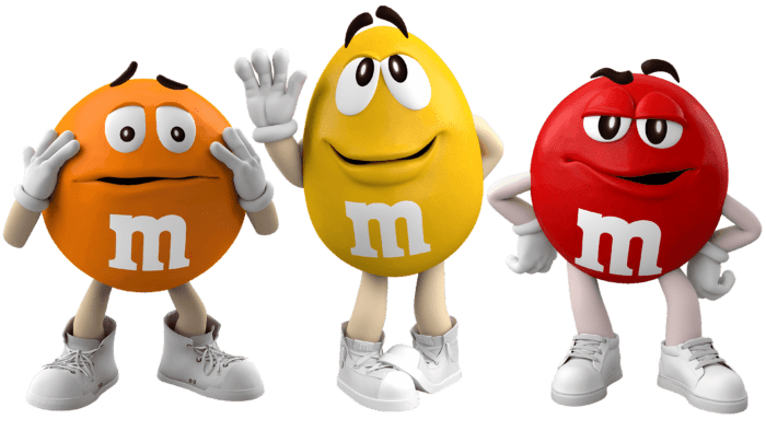
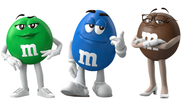
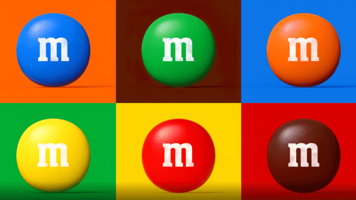
Appearance has evolved in all directions. It became fresh and modern, reflected in the formation of favorite characters. Increased attention has been paid to saturation reflection and color reproduction of the iconic palette and dragee shape definition, as well as demographics, junctions, lines, and knots, providing the necessary insight into the essence of fun along with M&M’s. The ampersand plays a special role in the logo, which was also not ignored. Its high-quality highlighting enhanced the effect of the combination of the letters M, which is a symbol of the unification of people that the company strives to achieve, reflecting this in its characteristic corporate jester style, humor, and wit.


