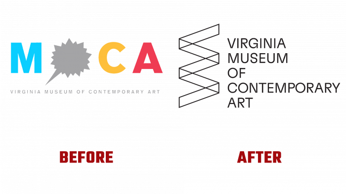
The recently re-branded Virginia Museum of Contemporary Art (MOCA) has revolutionized the museum’s visual identity. Over the past ten years, the museum has not undergone such a comprehensive reformat of its image. Today, changes have affected all areas of branding – from the logo, website, and up to the last flyer, which went out of print in July 2021.
The museum’s history began in the mid-50s of the last century as an association of free artists. Gradually, it grew into an art center, where classes began to be held, providing art education for those who wanted to join the art. 2010 became a starting point for the establishment. This year it was given the status of a museum and was officially given the name by which it is known in the world today. At the same time, the first logo was developed and applied, which was changed in 2021. The need to change the image was caused by the transition of the organization to a new level. If earlier the institution was more consistent with such a definition as an art center, today it has already fully confirmed the status of a museum, assigned ten years ago.
As a result, the former bright and colorful brand mark, more in line with the art center, was left in the past. The new logo is a demonstration of the seriousness and modernity of MOCA. In 2020, management surveyed art and visitor representatives from the Virginia City Council. Based on the results obtained, a new visual identity project was developed. Its focus is on solving the problem of poor popularization of the museum. The development company conducted a branding analysis of about 100 museums.
The result of this fruitful work was a new logo in a single black color, visually indicating the seriousness and severity characteristic of an institution of this status. The emblem is a composition of a ribbon folded in a zigzag, to the right of which there are words in a column that make up the full name of the museum. They are left-aligned and in lower case. The ribbon is shaped to give the visual impression of transparency, allowing you to see the elements hidden behind each bend. Thus, an important feature of the museum was conveyed – the constant renewal of the exhibition assortment, which indicates that not a single collection is lingering or “gathering dust” in the museum’s storehouses.


