


![]()
MoMo, Vietnam’s leading mobile payment platform, has introduced a refreshed visual identity that reflects its innovative approach and central role in the country’s digital financial ecosystem. Designed by M—N Associates, the updated logo embraces simplicity and modern design trends while staying true to the brand’s recognizable style.
The new logo moves away from the previous design’s enclosed square with rounded corners, opting for an open and versatile layout. This shift improves its adaptability across digital platforms, prioritizing clarity and usability. While the letter arrangement remains the same, the updated design brings better balance and refined proportions.
![]()
A standout feature of the redesign is the updated typography. The typeface retains its approachable, rounded character, signaling accessibility and ease of use, but now includes subtle refinements. Adjustments to the “m” shapes and “o” proportions provide a polished yet friendly look.
The vibrant magenta, a signature element of the platform’s identity, continues to dominate the color palette. This bold hue reinforces an energetic and modern image while ensuring high visibility across digital and physical platforms. The lighter background in the redesign introduces a fresh and open feel, enhancing the overall impact.
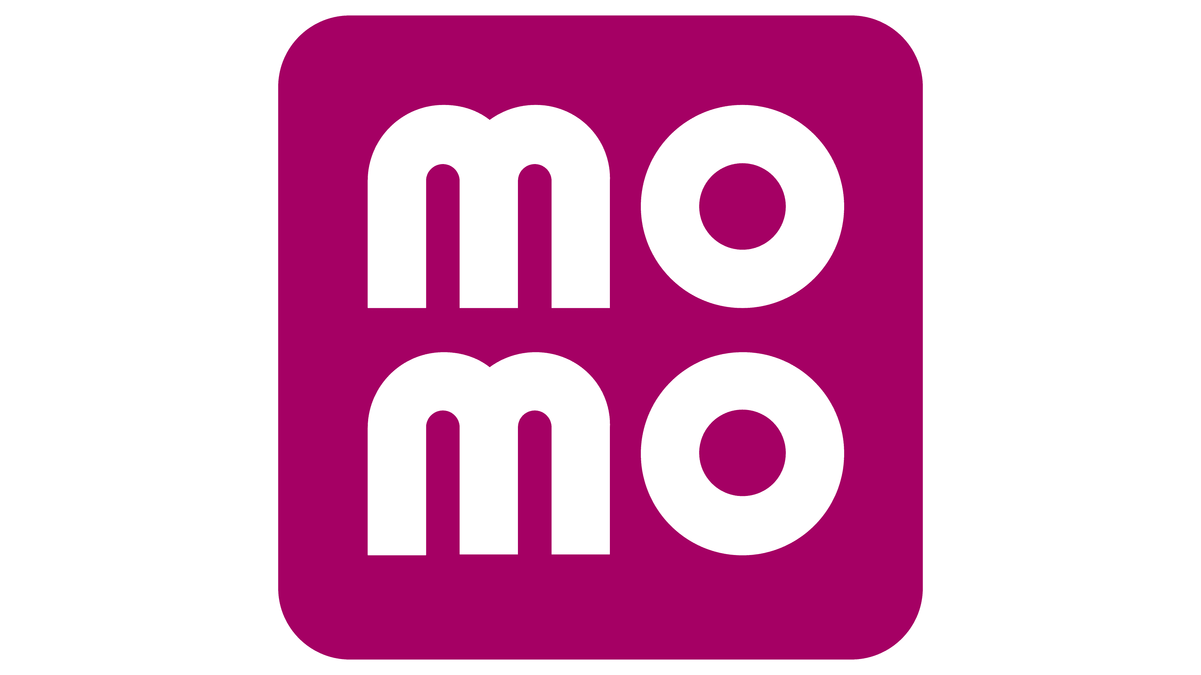
The updated design goes beyond aesthetics, symbolizing the mission to simplify financial transactions for users. Removing the previous “Mobile Money” descriptor and the enclosing frame reflects confidence in strong brand recognition and solidifies its reputation as a trusted name in Vietnam’s fintech sector.
The new logo is designed with practicality in mind. Its minimalist structure ensures compatibility with various applications, from mobile screens to social media icons, while maintaining its integrity in small and large formats.
![]()
This rebranding highlights readiness to meet users’ evolving needs and keep pace with the growing digital economy. The updated identity underscores a commitment to functionality, accessibility, and innovation, enhancing the platform’s role as a leader in cashless transactions and digital financial solutions. With this redesign, the platform strengthens its connection to its 30 million users while projecting reliability and forward-thinking values.