Big rebranding failed, as evidenced by fan reactions on social media.
Luis Rubiales, President of Royal Spanish Football Federation (RFEF), said it took a year and a half to develop the new logo. The organization completely redesigned the logo in an attempt to make it more concise and straightforward. In the words of the creative director, this image can help build a brand in the future.
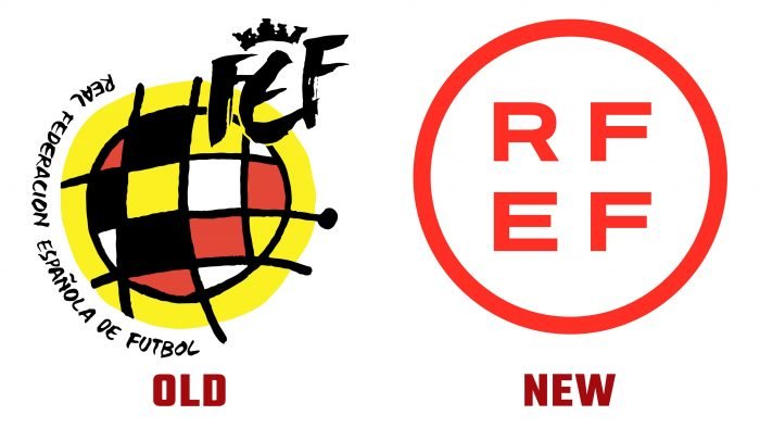
The logo consists of an organization abbreviation surrounded by a white circle on a bright red background. The white circle is associated with soccer field markings, a ball, or a clock’s shape. The organization also presented a video depicting the new logo on the players’ uniforms, cards, documents, posters, and an icon for the application. Recall that RFEF has used the previous image since 1988. It was created by the legendary artist Joan Miro. The logo combined bright colors and graphic elements.
To achieve conciseness and simplicity, the organization lost its uniqueness and merged with other large companies. Fans were unhappy with the rebranding and drew parallels with well-known brands, for example, Bayer, Uniqlo, and someone even said they had found a similar template in Canva. A larger organization, according to football fans, deserves a unique design.


