The well-known American brand “Money” is famous because it offers monthly financial summaries in the form of a magazine and useful information regarding the implementation of monetary processes on the site. Founded in 1972, the brand has gradually increased its pace of development, and now the range of its topics is quite wide. Now you can find an analysis of the problems of lending, mortgages, insurance issues, personal financial flows, investment, family financial condition (tuition fees, loans, career investments, improvement of housing conditions).
When you can look at a website or magazine, it’s good to quickly find practical advice on how to improve the quality of life. For example, a section contains information on the best places where an American could settle down and live for his pleasure. Statistics show that in 2020, amid a pandemic, interest in the brand increased: in April of that year, 10 million unique visitors to the site were recorded.
The very word in the “Money” logo already says a lot. Let the word be simple, the logo is the font, and the color is not catchy. The main thing is the meaning, what is hidden behind the image.
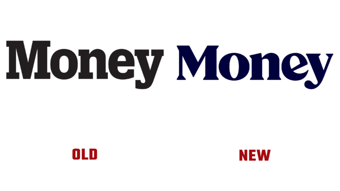
At first, the logo was very verified, neat from all sides; even the serifs were geometrically clear. Now the logo is distinctive and daring. This is evidenced by certain accents in the letters M, N, E, and an acute U. The fact is that the voids of these letters form angular shapes while they look harmonious in combination with dark blue contours. Previously, the logo style was more “typed,” like on a typewriter. Now it has become stretched in breadth, more pleasing to the eye.
The authors – The Curious Company (San Francisco, CA) – did their best because now it is impossible not to notice the “breadth” that Money means. The capital letter M carries confidence in the future, and the entire logo seems to say, “don’t worry, we know what you need.” Aesthetic pleasure curls in some places seem to hint at rolled banknotes, causing positive associations with real money.
However, the logo change reinforces the idea that “Money” will remain “Money” because it is the recognizable brand of an affordable digital financial advisor.


