Comfort and convenience come from the emblem. The Monzo logo symbolizes the wide range of online services that customers can take advantage of. The desire to be useful and the user-friendly interface of the bank application are encrypted in the symbols.
Monzo: Brand overview
| Founded: | 2015 |
| Founder: | Gary Dolman, Jason Bates, Jonas Huckestein, Paul Rippon, Tom Blomfield |
| Headquarters: | London, England, UK |
| Website: | monzo.com |
Meaning and History
Monzo was founded by several people who worked together at Starling Bank. When one of them was fired, they decided to create their project, which would be modern, simple, and understandable for the younger generation. Aspiring entrepreneurs happily got rid of everything that, in their opinion, prevented them from using banking services, including checkbooks. They have transformed the institution’s work into a new format, focusing on the Internet version.
True, the businessmen had no startup capital, so the money had to be raised on a crowdfunding platform. They managed to get the required amount in 96 seconds. All these events took place in 2015-2016. And only a year later, Monzo was recognized at the legislative level as a financial organization and received the right to conduct various banking operations.
Digital Banking has revolutionized because it has always been customer-centric, making everything safe, attractive, and simple. One of the elements of such marketing is a striking logo that goes well with pink cards.
What is Monzo?
Monzo is a British bank that operates exclusively online. It has no branches, but it does have a mobile app that allows users to manage their accounts online. This neobank offers various financial services, including currency exchange, loans, cards, etc.
2015 – 2016
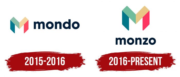
When the company launched its first app, it wasn’t called Monzo, but Mondo. The same word became the main “star” of the emblem. It was written in the dark, bold sans serif letters and was to the right of a colorful stylized capital “M” icon. But this concept did not last long because there were difficulties with the registration of the trademark.
2016 – today
There were no complaints about the graphic part of the logo, so it remained unchanged. But the inscription had to be changed because the digital bank chose a new name for itself. Moreover, he entrusted the naming to his numerous clients: he was interested in the opinion of all 100 thousand people who at that moment were using financial services. They received personal invitations to participate in the competition, but with one condition: the first, as before, had to remain the letter “M.” This was necessary not to change the M-shaped emblem.
Company executives received about 12,560 options, including Monzo. The bank did not want to repeat past mistakes and recruited a team of lawyers to choose a new name. They checked whether such a trademark could be registered and whether there would be problems with it in the future. When all the issues were settled, the designers integrated the name into the old logo, using the same font and adhering to a familiar color scheme. So the word “monzo” ended up being written under a large stylized letter, “M.”
Monzo: Interesting Facts
Monzo, a digital bank from the UK founded in 2015, is at the forefront of the online banking movement, designed for a generation that prefers everything on their smartphones.
- Growth: Monzo quickly attracted millions of customers with its easy-to-use app, clear fees, and customer-input-valuing approach.
- Funding: Monzo used crowdfunding in addition to traditional funding, letting customers invest and deepen their connection to the bank.
- Banking License: In 2017, Monzo obtained its official banking license, which allows it to offer complete banking services, such as checking accounts, overdrafts, and savings.
- Features: The bank is loved for features that give instant spending alerts, show where your money goes, and help with budgeting in the app.
- International Transfers: Monzo makes sending money abroad cheaper and easier through partnerships with global transfer services.
- Security: Security is top-notch, with options to lock and unlock your card in the app and thorough checks to keep accounts safe.
- Marketplace Banking: Monzo aims to be a one-stop financial hub in the app, integrating services from other companies.
- Community Focus: A large online community for feedback and discussions helps Monzo align its offerings with users’ needs.
- Eco-friendly: Monzo is working on reducing its environmental impact, including offering a biodegradable card.
- Future Outlook: Despite facing competition, regulatory challenges, and the need to be profitable, Monzo’s innovative banking and strong customer base set it up for ongoing success.
Monzo stands out for its commitment to technology, customer satisfaction, and a sense of community, reshaping how we think about banking in today’s digital age.
Font and Colors
When developing the visual style, the company’s leaders set a key task for the team: to create an image that would position Monzo as a simple, understandable, and high-tech bank. The first badge was temporary and black and white, but it did not correspond to the desired idea. The owners of the brand needed dynamism, expressed in vibrant colors and unusual shapes.
Following the stated requirements, the designers came up with an emblem in the form of a multi-part letter “M.” It contains four colorful trapeziums, lined up in a specific sequence, and perfectly complements the authentic inscription. The main aspects that such a symbol expresses are recognition, friendliness, confidence, and constancy.
The closest version of the font featured on the Monzo logo is called Kappa Display Extra Bold. It contains geometric and humanistic elements. But the designers of the wordmark used a slightly different version – with miniature, barely noticeable protrusions at the top of the “m” and “n.”
The color scheme, like the font, shows the informality of the banking company. It contains muted tones of navy blue (# 132136), cyan (# 327787), cyan green (# 8ABB9C), light yellow (# DFC586), and Amaranth red (# E83860). The wide range of colors focuses on the lettering and the M-shaped symbol.
Monzo color codes
| Teal Blue | Hex color: | #327787 |
|---|---|---|
| RGB: | 167 30 49 | |
| CMYK: | 5 100 71 22 | |
| Pantone: | PMS 7474 C |
| Dark Sea Green | Hex color: | #8abb9c |
|---|---|---|
| RGB: | 138 187 156 | |
| CMYK: | 26 0 17 27 | |
| Pantone: | PMS 338 C |
| Lion | Hex color: | #dfc586 |
|---|---|---|
| RGB: | 223 197 134 | |
| CMYK: | 0 12 40 13 | |
| Pantone: | PMS 7508 C |
| Cherry | Hex color: | #e83860 |
|---|---|---|
| RGB: | 232 56 96 | |
| CMYK: | 0 76 59 9 | |
| Pantone: | PMS 1785 C |
| Squid Ink | Hex color: | #132136 |
|---|---|---|
| RGB: | 19 33 54 | |
| CMYK: | 65 39 0 79 | |
| Pantone: | PMS 289 C |
