A large section of the financial market shows the Morgan Stanley logo. The emblem, like a cornerstone, underlies customers’ well-being. The sign evokes a feeling of reliability and reflects big capital and a significant safety cushion.
Morgan Stanley: Brand overview
| Founded: | 1935 |
| Headquarters: | New York City, New York, U.S. |
| Website: | morganstanley.com |
Meaning and History
Morgan Stanley bears the surname of John Pierpont Morgan I’s grandson – Henry Morgan. Despite the similarity of names, it is an autonomous organization with nothing to do with JPMorgan Chase. It appeared in 1935 and, until 2008, worked as an independent investment bank. After the restructuring, Morgan Stanley has grown into a major financial conglomerate. Before that, he managed to visit a public joint-stock company (in 1986) and merge with the brokerage firm Dean Witter, Discover & Co. (in 1997), which, among other things, was engaged in the issue of bank cards.
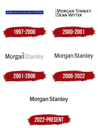
Morgan Stanley’s identity reflected this eventful story: it had at least five logos. Versions used from 1935 to 1997 are a thing of the past.
What is Morgan Stanley?
Morgan Stanley is one of the systemically important banks in the United States, a financial conglomerate that owns the largest brokerage business in the world.
1997 – 2000
In 1997, the bank became Morgan Stanley Dean Witter & Co. after a merger with a company that provided brokerage services. At the same time, a new emblem appeared—a blue rectangle with a white inscription, “MORGAN STANLEY DEAN WITTER.” All letters were in capital letters, and the font was antiquated in italics.
2000 – 2001
The financial institution changed its logo a year before the renaming. The designers removed the blue geometric shape, made the inscription black, and divided it into two lines. The first half of the name was at the top, and the second was slightly below. A black vertical line was drawn on the left. This version used a flat sans-serif font.
2001 – 2006
In 2001, the bank’s board decided to return to the old name, Morgan Stanley, to make the brand more recognizable. The designers combined two words on the emblem: black “MORGAN” and light gray “STANLEY.” Between them was a small white triangle with a blue frame.
2006 – 2022
The latest version of the logo is monochrome: the inscription is completely black and is not supplemented by other elements. The developers did not change the font; they just corrected the shape of the letters “g,” “a,” and “l.”
Morgan Stanley’s two-color mark contains only the name of the financial conglomerate. There is nothing else on it: the developers have removed even that small triangle in the past between words. Such minimalism perfectly conveys the seriousness and stability of the company.
2022 – today
Initially, it seems that the changes in the logo are minor, but upon closer examination, some subtle differences become apparent. The new font, while retaining the characteristics of the previous one, appears slightly bolder. However, the overall design of the logo remains largely the same.
The “Morgan Stanley” company logo is characterized by elegance and restraint in design. It is executed strictly using black color on a white background, providing high contrast and recognizability even from a distance. The logo’s font is sans-serif, lending it a modern, clean, and professional appearance. The letters are written uniformly, emphasizing the brand’s stability and reliability.
The logo’s color palette is reduced to classic black and white, making it versatile and adaptable for various backgrounds and contexts. The color black is often associated with elegance, strength, and authority, reflecting the company’s aim to underscore its reputation in the financial sector.
The “Morgan Stanley” logo is distinguished by the absence of decorative elements and graphic images, focusing on the name itself. This minimalism symbolizes straightforwardness and transparency in business relations. The even spacing between the letters adds balance and order to the design. Such an approach indicates the company’s confidence in its stable reputation and commitment to direct communication, which is especially important in fields such as finance and law.
Morgan Stanley: Interesting Facts
Morgan Stanley, a major player in global finance, has shaped the financial landscape since 1935.
- Start: Henry S. Morgan and Harold Stanley founded the company after the Glass-Steagall Act required separating investment from commercial banking, focusing on securities and investment management.
- Big IPOs: It’s handled the initial public offerings for major companies like Google, Apple, and Facebook, raising significant capital and marking notable financial moments.
- Worldwide Operations: With offices in over 42 countries, Morgan Stanley serves a diverse range of clients, including corporations and governments, highlighting its global influence.
- Major Deals: The firm has advised on big transactions, like during the 2008 financial crisis with the U.S. Treasury, showing its role in critical financial events.
- Charity Work: Morgan Stanley is committed to giving back through its foundation, which is focused on children’s health and global healthcare improvement efforts.
- Financial Innovation: It led to the creation of the Eurobond market in the 1960s and has been a pioneer in electronic trading and wealth management.
- Diversity Efforts: The company promotes diversity and inclusion, supporting women, people of color, and LGBTQ+ individuals through various programs.
- Sustainable Finance: Morgan Stanley is dedicated to sustainable finance, working on financial solutions to combat climate change and investing in sustainable projects.
- E*TRADE Acquisition: In 2020, it acquired ETRADE, significantly growing its wealth management services by adding ETRADE’s technology and clients.
- Education and Development: The firm partners with educational institutions to develop future financial professionals and leaders.
These points showcase Morgan Stanley’s deep impact on finance, from managing significant IPOs and advising on major deals to its commitment to innovation, diversity, and sustainability.
Font and Colors
The lettering font is an exact copy of Trade Gothic Roman. The typographer Jackson Burke created this versatile, grotesque typeface in 1948. It emulates the 19th-century style and is often used in newspaper headlines.
As mentioned, the palette is limited to only black and white colors. The monochrome design represents Morgan Stanley as a responsible and fundamental organization.
FAQ
What is Morgan Stanley’s slogan?
Morgan Stanley’s slogan is “At Morgan Stanley, we lead with exceptional ideas.” This slogan shows the brand’s focus on innovation and leadership in the financial industry. It shows the creation of unique and impactful ideas that help the company and its clients achieve their goals.
The slogan shows the importance of creativity and thinking. It aims to set the brand apart in a competitive market by building confidence among clients and stakeholders. This reflects the company’s dedication to providing high-quality financial services and solutions.
What does Morgan Stanley mean?
This is an American multinational investment bank and financial services company. Its headquarters are at 1585 Broadway in Midtown Manhattan, New York City. The company operates in 41 countries and has over 75,000 employees. It serves many clients, including corporations, governments, institutions, and individuals.
The brand offers various financial services, such as investment banking, securities, wealth management, and investment management. Its wide range of services and global presence make it a key player in the financial industry.
Founded in 1935, the company has a long history of providing financial expertise and innovative solutions. Over the years, the brand has built a reputation for leading with exceptional ideas and maintaining a strong commitment to its clients.
The firm’s extensive network of offices and experienced professionals allows it to deliver high-quality services tailored to its clients’ needs. This global reach and expertise enable the company to help clients achieve their financial goals, whether they seek investment opportunities, asset management, or advisory services.
Are JP Morgan and Morgan Stanley the same?
Although they share a common history, J.P. Morgan and Morgan Stanley are different companies. Both started from the same entity but now operate independently with different focuses in the financial industry.
While both companies are major players in the financial industry, their services and client bases differ. J.P. Morgan, part of JPMorgan Chase & Co., is one of the largest commercial banks globally, offering a wide range of banking services. Morgan Stanley is known for its investment banking, securities, wealth management, and investment management services.
The two brands have distinct identities and operate independently, each with its strengths and areas of expertise. Despite their shared origins, they have evolved into separate entities with unique roles in the financial sector.
Does Morgan Stanley have a logo?
Morgan Stanley has a logo that is crucial to its brand uniqueness. The logo is positioned in the top-left corner of all print and digital materials, helping maintain a cohesive and recognizable look.
The logo is simple and elegant, reflecting the company’s professional image. The careful use of typography and spacing ensures it is clear and legible in different formats and sizes.
When did Morgan Stanley collapse?
The brand faced big challenges during the 2008 financial crisis, losing over 80% of its market value between 2007 and 2008. On September 17, 2008, the British evening news program Newsnight reported trouble for the brand after a 42% drop in its share price over two days.
The crisis caused severe stress across the financial sector, leading to liquidity problems and loss of investor confidence. This raised concerns about Morgan Stanley’s stability and future.
To stabilize, the brand converted to a bank holding company, accessing emergency funds from the Federal Reserve. Mitsubishi UFJ Financial Group invested $9 billion in the firm, bolstering its financial position.
Despite the severe impact, the bank navigated the turmoil without collapsing. The steps taken to stabilize the company and the investments helped it recover and continue operations.
What is Morgan Stanley famous for?
Morgan Stanley is a global leader in investment banking, providing services to corporations, organizations, and governments worldwide. The brand advises clients on many financial transactions, including mergers and acquisitions, initial public offerings (IPOs), debt offerings, share repurchases, and derivatives.
The firm deals with derivatives and convertibles, offering clients advanced financial instruments to manage risk and enhance returns. This requires high expertise, which the brand provides through its dedicated teams.
With decades of experience and a global presence, the brand is a trusted partner for clients aiming to achieve their financial goals in a complex market.


