The newly minted company to improve the working area in computer technology Moss appeared just recently, and not a year has passed. The brand creates space for creativity, technically providing simplicity, reliability, and accessibility of creative processes. This is the organization, optimization, and simplification of the entire desktop that a person needs at a certain period of vigorous activity.
RegretsOnly agency (Boston) was contacted for the development of the logo.
Analytical work was carried out, during which the conclusion comes to the fore: for those who will see the brand, it is necessary to give strong support so that there is no connection with the name. You need a visual game, a bold and lively picture that embodies coherence, germination, and completeness. There was an idea to depict a flexible blade of grass as a symbol of the beginning and continuation of invisible lines. The idea of a “working” atmosphere and environment penetrates our everyday lives and does not clog our minds.
The use of natural elements, the presentation of the anima, a living microorganism associated with the majestic microcosm, was an excellent implementation of the concept of the initiators of the new image.
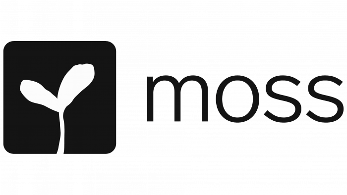
A white sprout against a black background of a rounded square, as if inscribed by nature itself (or maybe a child’s hand?), Harmonizes perfectly with the black rounded font. The logo and the name look simple and concise; nothing needs to be added. The square looks like a field or work area where the most important thing happens – the manifestation of creative power in the form of a blade of grass.
Aesthetically, despite the black-and-white nature of the visual solution and metaphorically, the name is played up, which is difficult to associate with creativity. The designers highlighted the company’s virtues – creation, growth, and support. This, perhaps, is what eats the brand values transmitted to the target audience.


