The bird is a symbol of flight. That is why it is often seen in most countries’ emblems of air carriers. It is also chosen for the desire for height – as a sign of growth, for the ability to fork nests – as a personification of a cozy home, for the care of chicks – as an allegory of motherhood. In addition, it is fast, light, and free. The bird is perfectly oriented in the sky, choosing the only right path, and is always on the move. Accuracy, high speed, and purposefulness – this is its main advantage.
Birds have other important qualities. One of them is wisdom. Usually, this category is represented by crows and owls, which are actively used by brands associated with intellectual themes. Large birds are often the mascots of sports teams, so you can see eagles, falcons, and other winged raptors on their emblems. After all, they are enduring, strong and formidable. Do not forget about the dove, which means peace. This classic example has also not gone unnoticed by various organizations.
We offer you a selection of the 100 most famous bird logos. They are unique and original. Some belong to old and defunct companies, while others are modern and actively working. Emblem styles are rich in directions—from allegorical cubism to realistically detailed images. The brands are arranged in random order. So, let’s get to know them better!
Simca
One of the most sought-after automobile brands from the 30s to the 70s was known worldwide. Cars with its emblem were popular: these French models were incredibly elegant and technological. Oblivion began after the company’s takeover. Before that time, cars with swallows on the hood flew on the roads of many countries. Designers developed a logo for Simca with a white bird. It was depicted in the form of a silhouette and was located in the upper part of the pentagonal shield. In the lower part, the name of the manufacturer was listed. The main palette of the sign was a combination of red, blue, and white colors – the colors of the flag of France.
Hollister
Fashion brand Hollister has a logo in the form of a petrel. It is depicted as minimalistic, without details: a black thrush with wide wings, flying to the left on a flat white background. Thanks to clear contours, it looks distinct and confident. Under it is the name of the company in vertically elongated letters. They are flat, strict, and grotesque. This symbol shows the company’s desire to move forward despite any obstacles.
Duolingo
In this case, in front of us is a symbol of wisdom – an owl. It fits perfectly into the name of the mobile application that promotes easy and convenient learning of languages. At the same time, the Duolingo logo is not realistic but cartoonish, which emphasizes the ease of learning. The bird is full-sized and painted in two colors, orange and green, of several shades. Below is the name of the program. It consists of rounded lowercase letters, keeping with the owl’s style.
IMSS
Designers proposed an abbreviation for the IMSS logo because Latin America’s largest social security organization is the Mexican Institute of Social Security. The short shape fits perfectly into the visual identity and takes up the entire bottom space below the silhouette of a bird in a square with rounded corners. The emblem’s color scheme is green and white.
Salewa
Salewa, an Italian clothing, footwear, and equipment manufacturer for tourism and outdoor activities, has chosen a very original logo – even schematic. It depicts a flying bird formed from two complex geometric figures resembling a trapezoid. The inscription is also made in cubist style and looks like arranged figures. The letters are connected in pairs (“SA,” “LE,” and “WA”), so they seem to form three separate compositions. Although the bird is allegorical, it is symbolic: it conveys confidence, endurance, and support.
Dove
The world-famous cosmetics company Dove has a logo containing an image of a gentle dove flying to the right. The softness of its character resonates well with the softness of its detergents, which are gentle on the skin like fluff. This is conveyed in the bird’s body’s flowing lines and loose curves. It is painted beige and golden and is illuminated with a dazzling glare. Above it is a blue inscription, the brand’s name, typed in italics in the same elegant style.
Martell
The label of the famous French cognac also has a bird on it: the designers proposed a logo with a graceful swallow for Martell. This light-winged creature fits perfectly into the brand’s concept: after drinking the cognac, customers feel so inspired that they feel like flying on wings. The bird has a forked tail and refined body lines. The swallow, the coat of arms, the year the company was founded, and the word “cognac” is gold in color, while the name of the trading house is dark blue.
Famous Grouse
This alcoholic brand will have a bird on the label, as the Famous Grouse logo is based on its name. The blended Scotch whisky from 1896 is easily recognizable by the large black grouse that stands proudly to the left of the lettering. It is contoured, golden in color, with wide burgundy eyebrows. The adjoining text is in magenta and divided into two lines.
Swift
Swallow demonstrates the simplicity of this programming language – its usage, coding, and functionality. To emphasize the necessary qualities, the developers chose Swift, a logo with a very agile bird that can fly at different heights and instantly adapt to the environment. It has wide wings, a forked tail, and a sharp beak. It is colored white and placed in an orange square with rounded corners. On the right is the name, typed in grotesque. Its peculiarity is in the connected “f” and “t”. The designers made them a common crossbar.
FPV
The Australian branch of FPV has a logo in the form of an eagle. In this case, the fast bird fits perfectly into the automaker’s concept, as it is big, swift, powerful, and authoritative. The sign contains a stylized, not a real image. The eagle looks formidable thanks to the presence of sharp elements near the eyes and beak. The inscription is located to the left under the head and represents the abbreviated name of Ford Performance Vehicles. The color of the emblem is monochrome.
Lalamove
The hummingbird’s flight is swift and almost invisible. Its image inspired the concept of an Asian delivery service with its own mobile app and web program. The logo designed for Lalamove depicts the quick-winged and agile bird as a sign of the instant delivery of goods. It looks up and flaps its wings constantly, as evidenced by the three white stripes that give the emblem dynamism and energy. In terms of color, the name is divided into two parts: the first half is orange, and the second half is yellow.
Morehead State Eagles
The Morehead State Eagles Club has an emblem featuring a bald eagle, one of the main symbols of the United States. It looks straight ahead with a sharp beak and gleaming black talons. The beak and paws are colored yellow. The powerful wings are colored blue and serve as a background for the faculty name belonging to MSU (Morehead State University). The top and bottom lines are colored white, and the middle line is colored yellow. All elements are outlined in black color. In this case, the bird symbolizes the athletes’ strength, endurance, and patriotism.
Peerless
This company began as a clothing manufacturer, then moved on to the production of bicycles and cars and, finally, was transformed into a brewery. The Peerless logo resembles the American flag, consisting of red, blue, and white colors used to paint a quadrangular shield. Above it, on a separate banner, is the brand’s name. The background is an eagle with raised wings. All elements are located in a vertical oval.
China Eastern Airlines
The bird on the air carrier’s icon is abstract, depicted in a geometric style. It has a left-turned head with a short beak. The wings are raised upwards, while the tail, on the contrary, is lowered downwards. The developers also proposed a logo for China Eastern Airlines with a curved blue stripe resembling a boomerang. Both parts of the swift form an original design. The text on the emblem is two-tiered: the first line consists of an inscription in Chinese and is in characters, while the second line contains the name duplicated in English.
Benfica
The Portuguese soccer club, playing in the top division of its country, has a modern emblem based on a badge that appeared in 1904. Then, the Benfica emblem was decorated with an eagle – a symbol of nobility, power, and independence. He stands on a wheel, broadcasting the team’s first sport – cycling. Below is a green and red ribbon with the motto “E pluribus unum” in Latin. In the center is a heraldic shield depicting a yellow ball and a blue diagonal stripe with the abbreviation “SLB” (Sport Lisboa e Benfica).
Pos Indonesia
Pos Indonesia, the state postal service, has chosen a logo featuring a globe and a bird. They symbolize the reception of correspondence from all over the world and fast dispatch to any corner of the planet. Both elements are drawn with outline orange lines of medium thickness. By the head and beak shape, this image resembles a pigeon – the traditional mail deliverer in ancient times. On the bird’s wings are additionally drawn four stripes, which give it dynamics, as if it is rapidly flying forward. The organization’s name is written below in gray, bold, and grotesque. All letters are wide and capitalized. Such minimalism characterizes the work of the postal company in the best possible way: correspondence is delivered neatly, professionally, and quickly.
Duesenberg
Although this automobile manufacturer has been defunct since 1937, it contributed greatly to the industry with its inline 8-cylinder engine models. In 1921, its race car became the first American sports car to win the French Grand Prix. Already at that time, on the hood was a bird: luxury and sports cars. Duesenberg had an emblem in the form of an eagle with widely spread wings. On it were drawn feathers, a beak, and a head. The number “8” was on the tail, denoting the number of cylinders in the engine. And from the tip of the left wing to the tip of the right-wing stretched a large blue inscription – the brand’s name. Below was the word “Straight” in the same color.
Toronto Blue Jays
The Toronto Blue Jays team has a very stylish logo. It depicts a bird turned to the left. It is drawn in profile and is painted in two shades of blue. The background is also blue, so the head is outlined in white. The beak is powerful, straight, and horizontal. A dark band is directed from it to the eye, which is hidden behind a red leaf. Canadian baseball players chose two main mascots of their country: Maple and Jay. The designers combined them graphically without breaking the business style of the logo.
Arash
The logo presented by Arash contains an image of a peregrine falcon – one of the fastest predators. This image harmonizes well with the car manufacturer as it represents the high speed of cars. The yellow bird is drawn at takeoff, so its wings are positioned at different angles. Powerful paws are bouncing off the surface. At the top is the company name, which is typed in bold grotesque. The background is a black vertical trapezoid with a light highlight on the left.
Barclays
The international bank Barclays has a solid logo. Because of the unfolded position of the bird, it resembles a coat of arms. A blue eagle is depicted with wings spread wide and head turned to the left. Although the style of the emblem is schematic, thanks to the neutral white background, it accurately conveys the outline of the powerful bird. It is not detailed but well recognizable. Below it is the text part of the symbol – the company’s name. The inscription is made in a light blue color and is slightly slanted to the right. Small extensions resembling sharp serifs are at the ends of the letters.
ADATA
The brightly colored hummingbird is a great addition to the emblem of a high-tech company from Taiwan. It specializes in memory sticks, solid-state drives, and computer accessories. However, the logo designed for ADATA is not as serious as its line of business. The icon is colorful and bright: the bird is painted purple, burgundy, blue, green, yellow, and orange. The short tail ends with forked feathers, which turn into miniature stars. The brand name, on the other hand, is strict and official. It is typed in sans-serif capital letters.
Russo Balt
In the automobile department of the company “Russo Balt” in the logo, there is a traditional Russian symbol – a double-headed eagle with a scepter and an orb, which he holds in his paws. The stubby wings are spread, sinuous tongues stick out of the beaks, and crowns are worn on the heads. And the third is still above them. The bird is surrounded by a ring, on which the company’s name is written in thin capital letters. The emblem is contoured and monochrome.
Nice
French professional soccer club Nice chose an emblem with a proud eagle. He looks menacingly to the left and holds in his wings a triangular shield with red and black stripes (below) and the team’s name (above). The first line is the abbreviation “OGC,” formed from the word Olympique Gymnaste Club. On the second line is the word “Nice.” The text is typed in white font and has a thin gray border. Under the volumetric shield (in the paws of the bird), there is a ribbon with the year of foundation of the sports organization.
Atlanta Hawks
The professional American basketball team Atlanta Hawks emblem consists of the head of an eagle, more precisely, a white eagle, one of the key symbols of the United States. It has a menacing look and a sharp beak. The white bird is on a white background, so they do not merge; the designers circle it with a maroon line. The rest of the circle is the same color. The center element is edged with a wide ring with the name of the sports club.
Bandini
Italian car manufacturer Bandini used a logo with a pet bird – a rooster. It was schematic, black, and placed on a yellow background, making it distinct. At the bottom of the vertical shield stretched a blue band with the company name and a triangular element painted in the colors of the Italian national flag: green, white, and red.
Rochester Red Wings
Designers offered the Rochester Red Wings baseball team from New York a logo with a formidable eagle. He swings his bat sharply to strike a precise blow. Based on the name, the bird is colored red and has a black baseball cap on its head. The beak is yellow. In the ajar mouth, you can see white teeth – this is an anthropomorphic character endowed with human qualities. On the background of the wing is a cursive inscription with the club’s name.
Garuda Indonesia
Indonesian national carrier Garuda Indonesia chose a logo depicting a forward-looking bird. It points to the right side and is colored in two shades of blue. The eagle’s figure (judging by the shape of the head) is formed of five curved bands of different lengths. They form both the body and the wings.
American LaFrance
A manufacturer of emergency vehicles from the USA used an emblem with an eagle sitting on the iron cross with massive sides. The bird was depicted leaning forward with its wings spread wide. It represented protection, vigilance, and alertness. A plaque with the company’s name was in the center of the American LaFrance emblem.
Tiesto
For DJ Tiesto, the designers designed a logo with an abstract bird. It is depicted above in flight, looking like an air glider surrounded by three arc-shaped lines. The silhouette is colored in black and is complemented by a broad tail of five feathers rounded at the ends. The head with a triangular beak points upwards. The following is the musician’s pseudonym.
Pemex
Mexican oil and gas company Pemex chose a logo in the colors of the national flag. The lettering is green, and the symbolic bird next to it is dark red. Its head is painted with white horizontal stripes and completed with a triple knot. The background is a large drop. The font in the corporation’s name is individual, non-standard, and grotesque. It has rounded corners and smooth lines, harmoniously flowing from letter to letter. Thus, there is a pair connection of two syllables: “EM” and “EX”.
Rossignol
The visual style of the French manufacturer of clothing and accessories for extreme sports is very elegant. Even though Rossignol has a logo in the form of a rooster, it looks sophisticated. The sign is designed in the colors of the national flag. The miniature badge depicts the main symbol of France, divided into two parts. It has a red tail and a blue head, divided in the middle by two vertical lines. The bird is placed in a white shield outlined by double frames. In front of it is the name of the fashion house, typed in a bold, rounded font.
Cebu Pacific
The emblem designed for Cebu Pacific could not be different because it is a Philippine air carrier, and the bird personifies flight. The emblem depicts an eagle. He has three light blue feathers on his neck, and the head consists of two emerald bands of complex configuration with pointed elements on the chest, near the beak, and the eye. Below is the name of the company. It is typed in lowercase letters. All letters are smooth, streamlined, rounded, and bold.
Movenpick
The bird is an old part of the famous ice cream manufacturer’s identity. It is golden-beige, light, simple, and symbolic. The Movenpick logo lacks specifics: it depicts a wavy stroke resembling a bird in flight. On the contrary, the name is bright and large, colored crimson, and occupies the whole lower part of the black rectangle. The curved line softens the emblem and adds to its sophistication.
Bowling Green Falcons
BGSU’s athletic department, the Bowling Green Falcons, uses an emblem featuring America’s most important mascot, the bald eagle. It is drawn in cubism and peeks behind a diagonal “BG” monogram. The abbreviation is white and bordered in the bird’s color—red and brown borders. The hooked beak, triangular narrowed eye, and sharp feathers make the eagle dangerous, instilling fear in the enemy.
Oneteaspoon
The Australian fashion brand has been using the bird emblem since its inception. Moreover, One teaspoon has an incredibly original logo, which is well established among its competitors as it produces jeans, shorts, t-shirts, blouses, and T-shirts, i.e., goods in the range of other manufacturers. The unique mark has helped it to stand out and gain widespread recognition. Her identity is built on the image of a sophisticated swift with a chain around her neck, where instead of the classic pendant hangs a bone. The style of the text is also inimitable: the first half of the name is printed, and the second half is handwritten. The word “teaspoon” is written in clumsy handwriting without italics.
Sydney Roosters
After renaming to Sydney Roosters, the athletes changed the logo, and as a result of a complete rebranding, a formidable rooster appeared on the emblem of the Australian professional rugby league soccer club. He has a yellow beak, a pointed crest, an arrogant squint, and a proud posture. The bird is depicted inside a triangular shield with a triple border, preceded by the word “Roosters.” It is connected, arranged diagonally, and typed in italics. The main colors of the badge are red (bottom lettering, beard, crest, and wide border), blue (background for the name and thin border), and white (rooster background, top lettering, and part of the feathers).
Arizona Cardinals
The Arizona Cardinals, an American professional soccer team, has used a bird-shaped emblem since its inception. It depicts a cardinal—after the sports club’s name. The head is shown in the profile and is turned to the right. A powerful, thick beak, a menacing, serious look, and four sharp feathers express the unconditional mood for victory. The symbol is made of black and burgundy. White and yellow colors soften the composition.
Creighton Bluejays
The athletic department of Creighton University (Nebraska) also chose the blue jay as its visual symbol. This representative of the corncrake family is very common in North America, so it is often used as a mascot. The designers proposed the Creighton Bluejays logo with its head superimposed on top of the block letter “C” – the first letter of the club’s name. Both elements are done in the same manner and painted in the same colors: white, light blue, and navy blue. The symbol has sharp serifs that complement the beak and crest of the jay.
American Austin
This car brand represented passenger cars of the British Austin Motor Company, produced under license but failing, bankrupting in 1935. Since then, the American Austin emblem has become little known. It was a horizontal red oval with a golden rooster in the center. He was very bellicose: sharp claws, powerful spurs, a long tail, raised wings, and fluffy feathers on his neck. That is, the rooster assumed a fighting posture. Stripes and gold plates surrounded it with its name.
Kansas Jayhawks
For the athletic department of the University of Kansas, visual style developers also proposed a bird, but a cartoonish one. As a result, a team called the Kansas Jayhawks uses a logo with a friendly cartoon image. Their mascot (presumably a turkey) is colored blue and has the abbreviation “KU” on the side. It has a massive yellow beak and boots with spurs of the same color. The buckles and head are bright red. The bird is depicted full-length and turned on its right side.
Memphis Redbirds
Early in its career, the American baseball club chose an emblem to match its name. Therefore, the Memphis Redbirds emblem features a red bird. It is at the top of the sign and peeks out from behind the name. On the top of her high crest, the bird is colored, like the whole head, in a maroon shade. A yellow beak dilutes the composition. Thanks to this combination, the symbol looks modern.
Accor
The international hotel chain Accor has a logo with a minimum of elements. It uses the capital letter “A,” in which the entire left half is replaced by the silhouette of a bird taking off. Judging by the outlines, it is a goose or a swan, as evidenced by the long neck, wide wing, large body, and short tail. The block symbol is above the company name and colored in gold, as is the upper part of the emblem.
Lufthansa
The visual style of this German company could not be different since it is associated with air transportation. Indeed, the Lufthansa emblem is a circular icon with a bird in the middle. It is rectilinear and diagonal, flying to the left. The bird has crested wings, long legs, and a beak. The crest on its head indicates it is a member of the heron family. To the right of the graceful silhouette is the organization’s name in classic sans-serif font. The letters are bold and rounded.
Tottenham Hotspur
Slim, graceful, taut—this is the rooster of an English professional soccer club. It has long been part of its visual identity, so the team is colloquially called “Spurs” (by the way, they can be seen on the emblem). Tottenham Hotspur’s emblem looks elegant. A vertically elongated bird stands on a ball, and under it are two arched lines with the name of the sports organization.
Humminbird
The Humminbird logo looks like a miniature golden hummingbird fluttering to the left of the brand name. Unlike the little bird, the lettering is massive, bold, and black, with minimal spacing. The hummingbird is outlined but realistic, with well-drawn wing feathers and a head with a long beak.
Rossion
Sports car manufacturer Rossion chose not a horse but a bird for its emblem because it is fast, maneuverable, and powerful. Its emblem depicts a soaring eagle. The white silhouette with raised wings and large paws can be seen against the background of a black shield in a double frame. Above it is an inscription with a horizontally stretched letter “c.”
West Bromwich Albion
For the English soccer club “West Bromwich Albion,” designers made a logo with a very touching bird. The cute creature sits on a green branch with three red berries and diligently sings, which can be judged by the open beak and extended neck. The background is blue and white stripes located in the lower part of the triangular shield. In the upper part, the team’s name is divided into two lines: in the first, it is a small and thin font, and in the second, it is large and wide. The lines are aligned on both sides.
Auchan
The logo of the international brand Auchan consists of two elements: one graphic and the other text. They were originally combined: a bird standing in the background of the first letter of the brand name completely replaces the crossbar at the “A.” For harmony, everything is colored in red. This combination makes the emblem refined and balanced. The symbol of the trade network evokes a feeling of kindness and trust.
Cole
The Cole emblem is designed in an antique style. This design inspires seriousness, as the emblem depicts a formidable eagle with wings spread wide, occupying the entire surface of the circle. The bird has a curved and sharp beak, clearly drawn feathers, and on the chest – a five-pointed shield with the name of the brand on a diagonal stripe. The background of the circle is black, making the bronze elements look exquisite.
One of the most recognizable social networks also uses a bird in its visual style. The designers created a logo for Twitter that matches its concept, as the bird chirps, alerting everyone around it to something. The blue flying silhouette looks favorably on a white background. It symbolizes freedom of opinion, unity, and progress, and the smooth lines make the image cute and friendly.
Singapore Airlines
The flagship airline company, Singapore Airlines, chose a logo with an abstract bird. It has three wide lines forming the wing and two medium-thick lines transitioning into the body. This image represents flight, forward motion, and freedom. On the left side is the name of the carrier. It is typed in a custom font with the letter “n” cut off at the top, which, unlike all other symbols, is lowercase. The lettering is two-level, blue. The bird and underline are yellow-orange.
Nestle
The food corporation Nestle has been using the logo with a bird for a very long time because, in its case, it symbolizes care for children, a comfortable atmosphere, full-fledged children’s food, and care for the younger generation. This is reflected in the nest on which the bird sits with its chicks. The drawing is contoured in colors: all lines are blue, and the background is white. The affectionate mother and children show signs of touching and tenderness.
Moto Guzzi
The powerful Italian motorcycle manufacturer’s visual style is also strong: The Moto Guzzi logo is a huge eagle. The bird is drawn with spread wings, so it takes up the entire space of the emblem. It has a focused look, an open beak, and sharp talons. Below is the company name. It is made in black geometric font sans-serif. The eagle is colored golden beige, which indicates the highest nobility.
Aeronautica Militare
The company’s label is simple and organic. The designers proposed a logo in a thematic style for Aeronautica Militare: with a massive and confident font, a huge eagle, and a multicolored target. In this case, the bird represents total domination and supreme power, as a large crown complements the image. The target’s center point is green, followed by white and red rings. That is, this attribute on the emblem is painted in the colors of the national flag of Italy. The letters in the name are bold, with large serifs.
St Louis Cardinals
A professional baseball team from the United States, part of the National League, has a bird corresponding to the name. For example, the St. Louis Cardinals have an emblem with a red Cardinal sitting on a yellow bat behind the capital “C” at one end. The name is also crimson red. It mimics handwriting and has a slight slant to the right. The bird is positioned on the side and scrutinizes what is happening. The artists added to it one of the most important qualities of athletes – vigilance.
Monmouth Hawks
The Monmouth Hawks University Athletic Club has an impressive emblem: it depicts an eagle with an intimidating appearance and fluffed feathers. The hooked and sharp beak and narrowed eyes complement the menacing image well. The white text adds a certain softness. It is superimposed on the bird and balances the dark background. The letters are chopped, rounded, wide, and oblique.
Hartford Hawks
A sense of danger, strength, determination, and aggression – this is what the emblem chosen by the Hartford Hawks club expresses, depicting the head of a red hawk combined with a block “H.” The bird replaces the center bar and is pointed to the right side. It is drawn with flowing black lines, each curved at an angle. The dynamics of the image are given by three horizontal stripes pointing in both directions.
Air Mauritius
Air Mauritius has used the bird logo since its emergence in the professional field. It can’t be otherwise, because it is an airline company that transports passengers to different countries. To emphasize its successful work, it chose an emblem in an elegant style. The red bird is drawn with smooth lines and does not look like an airplane. It confidently soars in the air, inspiring a sense of calm and reliability. Under it is the name of the air carrier, painted in the same color. The font is lowercase, with a harmonious transition from sharp corners to rounded edges.
Ruger
Sturm, Ruger & Co. chose the heraldic eagle for its symbolism. At the same time, the Ruger logo is in the shape of a round target with an “R” in the center, as the company manufactures firearms. The bird’s wings are raised up and almost joined above the head. Four pointed feathers of different lengths are depicted on each side. On the right side is the company name, the same color as the eagle. The font is very large, with clear serifs and minimal letter spacing.
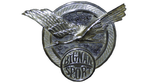
Bignan
Existing since 1931, the Bignan company used a logo with a large bird. On the hood of its cars was a stork. He was depicted in flight, so his wings exceeded the round badge. Below was another circle: it resembled the steering wheel of a car. It had a name divided into two parts by a curved bar: the word “Bignan” was written in elegant letters at the top and “Sport” at the bottom. The font was customized.
Seattle Seahawks
The Seattle Seahawks logo is cool and bright. Its base is the bird that gave its name to the professional soccer club. There is nothing else in the emblem. The whole identity is reduced to the image of a head stretched horizontally. It is drawn in profile and turned to the right. The eagle has an angry look and a sharp, powerful beak, which creates a sense of increased threat. The upper part of the neck is painted dark blue, and the lower part is gray. The beak and separating bands are white.
Giorgio Armani
The Giorgio Armani logo is one of the most iconic bird graphic marks. It is a hypothetical eagle with raised wings. It is depicted schematically and consists of black and white stripes of equal width, which are rounded on the sides. The exception is the neck and head area, where the lines are left straight or form a beak. On their background is the abbreviation of the fashion brand – “GA.” Elegant capital letters, small serifs.
Ball State Cardinals
Designed for the Ball State Cardinals club, the logo contains only one element—the diving head of a cardinal. Its intimidating look, evidenced by the sharp beak and equally sharp ends of the feathers, is designed to instill uncertainty in opponents on the sports field. The bird is painted in burgundy, white, and black and decorated with tiny strokes that create the illusion of energetic movement.
Srilankan Airlines
The logo designed for Srilankan Airlines is a very complex image of a bird. Three wavy stripes with pointed ends form it. The palette is made in the national flag colors green, red, and orange. The bird is arranged diagonally. Under it is the name of the air carrier, typed in an individual font with irregular contours of letters. The upper part of the inscription is blue; the lower part is blue.
Nationwide Mutual Insurance Company
Nationwide Mutual Insurance Company uses a logo with a shortened version of the name: it contains only the first word. The bird is a bald eagle on the background of the letter “N.” The letter is large, blue, and grotesque. Next to it is the word “Nationwide,” written in black font in lower case. The inter-character distance is small, which does not interfere with reading. The wing of the bird is raised upwards. It is flat, with pronounced feathers at the end. The tail, body, and head are horizontal.
Gulf Air
Gulf Air also has a logo in the form of a bird. And it is clear why: it operates in the aviation industry and is the main carrier in Bahrain, serving 55 routes. Its logo is light, graceful, and airy, depicting a flying golden eagle with wide wings. To the right of it is a text part divided into two lines. In the upper line is the name in Arabic, made of openwork symbols. Below it is the English translation in blue letters.
Hawk
The Hawk company uses the Hawk logo because it bears its name. It has a simple but elegant visual identity: a silver ring with a bird in the center. The bird is depicted in flight—with its neck outstretched, wings spread, and fan-shaped tail. The hawk is positioned diagonally and pointed to the left side.
Air China
The Chinese airline Air China has chosen an abstract logo. It has a very complex bird structure consisting of three curved red stripes. Despite this, it is visible in a U-shaped composition: it has wings (raised), a tail (curled in a half circle), a head with a beak, and a crest (turned to the left). It is supposed to be a silhouette of the mythical bird Phoenix. The name of the air passenger service is located on the right and is divided into two levels. The upper line is in English. The bottom line is typed in thin Chinese characters.
Johnson City Cardinals
The Tennessee minor league baseball team also chose a bird, so the emblem of the Johnson City Cardinals echoes the name. The emblem shows a Cardinal with a bat, from which the ball in the foreground appears to have flown off, judging from the drawing. To his left is drawn a mountain range painted in blue. Underneath is a two-tiered inscription. The first two words of the club name are white; the third is red. The bird has maroon-colored plumage and a yellow beak.
Medicare
Designers proposed an original badge for the United States public health insurance service. Therefore, the Medicare logo turned out to be touching and sincere: the bird’s silhouette is formed of people’s faces. This shows that the organization cares about everyone who needs its support. Around it, there is a ring with the name of the branch. It is written in small block letters, in contrast to the name of the service it includes.
Nandos
Nando’s logo is based on a Portuguese character named Barcelos. It is a miniature rooster. It fits perfectly into the South African chain of fast food restaurants, where the main item on the menu is chicken dishes. In the center of the bird is a red heart on a black background. The tail and crest are also colored red. The beak and eyes are white. Below is the brand name. It is made in a custom font with serifs and curves. The apostrophe has the shape of a drop – it is elongated and pointed.
Avianca
The flagship carrier from Colombia, Avianca, uses a logo with an abstract red bird. It is depicted in flight; its wings spread wide as if soaring freely in the sky. This image symbolizes reliability, confidence, and calmness. Its wings are made of semicircles, and the head resembles a triangle with one sloping side. The bird flies to the right side, and to the left is the airline’s name. It is large, flat, and written in lowercase letters without serifs.
Tucson Roadrunners
Developers proposed an unusual visual style for an Arizona hockey club. They drew a logo in the form of a woodpecker for the Tucson Roadrunners team. With this logo, the team took to the ice in its first season – 2016-2017. The anthropomorphic bird is smiling, holding a stick, and rapidly rolling across the rink, judging by the position of its legs. The image features the club’s official colors: black, copper, sand, brick, red, and white.
Nightwing
One of the best characters in the DC Comics universe, Nightwing, wears an emblem with a makeshift bird. The superhero’s clothes are painted with a black eagle, depicted as a bold “V,” signifying victory. The bird reflects his character traits such as fearlessness, vigilance, energy, agility, and determination. The large wings with notches on the edges are raised upwards, and the head with a powerful beak is turned to the left.
Packard
The logo of the American luxury car brand Packard used a swan. It was an elegant badge made in yellow and black colors. The bird with a gracefully curved neck stood at the top of the central composition and looked down. Below it were light patterns and a shield with purple ornamentation. All elements were located on a dark background and were enclosed in an oval frame, supplemented by thin black strokes. Due to this form, the emblem resembled an ancient medallion.
Bianchi Car
This Italian automobile brand produced small and retro cars. The first emblem of Bianchi Car was a round badge with an eagle. The bird with raised and spread wings stood on powerful paws and held the peninsula on which Italy is located. On its chest was a large oval medallion with a white cross, and above its head was a ribbon with the company’s name. All the elements were set against a blue background in a dark red ring.
Manly Warringah Sea Eagles
The Manly Warringah Sea Eagles, a professional Australian rugby club, has a logo depicting an angry bird driven to extreme rage. This eagle is its symbol. To instill fear in opponents on the playing field, the team uses a menacing image with sharp claws extended forward, powerful wings extending beyond the boundaries of the sign, and a large hooked beak. The bird’s gaze is angry and intimidating. Its mouth is open as if it is letting out a loud cry. The eagle is in the center circle, taken in a wide ring with the club’s name. The emblem is in the official colors – rich burgundy and white. In addition, it features gray and dark blue elements.
Incarnate Word Cardinals
For Incarnate Word Cardinals, the designers made an emblem with a cardinal. It could not be otherwise because this bird is the symbol of the intercollegiate sports team UIW from San Antonio, Texas. The emblem shows only the head pointing to the right. It is positioned in profile and is characterized by a menacing stare of white pupils. The rest of the part is colored red and outlined with a black band around the perimeter. The cardinal has a short but powerful beak. Its ferocious stare helps it fulfill its primary purpose of intimidating its opponents.
USPS
The USPS also has a logo with a bird depicted in profile, with its head looking to the right. But its colors, shape, and drawing style are different:
- It’s an eagle.
- It stands for high speed, reliability, and security.
- It represents the U.S. Postal Service, whose acronym is used in the emblem.
Abstract bird with a curved beak and squinted eyes, as if with great persistence, overcomes the powerful flow of air rushing towards it. It is drawn in white and the eagle in blue, the same color as the parallelogram on which all the elements are located.
Iraqi Airways
The Iraqi Airways logo is in a solid green color with no gradients. It has only three components:
- an abstract bird drawn in smoothly curved lines
- an inscription in Arabic letters
- The name of the company is in English.
The elements are on different levels and are placed one above the other.
Eintracht Frankfurt
The emblem designed for Eintracht Frankfurt is a classic coat of arms. The bird depicted on it symbolizes power, confidence, high value, and the historical roots of the German soccer club. The eagle is colored solid red and turned to the left. Its wings are spread wide, and a miniature crown rises above its head. A white shield with the first letter of the club’s name is painted on its chest, and on its wings are trefoils on long stems. The background is a circular medallion in a triple frame: the inner band is wide, and the outer bands are thin.
ADNOC
This inscription stands for Abu Dhabi National Oil Company. ADNOC chose a logo with a shortened version of its name to fit harmoniously into the small space under the bird. The logo depicts a falcon. It is depicted in smooth and slightly curved strokes – wide at the bottom and narrow at the top, giving the impression of a flow of liquid substance. The emblem also bears an inscription in Arabic. The company’s signature colors are blue and white.
Iowa Hawkeyes
The Hawkeye is the image chosen by Iowa State University for its athletic department. Therefore, the Iowa Hawkeyes teams have an emblem featuring the bird of prey. It is drawn in an abstract style: the composition is as if assembled from separate geometric figures. But it is still clearly visible that it is a head with a powerful beak, cheek, round eye, and wide forehead. All elements are made in black color with a yellow border. Although inscriptions or additions do not accompany the graphic symbol, they still look progressive and cool.
Atlanta Falcons
This professional soccer team is an active member of two important American organizations, the NFL and the NFC. Therefore, the Atlanta Falcons have chosen an emblem with one of the main symbols of the country – the eagle. It is depicted in profile, flying to the right. This bird is incredibly strong and has menacingly sharp talons, beaks, and feathers. It has a short body and large wings, and its paws are spread out as if it wants to grab something right on the fly. The sign is painted with black and red stripes, complemented by a silver border. All these are the official colors of the sports authority.
Kuwait Airways
Elegant, refined, and light—this is what we can say about Kuwait Airways’ symbol. Indeed, the Kuwait Airways logo depicts a graceful blue bird with gradient coloring. It has a long, pointed beak and the same wing. The body is elongated and narrow. To the right of the allegorical image is the company name, divided into three lines. The upper one is in Arabic; the lower one is in English.
Liberty Flames
The Liberty Flames intercollegiate sports team from Virginia introduced a logo in the form of a bird. They chose this image to represent their determination, perseverance, resourcefulness, agility, maneuverability, and predatory nature, as the logo features an eagle nicknamed Sparky. It is located behind the abbreviation of the university to which the athletic department belongs, “LU” (for Liberty University). The letters are diagonal, so the second is lower than the first. Behind it, a bird with a menacing look and sharp beak is drawn. The color scheme of the sign represents the corporate palette of the club. It includes white, blue, and red colors.
Lazio
Italian soccer club Lazio has chosen a pretentious emblem: a golden eagle carrying a pentagonal shield in its paws. The bird’s body and wings consist of alternating stripes, which turns it into a geometric element. It has a large beak and a massive head turned to the right. Below is a blue and white shield with dark edges and the abbreviated team name.
Queen
Naturally, the band Queen favors a creative logo. It is based on the zodiac signs under which the legendary rockers were born. Thus, the emblem depicts a metaphorical lion, cancer, and maiden. They are united by the mythical bird Phoenix. The center of the composition is the first letter of the musical group’s name; all the symbols are concentrated around it. On the right and left, heraldic lions hold the letter “Q”; on top of it sits a crayfish (crab), and at the foot sits maidens (fairies) with wings. In the block-glyph’s center is a crown – a symbol of unconditional superiority. The badge is made of monochrome, with no colored strokes in it. The inscription is located in the lower part. It is made in capital letters with sharp serifs.
UNF Ospreys
Jacksonville Intercollegiate Club refers to the University of North Florida, the abbreviation of which has become part of the name of the sports department. Therefore, the logo designed for the UNF Ospreys consists mainly of text arranged in three levels. It takes up almost all of the space. Little space is reserved for the bird image – only the bottom third. That’s where the osprey is depicted. It is made using dark blue and gray zigzag stripes with sharp ends. Its beak is wide and large.
Lamar Cardinals
The Lamar Cardinals sports organization uses a logo with a bird from its name. It is its mascot. The cardinal is located behind the two-tiered lettering, typed in large, bold letters. On the other hand, the bottom of the text is small and thin. The upper letters have shadows; the lower letters have a curved ribbon. The bird looks threateningly to the right. It has a short but massive yellow beak and a green eye with which it scrutinizes its rivals.
Turkish Airlines
Turkish Airlines has chosen a logo in the style of abstract minimalism. It is a bright sign with a stylized bird of indeterminate type. It looks like a geometric figure of a complex shape: it has a noticeable raised wing, elongated neck, and long legs. The background for the white bird is a red circle. It is located to the left of the black inscription, not grouped in two lines. The font is large, massive, and bold. The words in the upper and lower lines are aligned on both sides. The distance between letters is minimal. In this case, the image of a bird conveys freedom of flight, reliability, and confidence.
Liverpool
The full name of this English brand is Liverpool Football Club. Although the logo of Liverpool uses heraldry, it indirectly relates to the team because the designers copied the bird from the old coat of arms of the city of the same name, where the club is located. This is the bird of Liverpool, a mythical character associated with local legends. If we talk about a specific breed, the image is copied from the cormorant. It was he who once decorated the city shield. The modern version does not resemble it at all. The emblem depicts a graceful bird with wings folded back, proudly standing with a seaweed leaf in its beak. Below is the abbreviation “L.F.C.”.
Venturi
The Monaco-based car brand Venturi has not used a bird-shaped emblem for many years. It represented a silver figure with spread wings standing on a triangular crest. High above it was a sun with miniature rays. Above it was the brand name. These elements were in a blue triangle inscribed in a red oval with a gray border.
Bluefield Blue Jays
This was a baseball team from Virginia that ceased to exist in 2020. The Bluefield Blue Jays team logo was an emblem of a blue jay, one of the local symbols. The designers used only the head, placing it on a white background to make the blue color look bright and distinct. To the right of the bird was a red maple leaf.
Isdera
The private car company Isdera uses a massive and imposing logo. Its base is a vertical rectangle in a thin black frame. Inside, a landing eagle with wings raised upwards is depicted. The paws with powerful claws are stretched forward; the head is lowered, and the beak is ajar. The bird sits on the crossbar formed by the cap of the capital letter “T.” From it, in both directions, stretch stripes, forming a “roof,” under which there are other letters. The inscription is mostly in lowercase font, except for the columnar letter “T.”
USAA
The USAA logo uses the short form of the name of this American organization, as its full version is United Services Automobile Association. The lettering is bold, with tiny serifs on “A’s” and wide letter spacing. Above it is a sign with a stylized bird formed by four lateral lines on each side and one central triangle with a beak. The emblem is colored dark blue.
Baltimore Orioles
The Baltimore Orioles team has a cartoonish emblem, which is not typical for professional teams. However, these American athletes decided to energize positivity by looking at their symbolism. The emblem shows an anthropomorphic oriole wearing a baseball cap with the word “O’s” on it. The smiling symbol is painted in the club’s official colors: black, orange, and white.
Philadelphia Eagles
The Philadelphia Eagles chose the emblem to match their name, depicting a stern eagle. The bird’s head is pointed downward, and its beak is open in a threatening cry. The feathers on the neck are rectangular with sharp edges. A triple line of dark green, silver, and black colors surrounds the image. In addition to them, there is also a white color in the emblem.
La Poste
Abstract and simple logo designers proposed for the French postal service La Poste. The bird has three blue stripes of different widths, forming its body and wings. It is directed to the right and in a yellow oval with a gradient: the colors on the left are lighter than on the right. The bright contrast makes the icon memorable. The inscription, on the other hand, is gray and unattractive. It uses a smooth sans-serif uppercase font.
Bizzarrini
Italian automobile brand Bizzarrini chose a logo indicating its name and city of location. The base is a red circle with a makeshift bird in the center. It is drawn schematically: simply with wings spread and head turned to the right. Judging by the beak, it is an eagle-painted golden beige. The same color sharp teeth protrude along the edge of the frame.
