


The image of a castle has always been associated with reliability, strength, and protection, symbolizing stability amid endless change. Castles and fortresses with mighty walls and towers have long been integral parts of Europe’s landscape and other regions, serving as architectural monuments and living witnesses to historical events, eras, and destinies.
In brand logos, the castle symbolizes tradition, a company’s solid position, and its pursuit of longevity. Companies wishing to demonstrate respect for heritage and readiness to defend their positions choose a structure made from stone and history. The orderliness, strength, and geometric completeness of castle forms allow designers to convey confidence and prestige.
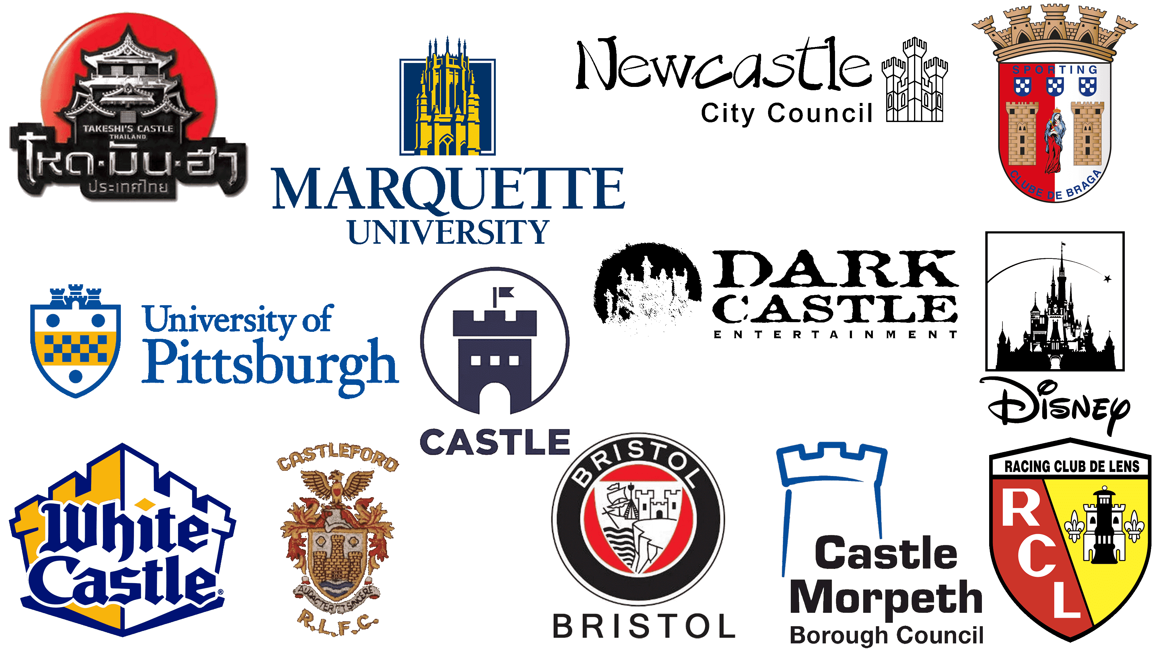
Below are some of the most striking and memorable company logos from various industries, united by a common symbol: the castle
White Castle
![]()
The White Castle fast-food chain’s logo represents a medieval castle through simple, expressive graphic techniques. The castle form is represented by a stylized outline of towers and fortress walls, executed in bright, appealing colors: blue, white, and yellow. The castle imagery connects directly with the brand’s name, emphasizing the tradition and reliability associated with a fortress.
The company is considered one of America’s original fast-food establishments, and using a castle in its logo symbolizes durability and stability. The typography visually echoes old castle architecture, creating a harmonious impression of unity between text and graphics. The castle image associates the brand with reliability and hospitality, inviting customers to feel like welcome guests in small “white castles,” where the signature burgers are served.
Castleford Tigers
![]()
The rugby club, formerly known as Castleford R.L.F.C., proudly featured a classic medieval castle on its logo from 1926 to 1991, symbolizing protection, strength, and the historical heritage of its hometown. The castle is rendered with attention to detail: powerful towers and brickwork recall the long history of Castleford, which was formed around castle fortifications and river routes, represented on the logo by blue waves.
Above the emblem, an eagle with spread wings traditionally symbolizing bravery and pride, highlights the team’s ambitions and fighting spirit. The logo’s color palette, featuring gold and red shades, reflects the richness of local traditions and emphasizes the club’s historical significance, founded in 1926 and firmly rooted in English rugby culture. The Latin motto, “Audacter et Sincere” (“Boldly and Sincerely”), enhances the castle’s image as a symbol of resilience and loyalty to the club’s and the city’s values.
University of Pittsburgh
![]()
The University of Pittsburgh’s emblem is crowned by three stylized castle towers, symbolizing tradition and the solidity of knowledge. The towers are harmoniously woven into the top outline of the coat of arms, resembling a crown and signifying the educational institution’s status as a respected and reliable center of education and science.
The coat of arms’ color scheme, blue and yellow, repeats the university’s traditional colors. Its central section features a checkered pattern, emphasizing the university’s historical significance to the region and its strong connection to the city of Pittsburgh. The restrained and classical typography of the university’s name complements the emblem organically, conveying the academic rigor and dignity of an institution known for its scientific achievements and deep ties to regional history.
Walt Disney
![]()
The silhouette of a fairytale castle has become a famous company symbol associated with a world of magic, dreams, and fantasy. Its prototype was the legendary Neuschwanstein Castle, built in the 19th century in Germany by King Ludwig II, which inspired Walt Disney to create his symbol. The castle in the Disney logo symbolizes open gates to a magical world filled with enchantment and friendly stories.
The company first presented the castle image in 1985, nearly 20 years after its founder’s death. The castle has become the hallmark of animated films and theme parks, where it is often constructed at full scale. It represents childhood and fairytales, reflecting the studio’s creative ambitions to bring fantasy and dreams into reality. The castle is depicted alongside a falling star in the logo, evoking wonder and reminding viewers that there is always room for magic and friendly adventures in the company’s stories.
Castle Pubs
![]()
The Castle pub chain placed a massive castle tower with a small waving flag in its logo. The tower is surrounded by a thin circular outline, open at the bottom, creating the illusion of an inviting entrance. The design reflects the pubs’ historical connection to the hospitality traditions of old English castles, where travelers could rest, feel safe, and experience the warmth of a home-like atmosphere.
The castle image directly references Britain’s centuries-old traditions, where ancient fortifications served as gathering places, sites for celebrations, and centers of community interaction. The pub chain carefully preserves this atmosphere of the past, offering visitors a quality leisure experience and immersion in a unique historical environment filled with the spirit of English traditions. The emblem’s calm, deep blue color palette adds stability, comfort, and confidence to the image.
Castle Morpeth Borough Council
![]()
Castle Morpeth Borough Council chose the symbol of a castle tower, depicted in simple yet confident blue lines, highlighting a modern approach while honoring the region’s historical roots. The tower references the famous Morpeth Castle, around which the town developed, becoming an important landmark and cultural hub over many centuries.
Morpeth is known for its medieval heritage; the fortress was the core and symbol of safety for the local population, with its walls helping residents survive turbulent times and fostering a sense of security and order. These qualities are reflected in the visual style of the borough council’s tower symbol. The font used in the logo adds simplicity and confidence to the overall perception, combining the ancient symbol with a contemporary style.
Bristol
![]()
Bristol’s emblem features, at its center, a small but expressive silhouette of an old castle on a cliff. The castle is a historical allegory. Bristol originally grew as a fortified settlement, relying on the strength of its walls and towers, which for many years provided protection and symbolized the city’s stability.
The club selected the castle image to highlight its connection to the region’s history. The depiction in the team’s logo conveys reliability and strength, reminding one of times when the city was a key port and defensive center in England, controlling shipping and trade routes. The fortress on the cliff symbolizes the team’s determination to maintain its position and withstand opponents’ pressure. The graphics featuring the castle and ship convey Bristol’s maritime heritage, with the castle central to the city’s defense and ships symbolizing prosperity and commercial success.
Takeshi’s Castle Thailand
![]()
The Takeshi’s Castle Thailand logo features a stylized Japanese castle rendered in silver and black, evoking the show’s inherent sense of mystery and adventure. The castle is set against a crimson circle, reminiscent of the rising sun, Japan’s national symbol, and the homeland of the show’s original format.
The castle symbolizes challenge and impregnability, reflecting the essence of the program, where participants must overcome diverse obstacles and tests to reach the final stage. The metallic, slightly three-dimensional lettering in the logo enhances the sense of strength and determination, aligning with the show’s spirit, originally conceived by renowned Japanese actor and director Takeshi Kitano in the 1980s and popular worldwide. In the Thai adaptation, the castle symbol helps maintain the original’s atmosphere, bridging cultures and continuing the traditions of the legendary program beloved by audiences for its vivid emotions and competitive excitement.
Marquette University
![]()
Marquette University’s logo combines the rigor of the Gothic style with an atmosphere of academic dignity and grandeur. The emblem’s central feature is an architectural silhouette of a castle tower rendered in bright yellow against a deep blue background, evoking a tall, impregnable structure. The tower alludes to the historic Memorial Library building, one of the most recognizable symbols on campus, built in the early 20th century. It represents the university’s cultural traditions and pursuit of knowledge.
The tower on the logo conveys a sense of upward aspiration, emphasizing the intellectual ambitions of the university’s students and faculty. The university’s rich history and traditions are naturally reflected in the emblem’s formal and classical execution. The font accompanying the graphic element is elegant and restrained, enhancing the institution’s overall impression as an authoritative educational center with deep historical roots and a strong academic reputation.
Sporting Clube de Braga
![]()
Braga is one of Portugal’s oldest cities with a rich cultural heritage, steeped in historical spirit and religious traditions. The city is famous for its numerous churches, monasteries, and ancient structures, with Braga Castle, also known as Castelo de Braga, being one of the central ones. The two majestic towers of this medieval castle are precisely placed at the heart of the Sporting Clube de Braga emblem, symbolizing strength, protection, and continuity.
The castle on the club’s crest pays tribute to Braga’s historical past, where castles supported and defended the city. The club seamlessly incorporates this castle-architecture heritage into its logo, emphasizing its connection to the city and its ancient traditions. The fortress represents reliability and steadfastness, reflecting the team’s character on the soccer field.
Dark Castle Entertainment
![]()
The logo of Dark Castle Entertainment immerses viewers in a mysterious and Gothic atmosphere. The castle’s outlines appear to have been drawn with charcoal strokes, forming an image of an abandoned fortress shrouded in fog. The artistic style resembles old engravings and mystical illustrations, evoking the mood of classic horror films for which the studio is renowned.
The name refers to the legendary horror director William Castle, who inspired the studio’s founders to produce atmospheric, dark films. The castle symbolizes mystery and seclusion from the outside world, visually embodying the studio’s films’ genre direction, which evokes uncertainty and suspense. The irregularly edged font enhances the sense of anxiety and mystery, conveying to viewers the mood of the company’s cinematic narratives.
Newcastle City Council
![]()
Newcastle City Council’s logo features a sketch of a three-towered castle drawn in thin lines reminiscent of antique engravings. The castle image derives from the city’s history, which began around a medieval fortification that gave Newcastle its name and symbolism.
The castle in the emblem refers to the city’s origins, cultural heritage, and the historical significance of the fortress that once guarded England’s northern borders. The three towers symbolically reflect the residents’ resilience, strength, and unity in preserving their historical memory. The name on the logo is rendered in a light, informal style reminiscent of handwriting, emphasizing the city’s friendly, open character. The contrast between the castle’s strict lines and the logo’s informal lettering conveys a balance between preserving historical heritage and the city’s contemporary, dynamic growth.
Lens
![]()
The French soccer club Racing Club de Lens uses the image of a castle as an important symbol on its crest. The castle tower is depicted in a strict heraldic style, creating an impression of tradition and reliability. Flanking the castle are two lilies, symbols of royal dignity, pointing to the rich past of the Artois region, where the city of Lens is located.
The castle references Lens’s history as a fortified town with defensive structures crucial for protecting northern France. Using the castle in its emblem, the club connects to the city’s historical past and underscores the team’s identity. The abbreviation RCL appears on the contrasting red half of the crest, balancing traditional symbolism with modern style.
Conclusion
Castles in logos create imagery that can unite history and modernity, conveying strength and security for the brand. This symbol simultaneously looks to the past, recalling origins, and moves toward the future, demonstrating a company’s reliability and stability. Visually, the castle conveys confidence, authority, and resilience in the face of external challenges. This is why it remains a popular motif through which brands communicate their character and uniqueness.