


![]() Walt Disney Pictures Logo PNG
Walt Disney Pictures Logo PNG
The Walt Disney Pictures logo symbolizes an entire era of American cinema. It promises many interesting stories that viewers will see after the opening credits. However, this emblem has extended beyond theaters and is associated with various Walt Disney projects, including amusement parks.
The history of Walt Disney Pictures began in 1923, when Walt Disney and Roy O. Disney founded Disney Brothers Cartoon Studio in a Los Angeles garage. Walt had just left Kansas City after the collapse of Laugh-O-Gram Films and restarted with short films about Alice.
In 1928, the studio introduced Mickey Mouse. The first two shorts passed quietly, but Steamboat Willie drew attention as one of the earliest synchronized-sound cartoons. The character brought contracts and industry recognition.
During the 1930s, the studio focused on shorts and prepared its first feature. In 1937, Snow White and the Seven Dwarfs premiered and earned about $8 million, an unusual result for the Great Depression era. The Academy awarded Walt Disney a special Oscar, consisting of one full statuette and seven miniatures.
The following years included Pinocchio, Fantasia, Dumbo, and Bambi. Competitors like MGM and Paramount Pictures did not match the same level of animation. During World War II, the studio shifted to government commissions, then returned to film production.
In the 1950s, Disney expanded into live action with Treasure Island in 1950. In 1955, Disneyland opened in Anaheim, alongside TV work with ABC. After Walt died in 1966, Roy completed Walt Disney World in 1971, after which the studio entered a long decline.
A shift occurred in 1984 under Michael Eisner, leading to releases such as The Little Mermaid, Beauty and the Beast, Aladdin, and The Lion King. In 1996, Disney acquired ABC and ESPN. Later deals included Pixar in 2006, Marvel Entertainment in 2009, and Lucasfilm in 2012.
Meaning and History
![]()
Walt Disney himself drew the original versions of the logo. In his youth, he worked as a designer at an advertising agency and became a cartoonist, which gave him extensive artistic experience.
The company’s logo appears in the credits and adorns the entrances to popular theme parks. However, for the first 48 years, Disney had no distinctive sign: viewers saw only “Walt Disney Pictures Presents” or “Walt Disney Presents” on the screen. Sometimes, they were supplemented by Mickey Mouse’s profile, which was outlined and changed color in the animated version. In 1937, the phrase “Walt Disney Pictures” began to be used as a logo. It is still relevant, although designers have made minor changes to it.
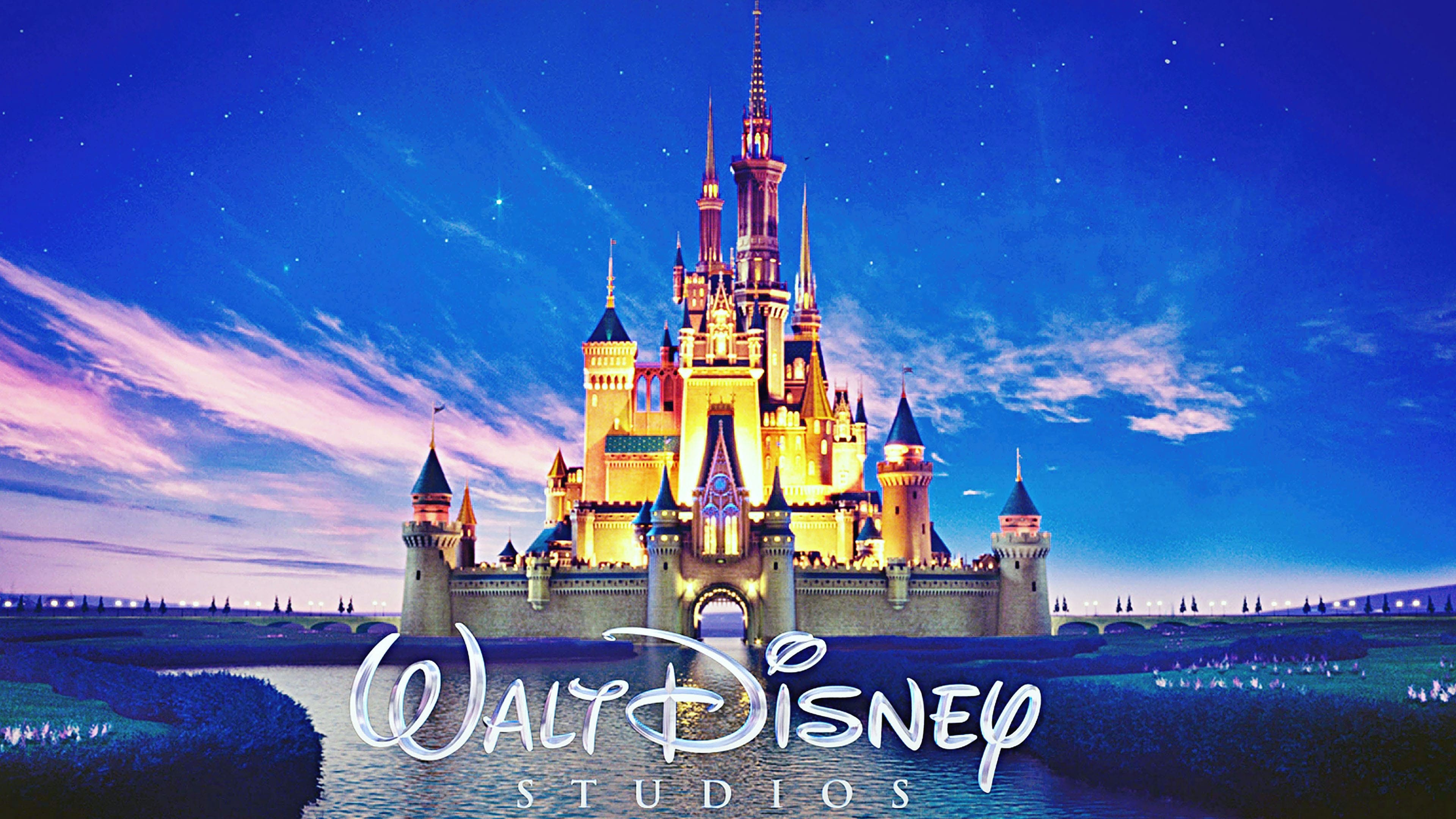
In 1985, a castle appeared on the emblem, an integral part of the brand’s visual style. It first appeared in the credits for The Black Cauldron and was already very recognizable, as the castles from Sleeping Beauty and Cinderella had inspired it.
The image has continuously transformed. Initially, it was a two-dimensional picture drawn with white horizontal lines. However, as technology developed, Walt Disney decided to show its viewers that it kept up with the times and that its graphics met the highest quality standards. This was aided by a three-dimensional logo, which Pixar created. The modernized design first appeared in 2006, when the movie “Pirates of the Caribbean: Dead Man’s Chest” was released.
What is Walt Disney Pictures?
Walt Disney Pictures is an American film production company, a subsidiary of Walt Disney Studios, which is a division of Disney Entertainment, owned by The Walt Disney Company. The brand was founded by the famous animator Walt Disney. It is located in Burbank, California. The company’s main activity is the production of live-action feature films.
1929 – 1937
![]()
Walt Disney himself helped create the brand’s first logos. One version featured the image of walking Mickey Mouse, who was already a symbol of the animation studio at the time. Above it was the phrase “WALT DISNEY PRODUCTIONS Ltd.” “MICKEY” was on the left, and “MOUSE” on the right. Under the first was the phrase “TRADE MARK,” and under the second was “REGISTERED.” The inscription “SOUND CARTOONS” occupied the next line, consisting of light letters with a dark frame. At the very bottom was the text “2719 HYPERION HOLLYWOOD.” A unique font, in most cases, an individual set of glyphs, was used for all parts of the logo.
1937 – 1948
![]()
The debut logo was one of the famous cartoonist’s signatures. Designers stylized it and enlarged it to branding size. The inscription is composed of a mix of uppercase and lowercase letters. The capital “W” and “D,” twisted, as well as the lowercase “i” and “y,” are visually reminiscent of a mouse’s ears and tail and are unique in their allusion to the main character of the Mickey Mouse cartoon.
1948 – 1979
![]()
Ten years later, the logo’s style changed, so the “Walt Disney” inscription, although it looked handwritten, no longer had an italic tilt.
1979 – 1983
![]()
A studio was launched in parallel with the general logo at this time. It was the 1937 version with the inscription “Productions” at the bottom. The additional word from the sans-serif category is executed in a smooth font.
1983 – 1985
![]()
During this period, a version appeared with the word “Productions” with serifs. The font is close to a classic universal one. But the upper inscription did not change: it is still executed in the Waltograph font.
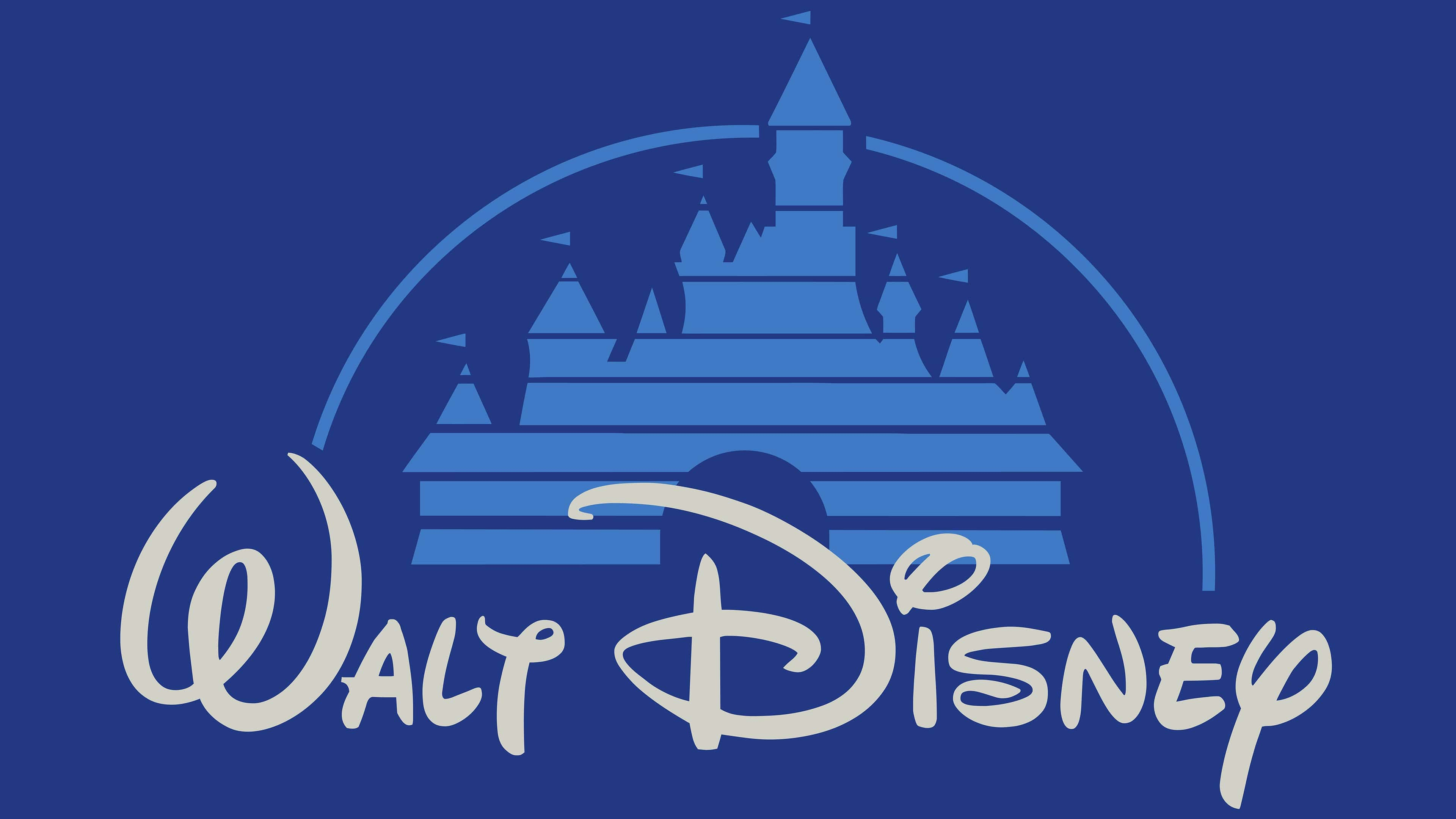
1985 – 2006
![]()
In the mid-80s, a graphic was added to the text. It is a castle located above the phrase “Walt Disney.” The film studio chose it as a symbol of a fairy tale. The palaces are depicted as horizontal stripes surrounded by a solid arch. Above each tower, there is a triangular flag.
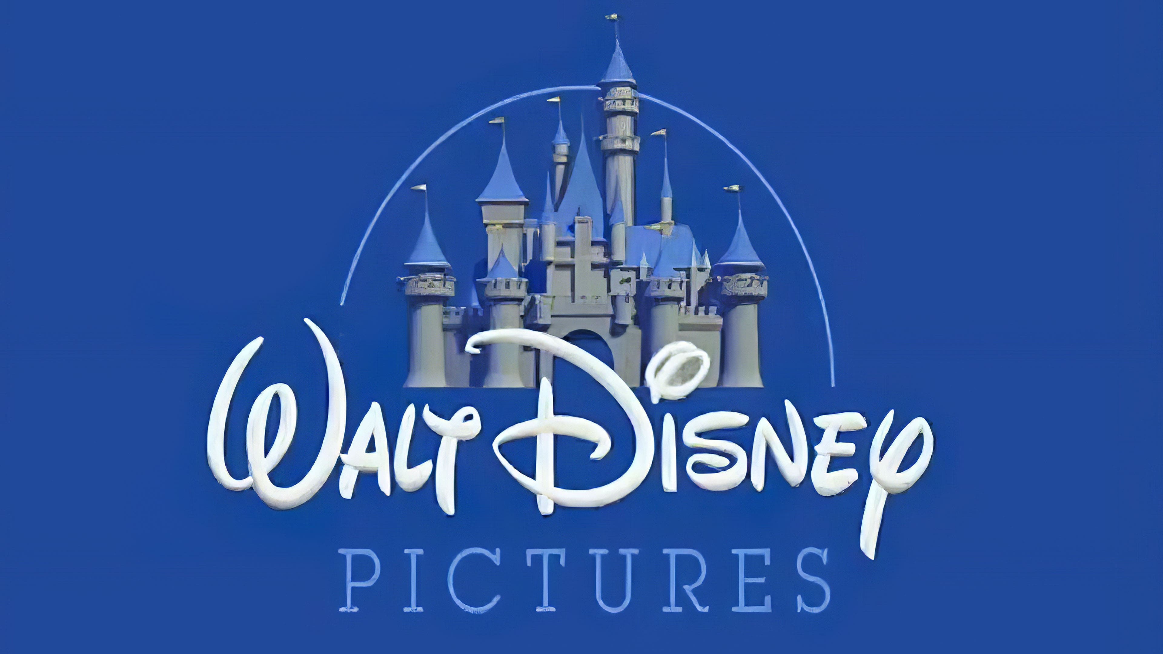
2006 – 2011
![]()
In 2006, developers proposed an emblem that visualizes magical castles: the stripes disappear, realistic details appear, wide-open gates, and a falling star hint that the film studio fulfills most fairy-tale wishes. The word “Productions” is reduced using a new cursive font, and the inscription “Walt Disney” becomes slightly thinner.
2011 – today
![]()
The current version is similar to the previous one except for the inscription. Instead of the full version, a shortened one is used: only “Disney,” the name of the animation company’s founder.
The new emblem is adorned with towers, windows, balconies, and flags. An animated star leaves a long line in the form of an arch. But the creators did not stop there and, over time, added even more details. Thus, several fireworks displays and clouds conveyed the brand’s magic. The castle, in turn, symbolizes romance, love, and fairy tales.
However, with the release of “Toy Story,” the world of cartoons changed. Animators began to accompany each cartoon with their version of the logo so that the picture matched the plot. For example, “Maleficent” is similar to the Cliffside Castle, and “Tron” is like a city of lights.
Disney 100 Logo
![]()
For its centennial anniversary, the Walt Disney Company introduced a new logo based on the classic signature of its founder. The designers took as a basis the style of the emblem first used in 1979: featuring a wide “D” with a single loop around the vertical stroke and a curly “s” with an inwardly twisted bottom end. The right side of “N” is bent to the left, the dot over “i” is a complex swirl, and “y” resembles a mouse tail. The famous cartoonist’s first name is absent in the festive emblem – only his surname is present, rendered in the proprietary Waltograph font.
The number “100” is playfully interpreted despite the serious occasion. The two zeros are connected, making them look like the huge eyes of an animated character: surprised yet unusual because they lack pupils. They also resemble Minnie’s bow and Mickey Mouse’s ears, the image from which it all began. “100 Years of Wonder” is written in a strict geometric font in the second row. All letters are uppercase, bold, and sans-serif. They harmoniously combine sharp angles and smooth curves. The lines are aligned on both sides and colored in black to emphasize the solemnity of the round date.
Font and Colors
The graphic element of the logo was introduced in 1985. It became an image of a fairy-tale castle since the animation studio is associated with magic, princes, princesses, kings, and queens. Initially, the palace looked constructed, but another, more tangible and realistic image appeared. According to the designers’ idea, it still changes depending on the plot of the cartoon or film.
The colorful image is accompanied by the phrase “Walt Disney Pictures.” The company’s name appears in early versions of the emblem, though the style has noticeably changed since 1937. There is an opinion that the phrase “Walt Disney” is nothing more than the owner’s brand signature. However, some are ready to argue with this, as the famous animator’s autograph looks completely different on old letters and postcards.
Like many animators, Disney had several signatures, including Roman or print. Moreover, he constantly improved them, almost as if he were redesigning Mickey Mouse. Until the early 1970s, the logo included one of the old versions, with careless lines and connected letters. A few years after Walt Disney’s death, the new leaders decided to use the original version.
The studio owner left behind many handwriting samples. Based on them, designers developed a universal word sign – most likely hyperbolic and stylized. They chose the most memorable signature with the strange letter “D.” The other symbols are also unusual: “T” resembles “Y,” and the dot above “I” looks like a large circle, crossed diagonally.
The media conglomerate has never had an official font, but in 2000, typographer Justin Callaghan attempted to recreate it from existing inscriptions. He developed two versions of the Waltograph: bold and regular, with lowercase and uppercase letters. Walt Disney Company noted that if Mickey Mouse were to write memoirs, he would choose the Waltograph font.