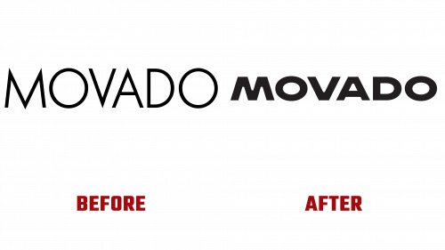
Movado, an iconic name in the luxury watchmaking industry, has unveiled a new logo and brand identity, marking a significant milestone in its history that dates back to 1881 in Switzerland. This rebranding reflects Movado’s ongoing commitment to marrying innovative design with timeless elegance, a philosophy deeply ingrained in the brand’s heritage.
The new logo symbolizes Movado’s evolution while staying true to its rich design innovation and excellence legacy. Renowned for pioneering watchmaking, Movado has earned over 100 patents and 200 international awards. Its designs, particularly the Museum® Watch with its minimalist single dot dial, have garnered critical acclaim and found a place in the permanent collections of museums worldwide, cementing Movado’s status as a paragon of modern watch design.
Central to Movado’s refreshed identity is the Museum Dial, designed by Nathan George Horwitt in 1947. This iconic dial, inspired by the midday sun, is a manifestation of Movado’s pursuit of radical simplicity. The updated logo encapsulates this design ethos, symbolizing the brand’s philosophy of minimalism and purity in design.
To complement its new identity, Movado collaborated with the typefoundry Schick Toikka to create ‘Movado Sans,’ a custom typeface that aligns seamlessly with the new wordmark. This collaboration underscores the brand’s dedication to artistry and craftsmanship, which have been foundational to Movado since its establishment.
The unveiling of this new brand identity coincides with a timeless brand campaign. This campaign celebrates Movado as a cultural and universal timekeeper, featuring a diverse group of individuals connected by their love for Movado’s iconic timepieces. The campaign honors the brand’s legacy of simplicity, harmony, and iconic quality by intertwining Movado’s past and present narratives.
The reimagined Movado logo marks a departure from its previous version, which struggled with balance and letter spacing, failing to resonate with the brand’s luxurious essence fully. The new logo, characterized by its extended structure and bespoke wordmark, effectively addresses these issues. The design elements, including the angular letters with wide open joints, impart an industrial yet refined feel, echoing Movado watches’ robust and sophisticated nature.
The minimalist icon, drawn from Movado’s signature dot, subtly yet powerfully represents the brand’s identity. The custom typeface, marrying elegance with modernity, enhances the wordmark’s extended structure, adding distinctiveness to the brand’s visual language.
Initial campaigns using the new identity feature luxurious photography accentuating Movado watches’ minimalism with a warm, inviting aesthetic. The layouts subtly integrate the wordmark and icon, amplifying the brand’s elegance. An anthem video for the campaign further reinforces this image with its whimsical music and dynamic visuals.
This substantial rebranding ushers in a new era for Movado, aligning the brand more closely with the quality and prestige of its products. By embracing a design that achieves much with minimal elements, Movado reaffirms its status as a leader in the luxury watch market.


