M&T Bank Logo

M&T Bank LogoM&T Bank Logo PNG

The M&T Bank logo represents a company with large assets focused on capital growth. The emblem emphasizes the age, experience, and knowledge accumulated within the institution over its more than 150-year history.

M&T Bank: Brand overview

On August 29, 1856, two successful Buffalo businessmen, Pascal Pratt and Brownson Ramsey, founded the Manufacturers and Traders Trust Company in Buffalo, New York. This marked the beginning of M&T Bank. The institution was created to support the city’s rapidly growing industrial sector, which thrived thanks to its strategic location along the Erie Canal.

In its early years, the bank focused on supporting local manufacturers and traders by providing essential financial services to help grow their businesses. The founders’ cautious approach to risk management enabled the institution to navigate multiple economic challenges in the following years.

During the American Civil War (1861–1865), the bank demonstrated resilience by continuing to serve its clients despite economic instability. It funded the Union’s war efforts, solidifying its reputation as a reliable financial partner.

By the late 19th century, the institution experienced steady growth. It expanded its reach through additional branches and diversified its services. During this period, the bank also enhanced its commercial lending operations and introduced home loans, further cementing its role in the local economy.

The early 20th century brought both opportunities and challenges. Its ability to weather the financial panic of 1907 strengthened public trust. During the 1920s, the bank expanded into asset management and trust services, broadening its portfolio to meet evolving customer needs.

The Great Depression of 1929 posed a major challenge to banks nationwide. However, the institution’s strong capital reserves and prudent risk management helped it endure the crisis. It acquired several smaller banks during this time, strengthening its market position.

The bank supported economic growth following World War II by financing local businesses and housing development. In the 1950s, it began modernizing its operations with new data processing technologies, improving efficiency and customer service.

Significant growth occurred in the 1960s and 1970s as the bank expanded beyond Buffalo, acquiring institutions across New York State. These acquisitions laid the foundation for future growth through mergers and acquisitions.

A major milestone was listing the bank’s shares on the New York Stock Exchange in 1983, which provided new opportunities for capital and expansion.

The 1990s were defined by aggressive expansion. Notable acquisitions included Olympian Bank in 1994 and East New York Savings Bank in 1990. These deals helped the bank establish a stronger presence across New York State.

In the early 2000s, the bank grew by acquiring institutions in neighboring states. The 2003 acquisition of Allfirst Financial was particularly significant, allowing the bank to enter markets in Maryland, Pennsylvania, and Washington, D.C.

From 2010 to 2020, the institution completed several high-profile acquisitions, including Wilmington Trust in 2011, which boosted its corporate services and wealth management capabilities. The 2015 acquisition of Hudson City Bancorp expanded its footprint into New Jersey.

One of the largest acquisitions in its history occurred in 2021 when it purchased People’s United Financial for $7.6 billion. This deal significantly enhanced its presence along the U.S. East Coast and extended its reach into New England.

Over its 150-year history, the institution has transformed from a small local bank into a leading regional financial entity. It has achieved this growth while adhering to its core principles of careful risk management and a commitment to exceptional customer service.

Meaning and History

M&T Bank Logo History

What is M&T Bank?

This American bank operates regionally and offers standard banking services such as checking and savings accounts, mortgage loans, auto loans, and financial advising. The bank serves individuals and small and medium-sized businesses. It has branches in several states on the East Coast and provides online banking and mobile apps for convenient account management.

Old

M&T Bank Old Logo

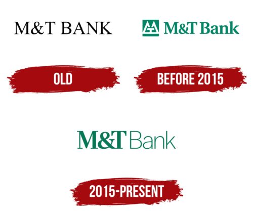
The company’s first emblem is distinguished by simplicity and ease. The thin black lettering “M&T Bank” symbolizes a small company that did not require extensive marketing support. In its early stages, the business focused on entrepreneurs, and its operations did not necessitate a complex advertising strategy. For this reason, the name and logo were chosen, presenting a modest yet confident style.

The abbreviation “M&T” stands for “Manufacturers and Traders,” reflecting the primary purpose of the bank’s creation—to serve manufacturers and traders in an industrial city. This name emphasizes the company’s focus on supporting local entrepreneurs and their financial service needs.

before 2015

M&T Bank Logo before 2015

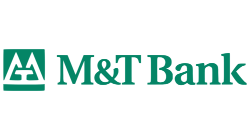
The bank’s logo has changed and now includes a green square, which has become the foundation of its visual identity. At the center of the composition is a large letter “M,” shaped into two mountain peaks, conveying the company’s strength and stability. Next to it is a small letter “T,” resembling a table and an anvil against the backdrop of mountains, evoking associations with power and reliability. This imagery references the bank’s office in a massive 21-story building in downtown Buffalo, an important industrial hub.

The green color connects money and financial operations, while the square suggests safety—symbolizing the protection of funds and valuables. To the right of the symbol is the company’s name. The font has become more pronounced, and “Bank” is written with a capital letter, emphasizing the company’s solidity and long-standing traditions.

2015 – today

M&T Bank Logo

The brand underwent a refresh after Robert Livingston Fryer was appointed bank president. The company’s abbreviation is now displayed in large bold letters, drawing attention to the name and making it stand out among other elements. On the right side, the company’s activity area is indicated using thin symbols, creating a harmonious contrast. The color scheme was updated: the green shade became darker, reflecting the company’s experience and work with large financial assets.