 MTA (Metropolitan Transportation Authority) Logo PNG
Business-like, strict, technical – all these describe the MTA (Metropolitan Transportation Authority) logo. Such characteristics make it a practical sign, conveniently placed on everything related to roads and passenger transport. It’s no wonder it represents an extensive network, demonstrating the reliability of one of the largest transporters in the USA.
MTA (Metropolitan Transportation Authority): Brand overview
Meaning and History
This organization was created to regulate road and transportation facilities and to ease the control of the flow of passenger automotive and railway equipment for suburban directions. It helps maintain all transportation routes located in the state of New York and the surrounding regions and assists in monitoring the condition of the vehicle fleet. Under its jurisdiction are the subway, tunnels, and several toll bridges.
The idea for establishing the corporation was proposed by Governor Nelson Rockefeller, and it was expanded at the initiative of John N. Dempsey. Naturally, the MTA logo is uniform across all branches, subsidiaries, and technical parks. The company also pays significant attention to advertising, so its emblem is adapted to the requirements of modern digital technologies: it’s flat, minimalist, and easily scalable.
What is MTA (Metropolitan Transportation Authority)?
MTA (Metropolitan Transportation Authority) is an organization that manages traffic flow and passenger transport on roads and railways in the state of New York and several nearby territories. It is the largest structure in the field of public passenger transport in North America. Under its control are roads, bridges, tunnels, and the subway. The corporation was established in 1965 with its headquarters in New York City and was expanded in 1967.
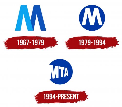
1967 – 1979
The logo, designed by Unimark International, is extremely simple. It uses a single glyph composed of several letters. Almost the entire abbreviated name Metropolitan Transportation Authority – MTA – is encoded in it. The symbol looks like two “A”s without a crossbar. To emphasize this, the designers colored them: the left letter is sky blue, and the right one is cobalt blue. They are positioned in such a way that they form a capital “M” with a wide and low middle. The font is custom, even, geometric, choppy, with smooth edges.
1979 – 1994
A redesign brought a radical transformation to the MTA logo. Now, it features only one letter – “M,” the first in the name of the transportation organization. It appears as a classic symbol at the entrance to the subway. The glyph remains solitary, large, wide, bold, and choppy, but it is painted in one color – white. The background is a dark blue circle.
1994 – today
Retaining the cobalt-colored disc, designers from the studio Siegel+Gale changed the interior part of the emblem. They inscribed all three glyphs of the abbreviation, and to fit them compactly without losing readability, the developers arranged them in decreasing size order. That is, the first letter is the largest, the second is medium-sized, and the third is the smallest. Such diversity helped to organize the space properly, despite the fact that the left part of “M” merged with the edge, making the circle open: it literally goes beyond the bounds of the emblem.
Font and Colors
Helvetica is the official font of the modern MTA (Metropolitan Transportation Authority) logo. The geometrically even letters perfectly fit into the strict style of visual identity. They are bold and do not contain serifs. In the first versions, the typeface was custom.
The corporate palette of the brand is built on several shades of blue: sky-blue, neutral, and cobalt. All of them complement white excellently, serving as its background or, conversely, acting as the primary color, as they are used for the text.
