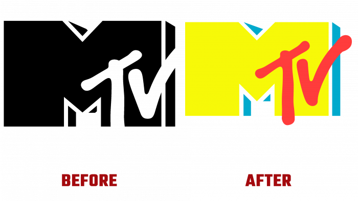
The MTV TV channel, known and popular among the youth today, has carried out a rebranding, creating a more attractive visual identity. Having started broadcasting back in 1981 as an entertainment music TV channel, it became the basis for the formation of pop culture. Its unique and interesting content for different ages, with modern ways of transmitting information, has covered almost all of these forms. Today MTV is broadcast on television, the Internet, and other platforms. In February 2021, the channel went on air with a new logo developed by New York-based design agency Loyalkaspar. Its active use in its full version was carried out on September 21 at the Video Music Awards, where the awards ceremony took place.
The new logo has significantly improved the viewer experience while increasing its readability when used on a small screen, on the Internet, or in external advertising media. The emblem was designed in two versions – full color and monochrome. Each of them performs its task. Color is the main one, keeping the classic palette of blue, red, and yellow. For its high-quality reflection, a black background is used to provide the required visual contrast. The one-color version, which has “lost” its dimension, is placed where it is required to avoid the three-dimensional effect. The logo is used in commercials and streaming services in various divisions where the channel is broadcast.
The font Gravity Grotesk (custom-designed) was used to reflect the abbreviation of the name. But the very graphic design of the name has undergone some changes. The letter “T,” placed on the inner surface of the right leg “M,” has acquired a slightly larger size. Its leg crosses the border “M,” and the upper one has shifted slightly higher. Thus, the letter demonstrates more naturalness and independence of the mapping. The center letter “M” has a slight slope, making it smoother and more streamlined when displayed on the screen. The right-hand “V” extends beyond the “M” as in earlier versions of the logo. But due to the decrease in thickness, the combination “TV” has acquired a neatness and even a certain gracefulness, making the entire logo more aesthetically pleasing.
Such changes made it possible to preserve a wide margin to make additions, expanding the visual information content of the logo in the future. This is ensured by its versatility and flexibility in harmonious combination with any images, graphics, and color palette.


