Munson, Utica’s internationally recognized fine arts center, has unveiled a striking new identity, including the Munson logo’s new design, capturing the organization’s rich heritage and multifaceted artistic pursuits. Founded in 1919 as the Munson-Williams-Proctor Arts Institute, Munson’s lively presence has graced the arts scene with its museum, performing arts facilities, and a nationally accredited art school in partnership with Pratt Institute.
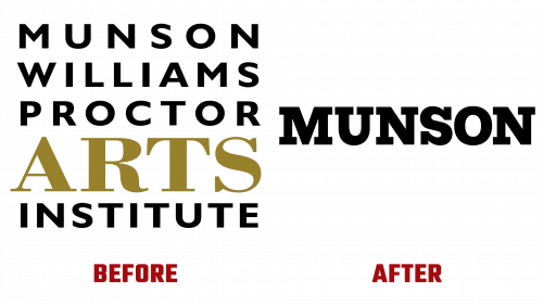
The original Munson logo, though functional, was beset with issues like uneven letter spacing and bland typography. It did its job but lacked the artistic refinement that one might expect from such a distinguished arts center. While not glaringly unattractive, it failed to resonate with Munson’s artistic soul.
The latest Munson logo is a minimalist triumph designed by Brooklyn’s Order. It resonates with Munson’s character and mission while drawing from the existing museum signage. The new logo is tastefully understated and features a simple yet commanding slab serif. Though not a sensational design, its beauty lies in its meticulous craftsmanship, including careful weight selection and precise kerning.
A standout element of the Munson logo new is a minimalist icon tailored for the Museum of Arts. This icon pays tribute to the building’s unique architectural style, specifically emphasizing its roof. The aerial viewpoint might not be instantly recognizable, but the building’s grid structure clarifies the association. Characterized by simplicity, boldness, and versatility, this icon stands out in various uses, from social media profiles to website favicons.
Accompanying the wordmark, the full slab typeface and matching sans serif add a touch of elegance. While not ground-breaking, they are executed skillfully, featuring subtle variations in thickness and distinct letter flaring, contributing a unique yet refined look.
Inspired by vintage Munson bulletins, the identity’s vibrant color palette adds another layer of intrigue. This multi-color approach, often considered risky, has been deftly applied here, providing flexibility and avoiding the trap of color monotony. When paired with the lively treatment of the typeface, this palette ensures that even the sub-brands exude vibrancy.
Munson’s new logo and identity offer a masterful blend of the traditional and the contemporary, connecting the institution’s esteemed past with its promising future. Its minimalism is balanced by a liveliness that reflects Munson’s serious commitment to art without falling into dullness. The fresh look stands as a fitting symbol for Munson, a cornerstone in Utica’s cultural landscape for over a hundred years, ready to inspire and nurture art enthusiasts for generations to come.


