Murray’s Cheese, a New York City institution since 1962 renowned for its vast selection of cheeses, has rolled out a new brand identity and enhanced digital platform. This move, orchestrated by Base Design, aims to transition the beloved local shop into a brand recognized nationwide while boosting its e-commerce presence to engage a global audience.
This rebrand emphasizes Murray’s longstanding cheese expertise and commitment to community engagement. The update introduces a modernized logo and an array of digital enhancements designed to make Murray’s vast cheese knowledge and unique offerings more accessible to a wider audience online.
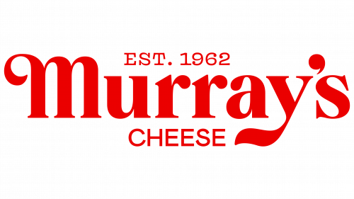
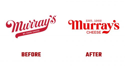
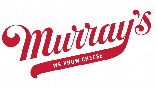
The redesigned logo modernizes the previous one while maintaining elements that honor the brand’s heritage. The earlier logo, a creation by Pentagram in the early 2000s, featured a classic script that is timeless and elegant. However, the updated logo shifts to a bold, high-contrast serif typeface that retains playful swashes in letters like ‘m’ and ‘y’, blending the brand’s traditional whimsy with modern flair. This new design improves readability and adaptability across digital platforms. It includes “est. 1962” to highlight Murray’s long history and expertise in the cheese industry, while the word “CHEESE” under the logo clarifies the brand’s focus.
The color scheme also sees a significant change, with a vibrant red hue now dominating, symbolizing passion and vitality aimed at drawing a diverse, modern crowd.
The typography strategy employs Colophon’s Brick Pro for the main text, offering a robust yet approachable feel, while Mabry complements this for more detailed content. Other typefaces like Vulf Mono and Kestrel Script add variety and texture, enhancing the brand’s visual language.
A novel feature of the new branding is the introduction of anthropomorphic cheese illustrations. These characters represent Murray’s cheese experts and make the cheese selection process engaging and educational. These illustrations serve as brand ambassadors, adding humor and a personal touch to customer interactions.
The overall redesign spans all elements, from packaging to online interfaces, creating a unified and seamless user experience. The new website mirrors the charm and expertise of the physical store, providing an intuitive and informative online shopping experience.


