The Mush company, although young, is very promising. Connoisseurs of delicious snacks and light, healthy breakfasts are very fond of all the brand’s products.
Recently, the owners of the company had an idea to update the identity, including the logo. To make the image of healthy food more fashionable, spicy, youthful, and popularize your products.
The main advantages of the brand are that the focus is on exceptional ingredients, without gluten and dairy components, and the fact that the line has a wide range of flavors – from classic vanilla to coffee-coconut.
Under the idea of a new kind of product that does not need to be cooked to eat, there is a veiled message to customers – you do not have to strain to provide yourself with breakfast, open our jar and enjoy the flavors.
In America, where the cult of delicious and high-calorie food reigns, this healthy approach becomes innovative and unusual. And this is by no means a vegan distribution brand. This is a company that cares about its consumers at the level of health.
According to the Mush website, the idea behind this line of products is based on the belief that “the best food gives the best results,” meaning that with a good energy charge, a person feels better and can reach their full potential.
Surely the new brand design will reveal the marketing potential of ready-to-eat products because the new interesting logo is already on all digital media and the packaging.
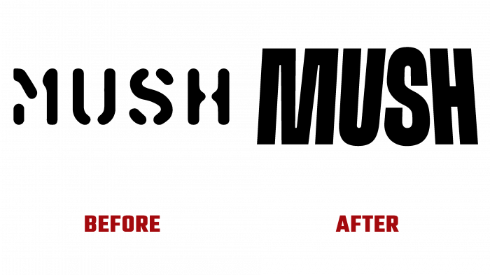
Let’s start the analysis by saying that the previous logo looked like the labeling of some grocery set. It is a typographic font with distinctive letter gaps. As for the color, the radical black color emphasized the association with the inscription on the bags in which all kinds of dry rations were carried on ships.
From now on, the logo is black and without accents, smooth, and has clear boundaries. The most important feature is that the letters are arranged so that all the letters tend to the middle, leaning tightly against each other.
The modern logo looks original and unexpected. Font logos are often chosen for products, which form drops, petals, tubes, waves, and crumbs. In this case, the logo does not imply that the manufacturer is associated with food. Perhaps this is even for the best because the intrigue remains, and the buyer should delve deeper into the understanding of the brand to understand how the product will benefit him.
In general, we can say that the very presence of the logo in isolation does not give anything except the idea of some kind of exclusiveness, dynamics, an interesting plot. When the logo is shown on the media and is presented on different advertising layouts and even the corresponding colors of different snacks, a completely new picture is presented to the buyer.
The design comes to life; the letters begin to speak with consumers. Isn’t this the best tactic for building communication with your target audience?
Without unnecessary symbols and pompous accents, an unobtrusive letter logo will completely fall into the focus of consumers’ attention and make the brand even more popular.
…


