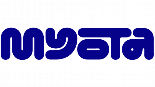
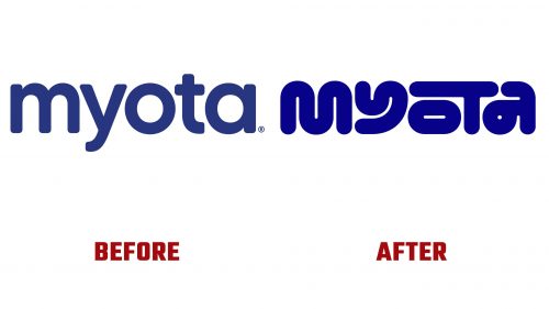
Myota Health, a pioneering UK-based gut health company, has announced a fresh new brand identity, including the distinctive Myota Health logo, developed in collaboration with London’s Kuba&Friends. This strategic rebranding reflects the company’s commitment to scientific innovation and its unique position in the market as the creator of the world’s first patented fiber blends designed to enhance physical and mental health.
Launched initially in beta in 2022, Myota Health was founded by scientists. It emphasizes its products’ direct derivation from scientific research rather than merely being “science-backed.” The range of fiber blends, available in various forms, including powders and fiber bars, aims to foster a healthy gut microbiome and the myriad benefits associated with gut health.
Recognizing the need for a coherent and impactful brand presentation, Myota Health partnered with Kuba&Friends to undertake a comprehensive rebranding. The collaboration also saw contributions from Silas Amos on brand strategy and Alec Tear on design animation and art direction, resulting in a logo that combines playfulness with a scientific underpinning. The logo’s custom mixed-case, mono-linear typeface features distinctive curves that subtly hint at the intestinal tract, making it visually engaging and meaningful.
The new logo’s quirky and friendly design addresses the delicate balance required to communicate the scientific basis of Myota Health’s products while remaining accessible and memorable to consumers. The logo’s animated version adds fun, with stroke paths that take unexpected turns, inviting viewers to engage more deeply with the brand.
Beyond the logo, the rebranding introduces a versatile visual language inspired by the unique letter widths of the Myota Health logo, allowing for creative applications across various brand materials. The supporting typography, Roobert by Display Type Foundry, complements the logo with its mono-linear geometric sans-serif typeface, mirroring its playful yet precise character.
The rebranding’s color palette steers away from traditional health industry hues, opting for warm tones that suggest health without the clinical associations. Choosing “metabolic green” and “gut pink” adds a unique touch to the brand’s visual identity, even as naming colors creatively sparks debate.


