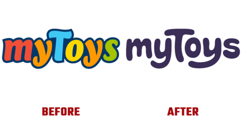
The well-known online store for children’s goods, which is part of the Otto Group, revised its identity at the end of summer. The reason is in the prospect of growth because, in the near future, it will become a marketplace. With the help of the new logo, the brand decided to strengthen its position in the market and retain the age segment of customers. Therefore, his new emblem is no less colorful than before but more serious than before.
This is the second redesign in the history of the main children’s store in Germany. According to a press release, his goal is to get a modern style that preserves the concept of the myToys company. As a result, the creation of the logo went in parallel with a survey of target groups and with project research. Strichpunkt created the corporate design in partnership with muse case and We Sound. Guided by the wishes of consumers, she received a logo that expresses joy.
The feeling of high spirits is conveyed in the smooth curves of the letters, which resemble a smile. It is clearly reflected in the “s” and in both “y.” Surprise and admiration are seen in the “o,” and the large “T” hints at caring for those who are less. In general, the online store intends to continue working in this direction, focusing even more on the children’s audience.
The font used for the new logo is a sans-serif bubble font. Now all signs have rounded ends and removed the blue border, which subconsciously held back emotions. However, now the glyphs are free: they are at the optimal distance from each other and are not limited by anything. Behind them – only a bright yellow background, painted in the color of the warm sun. The only thing that the developers have kept is a square. It has the shape of a classic children’s cube and is associated with the game.


