The vigorous activity allows the organization to rise higher and higher towards the sun – says the NAB logo. The emblem is filled with energy and a desire for leadership. And success is based on knowledge and sober calculation.
NAB: Brand overview
| Founded: | 1982 |
| Headquarters: | Melbourne, Australia |
| Website: | nab.com.au |
Meaning and History
The basis of the initial structure that laid the foundation for nab (it is in this version that the current name is written) was two progenitor companies. The first is the National Bank of Australasia, and the second is the Commercial Banking Company of Sydney. Together, they formed a finance corporation that was later transformed into National Australia Bank. The former banks’ identity has not been preserved since the newcomer started everything from scratch.
The inflow of money supply after the merger helped the significant expansion of offshore companies. At the end of the 20th century, NAB opened its own offices in Beijing, San Francisco, New Delhi, Atlanta, Athens, Seoul, Shanghai, and many other major centers globally. He also acquired Scottish and Irish banks, changing their logos.
The most difficult period in his activity fell from 2000 to 2005, when he was forced to sell his assets. This marked the beginning of a new stage in the bank’s development with a logo redesign. There were two of them in total.
What is NAB?
This is the acronym of the National Australia Bank group of monetary institutions, which is part of The Big Four. It was formed in 1982 due to the merger of two large banking institutions. In the 1990s, NAB expanded outside of Australia, opening branches in Asia, Europe, the United States, and the United Kingdom.
1982 – 2006
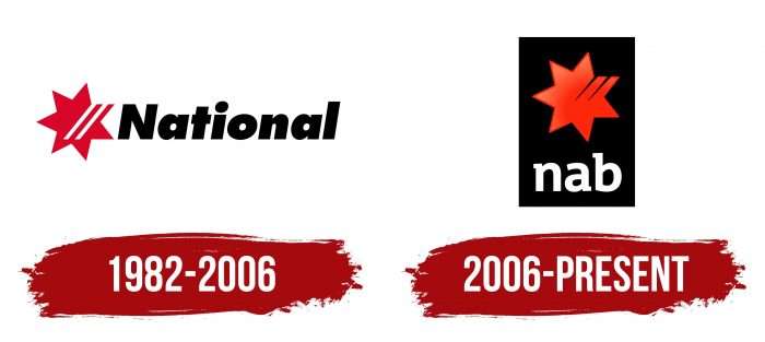
National Australia Bank emerged due to the mergers of the largest financial structures and significant banking market players. He received a personal logo – laconic, discreet, but meaningful. The logo was divided into two parts: the first was a personal distinguishing sign (left), the second was a grotesque inscription (right).
The graphic designation was a seven-pointed red star with two white stripes. They began on one of the rays and went far beyond the middle but did not reach the opposite edge. Next to it was the word “National.” It was written in lowercase letters, except for the first one: “N” was capitalized. Simultaneously, “l” surpassed everyone in height, yielding only to the point above “I,” which was very large.
2006 – today
After the bank went through the hardest period of its career, it again began to rebuild and began with a logo redesign. The star is repainted from red to orange and moved from a white background to black in the current version, so it looks very catchy and advantageous. But the main color is uneven – gradient transitions complement it from peach to tangerine. The edges of the rays have a darkened outline. The two white stripes are replaced by deep chisels that resemble ragged scratches with a sharp tip. Below is the abbreviation “nab” in lowercase serifs.
NAB: Interesting Facts
The National Australia Bank (NAB) is a major player in Australia’s banking sector, with a deep history and a big role in the country’s economy.
- Early Days: NAB started in 1858 in Melbourne as the National Bank of Australasia, marking the early expansion of Australia’s banking.
- Growth Through Mergers: NAB became larger over time, notably merging with the Commercial Banking Company of Sydney in 1982, boosting its operations.
- Worldwide Operations: Known mainly in Australia, NAB also operates internationally, including in the US, UK, and Asia, though it has reduced some overseas activities.
- Banking Innovations: NAB is a leader in banking innovation. In the 1990s, it introduced internet banking, changing how Australians handle their money.
- Renewable Energy Support: NAB aims to finance $70 billion by 2025 for climate action and renewable energy projects, showing its commitment to a greener future.
- Sponsorships: It supports Australian Rules Football and other areas, highlighting its community involvement.
- Digital Banking: NAB invests in digital technology and fintech partnerships, improving its services with apps, digital wallets, and online tools.
- Diversity and Inclusion: The bank is recognized for promoting workplace diversity and supporting women, indigenous Australians, and the LGBTQ+ community.
- Financial Education: NAB teaches people about money management through various programs and resources.
- Navigating Crises: It has weathered several financial crises, including the 2008 global downturn, adapting its strategies to remain resilient.
NAB’s journey mirrors the broader changes in the global financial industry. It maintains its leadership through innovation, a commitment to sustainability, and community involvement.
Font and Colors
The bank’s logo changed only once – after it got out of a difficult situation and began a new round of activity. Despite the adjustments, there was always a star with seven rays in it. Now it, together with the abbreviated name, is placed in a wide vertical rectangle.
For the debut logo, the bank chose a typeface close to SoftMaker’s Limerick Serial Heavy Italic. The only difference is the more spacious lettering. In the second case, the inscription is made in a modified font, reminiscent of Exo Slab Pro Bold.
The corporate palette consists of black (letters, background), red (star), white (word), and orange (star in the second version of the logo). The latter color has a wide range of shades – from light # f7815a to dark # f1270d.
FAQ
What is the NAB tagline?
NAB, or National Australia Bank, uses the tagline “Life’s about more than money.” This shows the bank’s focus on supporting customers beyond financial matters. The brand wants to highlight the importance of life experiences, personal growth, and well-being.
The bank offers services that help improve their customers’ overall quality of life. These services include financial advice, community support, and products that make life easier.
What are NAB colors?
The company uses three main colors in its branding: orange, black, and cool grey.
Orange adds energy and warmth, making the brand feel welcoming and approachable.
Black represents strength and reliability, giving the brand a professional and trustworthy image.
Cool Grey provides a neutral balance, complementing the boldness of black and the vibrancy of orange.
These colors create a strong visual identity for the brand, helping it stand out and communicate its values. The consistent use of these colors across different platforms ensures a recognizable and professional look.
Has NAB changed its logo?
In September 2021, the brand temporarily changed its logo to “JAB” to promote COVID-19 vaccinations. This initiative aimed to encourage vaccinations and support public health.
In early 2022, the company moved its global headquarters to a new 39-story building at 395 Bourke Street. This new office, designed with natural light and greenery, provides a better working environment. The move from 800 Bourke Street Docklands shows the brand’s commitment to a modern and sustainable workspace for its employees.
Is NAB only in Australia?
The company serves customers in Australia, New Zealand, and other parts of the world. The brand caters to a wide range of financial needs for its diverse customer base. Its global reach allows the brand to offer its expertise and resources to a broader audience, ensuring that customers receive the financial assistance they need wherever they are. This international presence shows NAB’s commitment to serving local and global communities, reinforcing its role in the financial sector.
What does the NAB logo mean?
The logo has a clear and meaningful design. The word “nab” is in lowercase, standing for National Australia Bank and implying the idea of catching or grasping, which reflects the bank’s goal to seize opportunities.
The logo includes a red star with six rays. These rays symbolize the six British colonies that founded the Commonwealth of Australia. A seventh ray on the star represents the brand’s founding. This seventh ray has two white stripes, indicating the bank’s main divisions: NAB and MLC.
What is the font of the NAB logo?
The logo uses a modified rectangular serif font. Its stroke widths are consistent, making it low-contrast. All letters are lowercase, giving it a modern and approachable look.
This font style is clean and professional, fitting for a financial institution. While the exact font is custom, similar typefaces are Exo Slab Pro Bold and TheMix. These fonts share the same low-contrast and rectangular serif features, closely matching the brand’s chosen typeface.


