Naggura is a Spanish company that has been developing and manufacturing therapy tables since 2014. Today the assortment offers two types of products – Naggura’Swop and Naggura’n. They differ in scope, technical optimization, and design innovation. If desired, it is possible to play music and customize the color palette of the panels. To increase the popularity and expand the customer base, a complete rebranding was carried out in conjunction with the design agency Toormix. The brand has undergone significant changes.
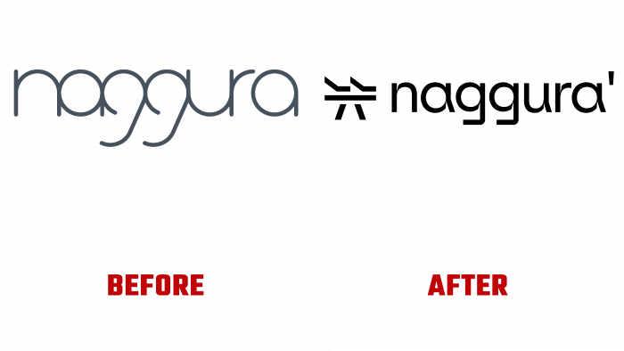
First of all, the company’s logo was transformed, and the connection with the countries of the East played a role here. In the old version, there was no such approach. Uniqueness was achieved by reducing the spacing between letters. However, there was a problem at the end because the “a” element could not be attached to the rest of the word. The letter “g” meant the wheelbase of the product being offered. This was a very memorable factor at the time. However, trends do not standstill. For consumer interest, it was necessary to revise the idea of submitting the logo.
The attentive viewer will understand that the inspiration of oriental writing is reflected in the idea of presenting the shape of the table and hands as something abstract. Hands refer to the person at work, a massage therapist, doctor, or another educated professional. It took a long time to develop lines and sections simplified by advanced digital technologies. However, the simplicity and brevity of the logo should not be misleading since it took quite a long time to obtain such original graphics. This can be seen in the design details that accentuate the overall look.
The brand text is based on the professional type Klarheit Kurrent, developed by the independent foundry Extra set designers in Switzerland. It perfectly follows the roundness and corners of the sign itself. After some manipulation, a flat bottom was added to the letter “g” to make it more similar to the therapeutic surface. In addition, the apostrophe in the name text at the end of “Naggura” is deliberately provided for a sub-brand. It acts as a separator, which complements the visualization in its way. There is clarity and harmony in the connection between the icon and the text. Sharp ink traps look a little aggressive. A sufficient number of smooth curves mitigates this.
For greater visibility of the brand’s offerings, 3D visualizations have also been developed. They provide a detailed visual representation of products and are attractive in design. Thus, the flexibility and quality of the offered therapy tables are well communicated.


