The NET Framework logo symbolizes the platform based on which a whole array of information is opened to the user. The availability and compatibility of the distribution with other programs are reflected in the straight and clear lines of the logo.
NET Framework: Brand overview
| Founded: | February 13, 2002 |
| Founder: | Microsoft |
| Headquarters: | United States |
| Website: | dotnet.microsoft.com |
Meaning and History
The software company started implementing the startup much earlier than the specified release date – around the second half of the 1990s. The working version was called NGWS, denoting that the new product is the next generation of Windows services. The test copy was already presented at the transitional stage of the millennium: in 2000, testing the beta version of NET 1.0 began. It became the core of Windows’ ambitious .NET strategy in line with its roadmap.
The new generation program has received an extraordinary visual identity mark that reflects its theme. At the same time, the designers tried to make it understandable for ordinary users, adding attractiveness and brightness to it. Now, every time the utility is updated, the logo is updated, so its history is divided into stages. At the moment there are three of them.
2002 – 2010
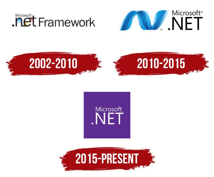
The emblem is completely textual. It contains three fragments. The largest is the first, consisting of “net” followed by a dot at the beginning. The original combination stands for “dot net.” Even though all letters are in lower case, they are very large and bold. This part replaces the graphic element. This is hinted at by the connection of the central symbol with the neighboring ones: two short stripes go from the “e” in opposite directions. The bottom stroke points towards “n” and the top stroke towards “t.” The intra-letter space is painted in the corporate colors of the software company: blue, green, orange, and red.
The second-largest word is “Framework.” Although it is not so large, the distance between the characters is greater, so the text is clearly visible. Bold, sans serif characters. The third fragment is located above the “net.” Microsoft is smaller and thinner than the others.
2010 – 2015
Another sign of the visual identity of the software includes two components: a graphic curve and a text. The hand-drawn element is a double wave or twisted ribbon painted in three shades of blue. They alternate: the central stripe is dark, and the outer one is light. They also give shadows that add texture and volume to the image. On the right in two rows are the words “Microsoft” (top) and “.NET” (bottom). In the second one, the letters are uppercase, not lowercase, as was the case in the debut logo.
2015 – today
The updated logo appeared with the launch of the next version of the program. The developers tried to modernize it, emphasizing the relevance of the utility, the fundamental difference from the previous versions, and the focus on new opportunities. The designers took a square as a basis, where they placed the text part from the previous logo. And to make the inscription readable against the neon purple background, they painted the letters white.
NET Framework: Interesting Facts
The .NET Framework, created by Microsoft, is a key tool for developing Windows, web, and mobile applications.
- Introduction: The .NET Framework, launched in 2002, has been around for a while. It aimed to simplify the creation of applications on various platforms.
- Core Component: At its core is the Common Language Runtime (CLR), making app development smoother by handling memory, security, and errors so developers can focus on the app itself.
- Supports Many Languages: It’s cool because it lets developers use different programming languages like C#, VB.NET, and F#, thanks to the CLR turning all that code into a common language before running it.
- Huge Library: The .NET Framework has a big library with ready-to-use code for everything from working with files and databases to web tools, speeding up the development process.
- Web Development: ASP.NET is part of the .NET Framework for creating dynamic websites. It started with Web Forms to make web interfaces easily and then added MVC architecture for better web apps.
- Desktop Apps: Windows Forms is used for simpler apps, and Windows Presentation Foundation (WPF) is used for more complex ones with better design and functionality.
- .NET Core: Microsoft made .NET Core for apps that need to run on Windows, Linux, and macOS, showing a shift towards supporting more platforms.
- Visual Studio: The .NET Framework works closely with Visual Studio, an IDE that gives developers tools for making, testing, and launching apps.
- Community and Open Source: While the .NET Framework isn’t open source, many related components encourage a community around .NET to grow.
- Ongoing Updates: Even with newer versions like .NET Core and .NET 5, Microsoft continues to support the .NET Framework, especially for older apps that depend on it.
The .NET Framework has helped developers for over 20 years, offering various tools and libraries. Integrated with Visual Studio, it remains popular for building various applications.
Font and Colors
Each stage of the reorganization of the visual identity of the digital platform is associated with the improvement of the computer program. The first logo was used with versions 1.0 – 3.5 SP1, the second – 4.0 – 4.5.2, the third – 4.6. Moreover, the sign changed so drastically that its opening variation is almost nothing like the current one.
The typeface chosen for the .NET Framework logo is standard print. In particular, it is grotesque – smooth, geometric, with narrow lines. The color scheme consists of red, blue, yellow-orange, green (in the first case), and the violet neon spectrum (in the current version of the logo).
NET Framework color codes
| Purple Heart | Hex color: | #5d2d91 |
|---|---|---|
| RGB: | 93 45 145 | |
| CMYK: | 36 69 0 43 | |
| Pantone: | PMS 267 C |
