A Canadian company called Combat Networks suddenly decided to open a new chapter of its biography for itself, announcing the launch of a new corporate naming and style.
The firm, headquartered in Ottawa, has been renamed Netagen and has a new logo and website. Serving the largest federal and provincial government departments, municipalities, healthcare providers, police, educational institutions, and Fortune 1000 companies, the company has become a market leader in high-performance computer networks.
This is a very profitable business at the moment since it is no longer possible to imagine the modern world without communication and data processing. And serious institutions that have access to a huge amount of personal data tap need a reliable partner in their work.
Twenty years of experience in the market, a wide audience of consumers, a high rating, and an excellent reputation among competitors. In general, experience in the IT field gives a great advantage for further development and brand promotion.
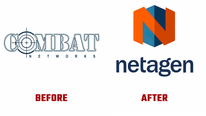
Looking at the old logo, corresponding to the old name, you can catch the last century’s trend. Why is there such an acute sensation of oppressive age? Because 20 years ago, it was fashionable in design to play around with arrows, checkmarks, lines, underlines, double circles, and shadow textures. Now, this looks boring and even comical because, in this way, many designs were created for brands that were not in any way associated with such graphic elements.
Specifically, in the case of Combat Networks, a serif-type logo was designed to convey the message of communication, emphasizing military style. In the middle of the word Combat, instead of the usual “O,” a sight was placed, which, as it were, conveyed the “hit on the target” of the company.
Of course, many brands wanted to position themselves in the market as leaders setting high rates of technology development. Still, such a logo remained inseparable from the brand for too long.
Now such a gray-black contour version of a serif typeface and a postscript in simple, even letters would be one hundred percent a big mistake in visual identity.
Following the path of modern design, the new logo is a combination of graphics and type. Well-chosen tones of reds and dull dark greens or even blues harmoniously emphasize the boundaries of the logo, defining visual contrast. The font is normal, slightly rounded, calm, sans serifs and curls.
And the favicon is played in the form of a square with a dark and light side, which creates a three-dimensional figure. And this cube is represented by an edge because it is more convenient to designate the letter N, which stands out in bright red.
The difference between the logos is visible to the naked eye. The current logo looks more solid, serious, authoritative, and brighter.
The industry in which this brand exists assumes constant changes, the search for alternatives. And it’s very good that the brand changed its name and dared to change its appearance radically. Now Netagen will surprise its customers with high-quality work and state-of-the-art technologies and a creative, elegant presentation.


