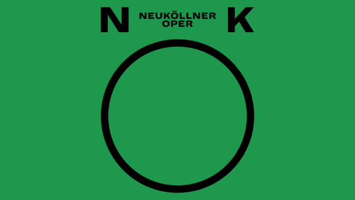
The Berlin Neuköllner Opera, founded in 1977, has acquired a new visual identity that most fully reflects the brand’s features, spirit, and mission. Having existed since 1972, the theater has shown a progressive desire to significantly expand the traditional boundaries of the genre, offering the audience a wide musical variety and genre-breaking productions. His field of activity covers almost all areas, from operettas and operas to musicals, revues, soap operas. Performances are distinguished by the presence of sparkling humor and a unique creative approach. Brand founder Winifred Radeke is a composer and church musician.
Moreover, the latter had a strong influence on his work and the repertoire of the Neuköllner Opera. Since 1988, the group has become the owner of its premises with 220 seats. The theater gives up to 10-12 performances a year, constantly updating its repertoire. Keeping up with the times, the brand felt the need for change. It changed its visual identity, which allowed it to become much closer to its audience, taking a significant step forward in popularizing its vision of theatrical art.
The new visualization reflects the brand’s vision for an alternative to traditional opera. The theatre’s vision of opera as a cross between drama and music is the foundation of its branding, aiming to highlight the importance of music and the diversity of theatre, which are the basis of Neuköllner Opera’s entire existence. The developed new version of the logo has acquired playfulness and some irreverence, making it special in an environment of a wide variety of forms and types of theatrical identity.
The graphic basis of the identity is a circle, which in its dynamic interpretation is constantly shrinking and stretching depending on the type, shape, and size of the layouts. The composition is complemented by bold letters N and K on each side of the figure, creating a visual perception of the composition as a stylized image of the human face of an opera singer performing a musical composition at the top of his voice. The second element of the logo is a wordmark in a conservative design, which serves as a visual “anchor” for all the elements that form a characteristic individuality. The text is in Schick Toikka Dia font, effectively displaying the required visual information both on its own and in combination with different versions of the logo. Finished in a conservative black color, it adds fun to the composition, thus ensuring attractiveness and memorability. But its abbreviation – NKO, on the contrary, becomes deliberately serious, providing the sign with a place of an excellent favicon and avatar in social networks.


