The Bluzelle platform has recently taken on a new corporate identity that is more attractive and “computerized” in shaping logo design. Created as a tool to simplify and convenient work with cryptocurrency, the platform was launched in 2018. It was widely used by financial structures HSBC, OCBC, MUFG, and insurance companies AIA and MSIG. With its help, the convenience of data management and security is ensured and minimizes risks from the impact of censorship blocking of cloud storage and information processing services. Bluzelle is characterized by good scalability and interoperability with other blockchains.
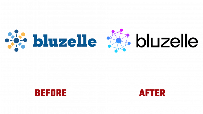
After three years of fruitful application of the program, some problems were identified that required improvements in many areas. First of all, the functionality was expanded, and the platform became more adapted to users’ requirements. The changes made were significant, making it possible to talk about creating a new version – Bluzelle 2.0. Its appearance demanded to mark this transition by rethinking the corporate identity, adjusting the logo. At the same time, it was decided to preserve recognition by linking to the first version, with the advantages and convenience of which many cryptocurrencies and users and developers of systems and technologies in this area were already familiar.
The redesign touched on the color scheme of signs, background, fonts, general style to demonstrate real growth and development prospects. The composition and the name itself remained unchanged. This is a perfect remix on an old theme but with an innovative approach. A unique combination was achieved – focusing the view on each element while simultaneously allowing the entire picture to be captured as a whole. In this way, it turned out to convey the essence and importance of decentralization of the storage as one of the platform’s advantages.
The black background and badge to the left of the title in a gradient design, with a transition from turquoise at the bottom, through cornflower blue and moderate slate blue to deep pink, provide the required attention to each element. The name itself, executed in white in lowercase letters, immediately becomes noticeable against a contrasting background. The company’s designers have modified the Benzin Regular typeface. The width of each character has been reduced, and the letter “u” was created without a ponytail with right angles and no fillets. The general appearance of the logo has become more “computerized,” better reflecting its belonging to the electronic digital “world.”


