On the southeast side of London, a famous factory with docks is rich in history and personalities. This place is also interesting because the forces of the Canada Water community are concentrated on 53 acres of its territory, which is engaged in a huge number of projects to restore housing conditions. So the master plan, which was developed in 2019 by British Land, will provide an opportunity to live in 3,000 new houses, work on a huge area (2 million square feet of jobs), trade on an area of 1 million square feet., and many more places for recreation, entertainment, public outlets.
This is not a typical London name of the place was given in honor of the protected area of a freshwater lake, formed as a result of the redistribution of the former Canada Dock in Port of London. According to the plan, the renovated city center will be located in the heart of London. Therefore, a new image and brand are needed, which was subsequently developed by London design masters – DixonBaxi.
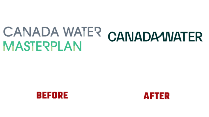
What sets this brand apart is the richness and layering of its surroundings and its connection to the nature of London itself. The rebranding authors note Expressionism, which was a key concept in the creation of the logo. In the end, we decided to make a logo that would emphasize the connection between man and nature, city and wildlife. Visual “gestures” of letters indicate the continuity of elements, intersecting lives, experiences, work processes.
With the imposition of the symbol, the designers showed the redevelopment of the Canada Water area, the course of its life in the vicinity of other neighborhoods. The three main concepts – flow, coherence, structuredness – are what the new logo is based on. They fully convey the spirit of the area and the active life of the area.
As for the typeface, Monokrom’s Karelia did an excellent job of demonstrating sharpness, fluctuation, movement, like water itself. Associated letters A and W speak of a close partnership between nature and urban landscapes, reflecting the essence of the Canada Water brand itself.


