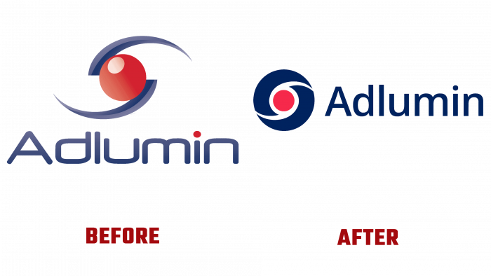
On July 13, 2021, Adlumin, one of the leading American product manufacturers in computer security and information security, announced a rebranding. The purpose of such information was to convey to their customers and partners, everyone who strives to provide the most effective cyber protection, about the need to be ready to perceive the new corporate identity and appearance of its logo.
One of the features of our time is the huge demand for products that provide cybersecurity. The number of companies working in this industry is constantly increasing, actually breaking into the market with new unique offers, thereby overloading it and forcing even leaders in this field to confirm their advantages constantly. The struggle for leadership in this area requires constantly being in trend, using the most modern promotion technologies and ways to ensure the consistency of old and attract new customers.
Changing the Adlumin logo is one such way that the most complete and accurate reflection of the increased power of the company in its area of the industry, the expansion of its capabilities, which guarantees an increase in the level of safety when using original products by the consumer is expected. The reason for such changes was several high-profile scandals in connection with the leaks of important and classified information and data last year. This problem was faced not only by private businesses but also by government organizations, defense structures, research centers, and the banking sector.
Adlumin’s offerings are one of the real ways to enhance your security by leveraging the company’s innovative security automation platforms, the latest releases of which are tailored to the current situation and are fully compliant with current regulations. By changing its logo, the company tried to adhere to three main criteria to its users and partners – trust, reliability, and responsibility.
The changes affecting the logo retained its basic traditional colors and shapes. A rich, aristocratic blue is in complete harmony with a brighter rendition of the red, which characterizes the company’s important aspiration to be the helpful and leading beacon in the invisible cyberspace. All the changes made were so subtle that they did not require additional efforts to ensure recognition. However, they made it possible to highlight its core values, aspirations, and prospects more clearly and vividly. The logo has become more energetic and competitive, highlighting the strongest points of Adlumin.


