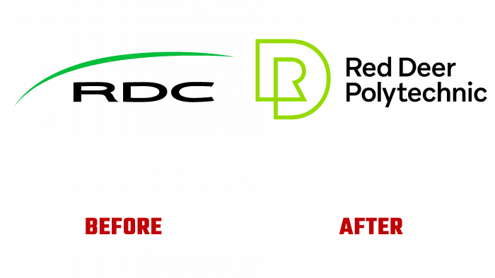
The history of the Red Deer Polytechnic educational institution, located in Red Deer, Alberta, Canada, began in 1964. As a polytechnic institution in 2018, the institution received the right to award an academic degree. Today the educational institution provides certificates, apprenticeships, degrees, micro-diplomas. Having thus expanded its capabilities, RDP decided to conduct a full rebranding, which was carried out by the creative team of Will Creative Incorporated. Having a fairly long history, the institution changed its name from Red Deer College to Red Deer Polytechnic, which became a springboard for further developing the brand and the entire region, continuing to support students. With two modern campuses that provide impressive amenities, the facility provides ideal conditions for learning, working, researching, and participating in various events.
The new image demonstrates a renewed progressive approach to fundamentals that demonstrate the importance of the individual, whether he is an individual student, teacher, employee, partner, or community representative. The changes affected the brand strategy, its logo, and all areas of visual identity. All this helped to form the basis that defines the concept of the history of the institution but also to create the required perception of the organization. More than 600 people, who took part in the discussion of the formation of a new visualization of the institution, played a great role in forming the identity.
The basis of the new perception of the brand was a monogram of two main letters – “R,” which is enclosed in a capital letter “D.” In this way, the institution identifies itself, personifying itself and its goals and objectives. The monogram is in bold type, which symbolizes the stability and certainty of the Polytechnic Institute. At the same time, the name placed in the logo speaks of the beginning of a completely new era, expressed through visual identity.
The color palette plays an important role in the new identity. The dark green background, the light green shade of the sign, and the white font create a sophisticated and modern composition that stands out for its personality and memorable combination. Conciseness and clarity are the basis for the formation of the required brand perception. Thanks to such a thoughtful new image, the institute created an optimal understanding of what Red Deer Polytechnic will offer students to get a higher education. This promising job allows them to develop their families, their future close to home.


