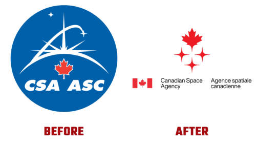
On March 16, 2023, the Canadian Space Agency (CSA) unveiled its new logo, replacing the emblem adopted in the fall of 1996. After so many years of use, it had become outdated as technological potential expanded, moral priorities changed, and much more. The creative agency LG2 was responsible for the new branding.
The CSA emphasized that this logo will travel to the Moon alongside a Canadian astronaut as part of NASA’s Artemis project. It will be the main symbol of Canada’s efforts in space exploration and highlight its growing role in opening a new era of possibilities. Canadians have thus updated their visual identity, opting for a simpler and more concise design. The logo consists of two basic parts: a maple leaf and three stars.
- The maple leaf – the national emblem of Canada. According to CSA’s concept, it emphasizes the country’s belonging and evokes pride in it, showcasing its limitless potential and development. The attribute also conveys an upward movement – a sense of flight. This is associated with the leaf’s structure, whose tip is sharpened like a rocket, and its overall shape resembles an airplane with wide wings.
- The stars – are symbols of space. They are the main components of outer space and specifically represent it in the logo. Their interpretation is simple: diamonds with four rays. This structure helps better convey the brilliance, intellect, experience, and strength of all project participants. This includes scientists, industry, academia, and STEM organizations. The stars symbolize them, hence their quadrilateral shape.
Together, both parts embody the country’s aspirations for the future, readiness to expand the boundaries of innovation, and the desire to implement inventions. All elements are colored red, confirming the primacy of the visual ecosystem of the Canadian Space Agency.


