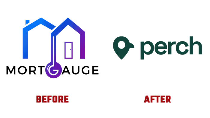
The development of the Perch service, formerly MortGauge, was based on creating comfort and convenience for Canadians who want to apply for mortgage loans. Her task included supporting and minimizing the terms for obtaining such loans, ensuring the choice of the most effective decisions on transactions in the real estate market based on the use of analytical data and their processing. The development team was able to achieve the desired effect thanks to a productive symbiosis of extensive experience in the field of the real estate market and the professional use of advanced technologies. Brokerage, underwriting, financial operations, strategic marketing, the use of digital media, the latest software, discoveries in the field of data science, and audit became the basic foundation on which the creation of a new platform was formed. Reflecting all these features and constantly adding to them with an innovative approach was the main reason for the renaming of the brand, which made it possible to more accurately reflect its essence and the new strategy of the platform.
The brand acquired a name that directly communicates the provision of a search service and assistance in acquiring a new ideal home. This idea is the basis for constructing the entire logo, which consists of a location designation made in the form of an original stylized silhouette of a bird. Such a performance is not filled with information but has a powerful appeal, providing brand recognition and memorability, intriguing with its extraordinary graphics. The icon itself is a good reflection of the understanding of what a person means in the deep sense of the phrase – “sit on your perch,” while at the same time being a well-known marker on the maps. This small icon successfully reflects all these connections.
The verbal part of the logo is made using a sans-serif typeface. Attention is drawn to it by the applied ink traps, the distinct and precise execution that attracts the eye. Perhaps this creates some hindrance to the visual perception of the entire composition as a whole. But these traps “work” as anchors for the gaze. Versatility is also ensured by the executed visualization of all applications created in a single, unifying style.
The basis of the corporate color palette is dark green, which somewhat softens the childish spontaneity and playfulness of the sign. It adds maturity and seriousness to the atmosphere of the visualization. In general, such a combination of elements and colors, the ongoing evolution of the name and the logo itself, form users a sense of confidence in the brand the legitimacy of its actions, providing absolute trust in it.


