The Fluency Academy brand is relatively young – only its fifth year in the foreign language teaching services market. It is both an extensive Internet platform and a mobile application that works with most European languages, offering to learn Japanese and even Mandarin Chinese simultaneously.
The founder of the company is an interesting personality. This is Rhavi Carneiro, a designer by profession, a language teacher by vocation. He knows and is fluent in 4 languages, in addition to teaching English. The school’s students, with a total number of 100 thousand, along with 250 language teachers, became targets for investors from different states of America. Because of the brand’s success, the quality of the work carried out, highly qualified personnel, and smart students are excellent indicators of the success of a once modest language school.
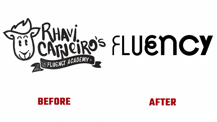
Over time, like everything created by the minds and hands of people, the school logo has become uninteresting. The image of an animal that could be interpreted as a goat, llama, horse (or some other animal, because it is not clear what it is at all) has ceased to work as an advertisement for the school. Likewise, the founder’s name, handwritten in the overall shape of the logo with a ribbon, in which the very small printed name of the school, is not an example of excellent public relations for the company.
Maybe it worked at first, but now, according to the tradition of simplification in design, it is better to use a minimalist logo so that the target audience’s eyes can focus on the overall concept rather than on individual parts of the visual. And that name was portrayed too tricky, the head of the animal looks ridiculous, and the school’s name is completely hidden in the backyard.
This disorder was decided to be corrected by TASTE from Brazil.
After a detailed analysis of the old logo, it turned out that the whole concept is based on the founder’s name. In Portuguese, his surname means “sheep.” But the execution of the drawing is by no means the best. In the new brand strategy, it is not the authority of the main teacher that comes first, but the flexibility of the students’ minds, flow, and language abilities. It is water that flows in different directions, penetrating all areas of activity. Now the learned language will bring you to new horizons, where the river of life carries.
The logo looks very cool and juicy. And here’s why: each letter is different from the previous one. Now a curl, now a clarification of the thickness of the lines, now slenderness. At first, the letter F is just the source, the beginning of the river, and its end is U, which is not the end at all, but, rather, the river bed, which brings its waters into the ocean of life.
Foreign languages open up new perspectives, and this is shown in the logo. There is a hidden idea of complication, an increase in the degree of speed, and maybe the volume. This is what is subjective.
The creatives themselves explain: curls are fluency of language, and thickness is loudness, confidence in use – an unusual solution and a great alternative together with a new brand naming.


