An interesting event has been held annually since 2020 in the city of Piedmont. A variety of artists present their exhibitions in a small town in northeastern Auckland. Spring gardens, recreation areas, walking areas are transformed into platforms on which art objects are located, be it paintings or clay products. The local fund for arts – Piedmont Arts Fund – is not a commercial organization but very bright. It also supports programs for arts development according to the K-12 scheme (a curriculum for education from kindergarten to 12th-grade school). Provides the necessary manuals, techniques, teaching materials, means to expand the horizons of children by introducing such a subject as art. Thanks to this fund, it was possible to raise about 17.5 thousand dollars to support the program.
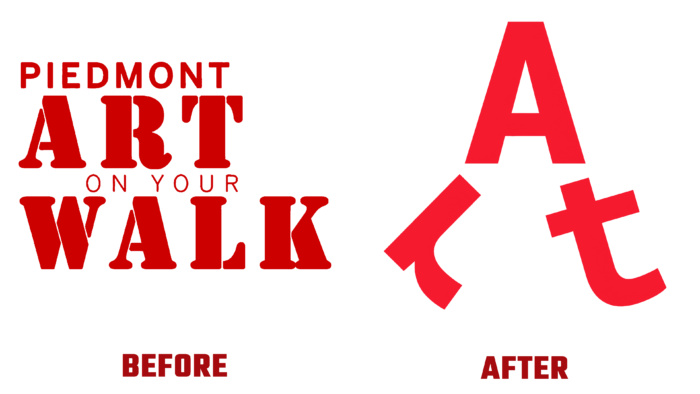
Although the event has emerged as a tradition recently, it became necessary to brighten the logo and add more openness to the event’s image. The fact is that serif typeface, mixed-sized letters, spaces, and empty spots in the first version of the logo look boring, if not miserable, even though this festival is a celebration of art, a performance for the sake of attracting people to the beautiful and tangible! On the contrary, red is more distracting than attention-grabbing.
Here is a completely different impression with the new logo. Intrigue, mystery – where do these legs go, which represent the letters a-r-t? This is a wandering art that walks among people, gives its emotions, unites the townspeople!
Beautiful creative from California-based design studio Mucho. The font is simple – A2 Gothic from A2-TYPE’s.
The logo is made with meaning, with awareness of the situation of use. This is a local image, not passed on to anyone, not inherited, the authentic Piedmont symbol. Digging deeper reveals the second bottom of the image. The name of the city itself is duplicated with the region in Italy, which, in turn, is often depicted as a boot. Moreover, “pied mont” is a foothill (from Italian), and from French, “pied” is a leg. The theme of walking, lifting, legs is very clearly visible in the new logo.
A good idea turned out to be a real emotional picture – they showed both the revival of interest in art and inspiration and the search for their creative path or recognition and the connection to the twin city and the venue of the event. The logo was named “Walk of Art,” which is very logical and symbolic.


