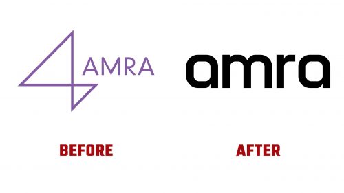
AMRA, established in 2014 as a global digital music collection society, recently debuted a new logo and brand identity. This redesign marks a significant update, aiming to better align AMRA’s visual presentation with its advanced technological approach to optimizing digital revenue collections for songwriters and publishers worldwide.
The previous logo featured an ambiguous icon resembling a “4” more closely than an “A,” paired with a nondescript wordmark in a muted purple color. This design was often seen as disconnected and failed to adequately represent AMRA’s innovative mission in the digital music sector.
The new logo introduces a strong, geometrically designed wordmark, notable for incorporating rounded elements in all lowercase letters of the company’s name. This design fosters a modern and accessible appearance. The wordmark is characterized by broad shoulders on the “a” s and smooth connections between the curves and stems, adding unique visual interest. There is also a slight asymmetry in the “m,” with the right side subtly wider than the left, lending a distinctive touch to the design.
A secondary element, called the “Beacon,” complements the primary logo. Designed to symbolize the idea of “illuminating the path to clarity,” the Beacon features an orb-like form with shifting, moody light effects inside. While visually striking with its grainy gradients, the Beacon feels stylistically separate from the main logo. Still, it successfully transitions the brand’s color scheme from the old purple to a new, vibrant mix of purple, green, and blue gradients. This change injects energy and a contemporary edge into AMRA’s visual language.
AMRA’s refreshed branding encompasses a variety of design elements across multiple touchpoints. Although diverse, these elements collectively project a sleek and professional image. The visual strategy includes silhouetted images of musicians and artist headshots, enhancing the brand’s relevance within the music industry. However, the broad array of design choices might introduce ambiguity about AMRA’s intended audience, including musicians, producers, or investors.
Nonetheless, the updated branding is poised to boost AMRA’s appeal across the music industry’s spectrum, from content creators to corporate stakeholders. This new identity is visually appealing and reaffirms AMRA’s leadership in digital music rights management, emphasizing its commitment to transparency and efficiency.
This comprehensive rebranding distinguishes AMRA in the competitive digital music collection field, signaling a new era in its mission to streamline and enhance revenue collection processes for music creators globally. The new logo and brand identity are designed to resonate strongly with existing partners and potential new collaborators, promising to usher in a new chapter of growth and innovation.


