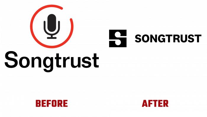
Founded in 2010 by Justin Kalifowitz and Joe Conyers III in SoHo, New York City, US, Songtrust launched a platform of the same name for songwriters and musicians in 2011. It provides ample opportunities for the latter to comfortably manage their rights to the implementation of publications and related rights, including the registration of their works directly. The platform provides access to receive royalties directly from all over the world (today, it already includes 90 countries). The main task of the company and the platform it created is to create better conditions for those who run their own music business. Songtrust partnered with NY-based Order of Brooklyn to ensure that it is fully up-to-date by creating a new visual identity that effectively reflects the changes that have taken place.
The renewal process began with developing a new strategy, in which the expert in the field, Adam Beal, participated. One of the directions was the expansion of communication capabilities, in which the authors would acquire additional capabilities at all levels. The identification system made it possible to make the widest coverage of all people’s voices, aspirations, and wishes in a unified platform built on and around a musical language with universal visualization. The new identity created all the conditions for demonstrating that each author becomes directly part of the entire system, consisting of many related elements. And the most active part of it.
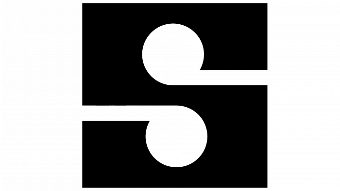
Selected as the main, recognizable element of the logo, two symmetrically located relative to each other musical notes is a symbolic interpretation of the fact that the brand considers each author a separate unique person, but as part of its community. In addition, the sign has a different visual meaning. If we look at the black field around two white notes formed by negative space, we can see a monogram in the sign, in the form of a stylized letter “S” – the first letter of the platform name. It is an original visual composition that creates a visual perception of the unity of words and music, which is visited in its center. Crafted with the National 2 font from Klim Type Foundry, the wordmark provides a visual sense of reliability, asserting that the brand is trustworthy. It effectively and harmoniously fits into the overall graphic composition, bringing a pronounced individuality.
The same applies to the well-chosen eclectic color palette, reflecting the brand’s inner spirit, the diversity of cultures that the platform represents. At the same time, the visual language itself is based on a formed understandable, and attractive visual structure, which includes the music itself as its basis.


