The new FRVR brand logo is a modification of the cool and bright image of the company, a kind of improved version of itself.
The brand has a long history of creating hyper-casual free games for millions of users around the world. The company considers the peculiarities of many platforms for which these games are created, so technical support plays an important role in creating their final product. For this, the brand is loved – attention to detail, respect for the user, and impeccable technical component.
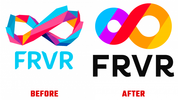
To initiate a rise in interest in the brand, the company decided to freshen up its shape. Before that, the logo looked like an infinity sign, made in a polygonal design. Thanks to these forms, the old logo looked successful and attracted attention from the first seconds. He wanted to be considered. The study follows the movement of forms.
Interestingly, one circle is smaller than the other; due to this, it seems that the logo is in dynamics. The triangles and irregular shapes that make up the logo have both cold and warm colors. Here you can find lilac, pink, orange, coral, muted blue, and turquoise shades. This is not to say that one color “grabs” another. By no means, the colors are distinctive, self-sufficient, and set boundaries to each other. But overall, the logo looked pretentious and playful, which the gaming industry needs to broadcast.
In the new logo, the rings of the eights of infinity have become soft and round, more accurate in shape. It feels like the logo has been aligned to show discipline and organization. This lends importance and credibility to an already promoted brand, so it doesn’t spoil the look of FRVR in the least.
The symbol of infinity is what means endless interest in the gaming field. The concept of “forever” is embedded in the concept of brand naming, which is why the graphic perception must correspond.
The new logo has only five colors, unlike the previous version. It is blue, lilac, red, orange, and warm golden yellow. The name is highlighted in black, and the font style emphasizes the letters R, with warlike lines at the bottom of the letters.
Previously, the lettering was in a bright sky blue shade, and the font was made in the tradition of constructing geometric shapes with chopped edges.
It is important to note that the sharpness of the corners and shapes was removed, making the new logo perfect. This makes it look more effective and easier to remember.
This symbol, together with the selection of the scale of the font, will become a favorite of users because it more fully reflects the essence of the game – dynamics, cyclicality, interesting plot twists. And, as you know, the stage of rebranding is followed by an increase in the public interest.


